• Welcome to Smashboards, the world's largest Super Smash Brothers community! Over 250,000 Smash Bros. fans from around the world have come to discuss these great games in over 19 million posts!

    You are currently viewing our boards as a visitor. Click here to sign up right now and start on your path in the Smash community!

SpeedySonic's Sig/user bar/avatar shop[OPEN]

Zankoku

Never Knows Best
Administrator
BRoomer
Joined
Nov 8, 2006
Messages
22,906
Location
Milpitas, CA
NNID
SSBM_PLAYER
Why are they all GIFs? That's pretty much the worst format you could use, besides bitmaps. And I'm pretty sure GIMP supports JPEG and PNG.
 

Cookiez

Smash Ace
Joined
Feb 24, 2008
Messages
564
Location
London, UK
Wow Yuichi is such a meanie! :O

Practice makes perfect, The OP stated he was new to it so why the hell are you being so critical?
 

Evelgest

Smash Apprentice
Joined
Feb 5, 2008
Messages
196
Wow Yuichi is such a meanie! :O

Practice makes perfect, The OP stated he was new to it so why the hell are you being so critical?
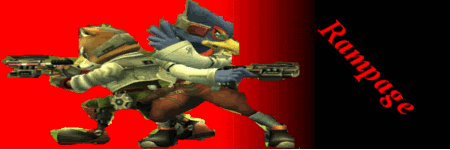
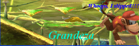
Most likely because the OP created a thread in General Discussion about the "Top 5 Sig creators" on these boards and he included his own name. And no, it was NOT a joke, because I thought it was, and "SpeedySonic" here told me that he doubted that I could make sigs because apparently I'm not allowed to have sigs. But looking at his sigs, I know who's the better between the two of us. I'm not very experienced myself, but here are two of my better works.

1
2
 

Yuichi

Smash Cadet
Joined
Nov 7, 2007
Messages
47
Location
AK
Wow Yuichi is such a meanie! :O

Practice makes perfect, The OP stated he was new to it so why the hell are you being so critical?
'cause it's true; he claims to be one of the top 5 sig makers in SWF; it's fun. ;)

@SpeedySonic

...Uhmm....I think the one i made (Down in my sig) is better than all of yours...
 

Waddle

Smash Ace
Joined
Feb 29, 2008
Messages
512
Location
Nebraska
Wow, people are just hating a friggin millenia in here. They arent the best sigs ever, but at least he's trying people. Show the man some love!
 

Evelgest

Smash Apprentice
Joined
Feb 5, 2008
Messages
196
Wow, people are just hating a friggin millenia in here. They arent the best sigs ever, but at least he's trying people. Show the man some love!
Man? Stubborn, egotistic child is more like it...

Speedy, Yuichi's sig is better than anything you've made so far. Keep practicing. Don't call yourself one of the best on these boards when you know yourself that you're new to this.
 

Yuichi

Smash Cadet
Joined
Nov 7, 2007
Messages
47
Location
AK
Man? Stubborn, egotistic child is more like it...

Speedy, Yuichi's sig is better than anything you've made so far. Keep practicing. Don't call yourself one of the best on these boards when you know yourself that you're new to this.
Thanks. Btw, those sigs you made are pretty darn good.
 

Grandeza

Smash Master
Joined
Nov 11, 2007
Messages
4,035
Location
Brooklyn,New York
dude your making sp wait.She needs the 1 image your using for the sig. Also I told you you were lying in school about the sig you supposedly got from her with 4 images.
 

-Knux-

Smash Ace
Joined
May 31, 2007
Messages
711
Location
Illinois
Speedy, this post has nothing to do with your artwork. You cannot triple post and just say "Sorry". Edit your friggin post if you need to add something. You've triple posted in your own thread TWICE. You should know the rules by now.
 

Grandeza

Smash Master
Joined
Nov 11, 2007
Messages
4,035
Location
Brooklyn,New York
You said you wanted some critiques so I'll critique your sigs on page 1 from top to bottom.

sig1:the smash ball is badly cut out. The background doesn't fit final destination. All you did was gradient background>F.D. cutout>smashball,sonic,lucario cutouts>bad text. You used not brushes or effects.

sig2: Way to blurry and low quality. Save everything as png's. Way to much text. Your name is too long. Your rendering needs work and your green hill zone bg didn't even cover the whole sig. still no brush use. needs work.

sig 3:You rendered everything better than usual this time. Still blurry. Use some fracking brushes. Your stage bg still didn't cover the whole sig. Text is bad.

I give up, and I don't care if they're not your most recent, that's my advice for your sigs. I hope I didn't come off as harsh. Google some tutorials.
 

darklinkjr

Smash Cadet
Joined
Feb 10, 2008
Messages
30
oh my god my eyes...... my eyes....
a few tips,
if your way too lazy to erase the backround of a stock then all your have to do is work around it.
if you want photoshop just pm me ill give it to you in 3 minutes or less.

everything just looks copy&pasted on there. no blending whatsoever, barely any light sources. in the middle of nowhere. some characters are resized and compared to the other things in the sig its way too big and just throws off the quality.

Again if you want Photoshop CS3 just pm me ill give you it full proof. without a penny to waste.
 

Grandeza

Smash Master
Joined
Nov 11, 2007
Messages
4,035
Location
Brooklyn,New York
you said today you were tied with me in sig making. im bad but im btter than you.

i dont think any of yours hold a candle to this.
 

Waddle

Smash Ace
Joined
Feb 29, 2008
Messages
512
Location
Nebraska
Type: Avatar
Link: http://i275.photobucket.com/albums/jj318/Waddle0011/WaddleDeeAvatar.png
Colors: None
Borders: None
Size: 100x75
Text: None
Font: None
Subtext: None
Extra: None
Detail: I want this to look exactly the same as it already looks except just bigger. I want that transparent thing or w/e you call it, just like how the avatar looks now:

How it's only the picture and the background just blends in with whatevers. I dont know the proper name for it, but I think you know what Im asking for. Thanks.

EDIT: I just noticed that since it is 100x75, if you resize it, it will look wide maybe? If it looks bad, then can you make it say Waddle long the side of the Avatar. I still want it 100x75. If you dont understand what Im talkin about, just PM or post.
 

Evelgest

Smash Apprentice
Joined
Feb 5, 2008
Messages
196
Type: Avatar
Link: http://i275.photobucket.com/albums/jj318/Waddle0011/WaddleDeeAvatar.png
Colors: None
Borders: None
Size: 100x75
Text: None
Font: None
Subtext: None
Extra: None
Detail: I want this to look exactly the same as it already looks except just bigger. I want that transparent thing or w/e you call it, just like how the avatar looks now:

How it's only the picture and the background just blends in with whatevers. I dont know the proper name for it, but I think you know what Im asking for. Thanks.

EDIT: I just noticed that since it is 100x75, if you resize it, it will look wide maybe? If it looks bad, then can you make it say Waddle long the side of the Avatar. I still want it 100x75. If you dont understand what Im talkin about, just PM or post.
I did it for ya. Resizing is easy.

Since your image was already 65x65, I made a 100x100 and then your requested 100x75.


PM if you must have text, I'm a little busy right now.
 
Top Bottom