• Welcome to Smashboards, the world's largest Super Smash Brothers community! Over 250,000 Smash Bros. fans from around the world have come to discuss these great games in over 19 million posts!

    You are currently viewing our boards as a visitor. Click here to sign up right now and start on your path in the Smash community!

Rate That Render! (Now Rating: #49 Little Mac)

NintendoKnight

Smash Lord
Joined
Oct 26, 2013
Messages
1,735
Location
Climbing the mountain I made from a molehill
NNID
Nin-Knight
I was frequenting the Ganondorf character board at one point before and I posted a relatively lengthy post which compared Ganondorf's renders between the games and which ones look good aesthetically, fit the personality and theme of the character being displayed, and which one I liked the best. (Though I must warn that I'm rather enthralled by the Ultimate artworks.) Since then, I've been inspired to do the same thing to all the characters that have been in more than one Smash game... which accounts for every character that wasn't introduced in Ultimate!

However, I thought it'd be fun if other people might want to rate renders of specific characters as well, as they might get to explain what they love (or hate) about a character's specific render from each game they've been in. So join me as we rate some character renders!

Basic rules to get us started:
1. All character renders ratings are to be self-contained; we will not be comparing the renders of different characters, nor will we be judging the renders on overall quality of the game they come from. Renders are to be compared with other renders of the same character only, no exceptions.

2. I'll be using a basic 0-to-10 rating scale with one additional decimal place for my ratings. e.g. 7.5/10. You may freely used a different method of grading, such as letters, scales of 1-to-100, etc. It doesn't matter what you use as long as the rating you give is clear to the rest of us.

3. I will start us off on a new set of character renders every so often when I feel that enough time has passed for another character's renders to be compared and rated. So until I do, please only rate the renders of the character currently being compared.

4. Again, we will only be rating characters that have a minimum of two separate renders. If the character is a newcomer in Ultimate, they are unfortunately ineligible for this as they don't have enough renders to compare... though, there will be an exception to this rule, but I'll leave that as a surprise for now.
Now, without further ado, IT'S COMPARISON TIME!

Our First Comparison: 01 Mario.

Smash 64: :mario64:
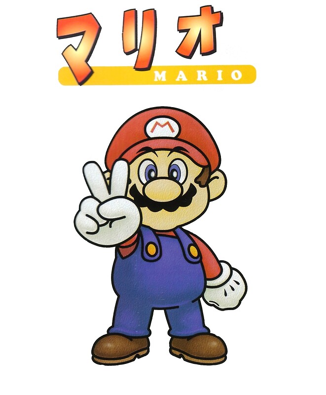
(Alternate Image Link)

Starting us off is Mario from Super Smash Bros. 64! Smash 64's art style was this drawn, comic book-like sort of feel to it. However, the difference between a 3D rendered image and a drawn one means NOTHING TO US! First off, it is a bit of a basic pose as Mario's not doing anything too dramatic or exciting; however it is perfectly clear what it is he's doing. He's giving us the two-fingered "V for Victory" pose that he was known for using since his olden days, which matches a well-known character trait of his. The hand he's holding up does sort of blend into his head when you look at just the silhouette, but the opposite side is very asymmetrical to counter balance it. I love how his face shape, and the curve of his mustache, naturally resembles a bright, big smile. Another touch is the ability to see the eyebrows through the cap, and how thin the "M" on the cap is. All-in-all, it's Mario; that's all you need to know.
7.7/10.

Melee: :mariomelee:
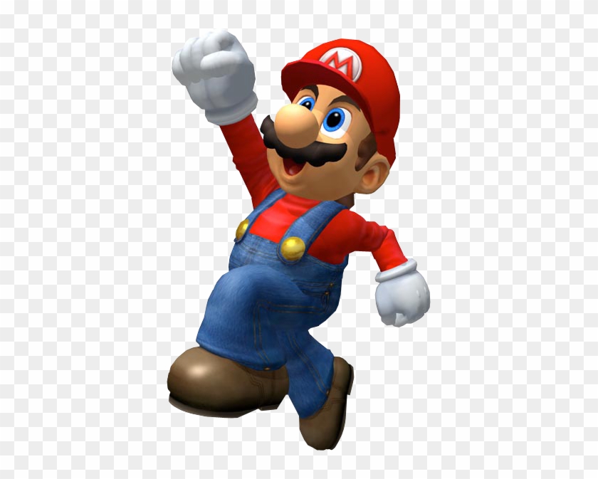
(Alt Image Link)

Now we're cooking with gas! Melee comes out swinging with a very strong render for Mario! Right off the bat the pose is immediately recognizable as Mario's signature jumping pose. The silhouette is immensely stronger, as well as the fact that the pose is much more dynamic and interesting to look at, especially with the asymmetry present. Mario is clearly in motion with his pose. This is the pose that most people know him for so it's a perfect representation of his character. The joyful expression on his face tells us he's having a blast no matter what he's doing, even if it means getting beaten to a pulp by 3 other all-stars. I love the energy here. (A point of note, I will indicate for Melee when a character's Select Screen Portrait is different form their main render and will be rated separately. That being said, Mario's CSS portrait is identical to his primary render.)
9.2/10.

Brawl: :mario2:

(Alt Image Link)

Brawl is where things take a strange turn for our Red-capped hero, to say the least. I don't know who did it, but it seems someone stole Mario's pasta and then peed in his Cheerios to turn our Happy-Go-Lucky Mr. Video Game into Mr. McSerious as Mario seems to be suffering from NA Kirby syndrome. The loss of his joy-filled expression is a tad upsetting, though it makes some sense in Smash's fighting context. However, the pose itself is actually pretty decen. He may be employing some type of self-taught Taekwon-Ninten-Do. Regardless, it's a strong stance and it's clear he's focused on the foe in front of him. The silhouette is strong even though I can't see his left arm, it's asymmetrical to boot, and it's composed decently well. It... just feels less like Mario than the previous two.
8/10.

Smash For Wii U/3DS: :4mario:
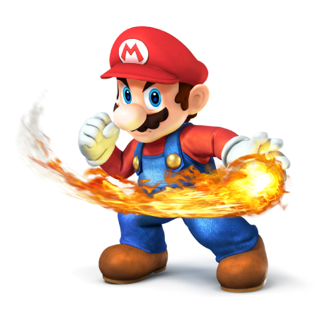
(Alt Image Link)

There are technically two Smash 4 renders for Mario, one with the fireball and one without. The one without is used for the silhouette images used in the menu for Smash 4 (which makes it a better image for a silhouette grade) but other than that we'll be rating the one with the fireball. First off, let me say this one looks pretty fantastic as far as renders go. This is the only render of Mario's that uses an additional effect to add to the image. In this instance, his famous fireball is on display and what a display it is. We're still suffering from "I'm Not Happy I Swear" Mode, but to that end he looks like he really means business. I love the glow of the fire on his nose and gloves, it's a neat little touch that's often forgotten or overlooked. Either by coincidence or by choice, Mario's over posing is similar enough to an old Sunshine render he used before, though it's mostly his head position that matches. There is no symmetry to the pose, which adds to its dynamic feel.
8.5/10.

Ultimate: :ultmario:
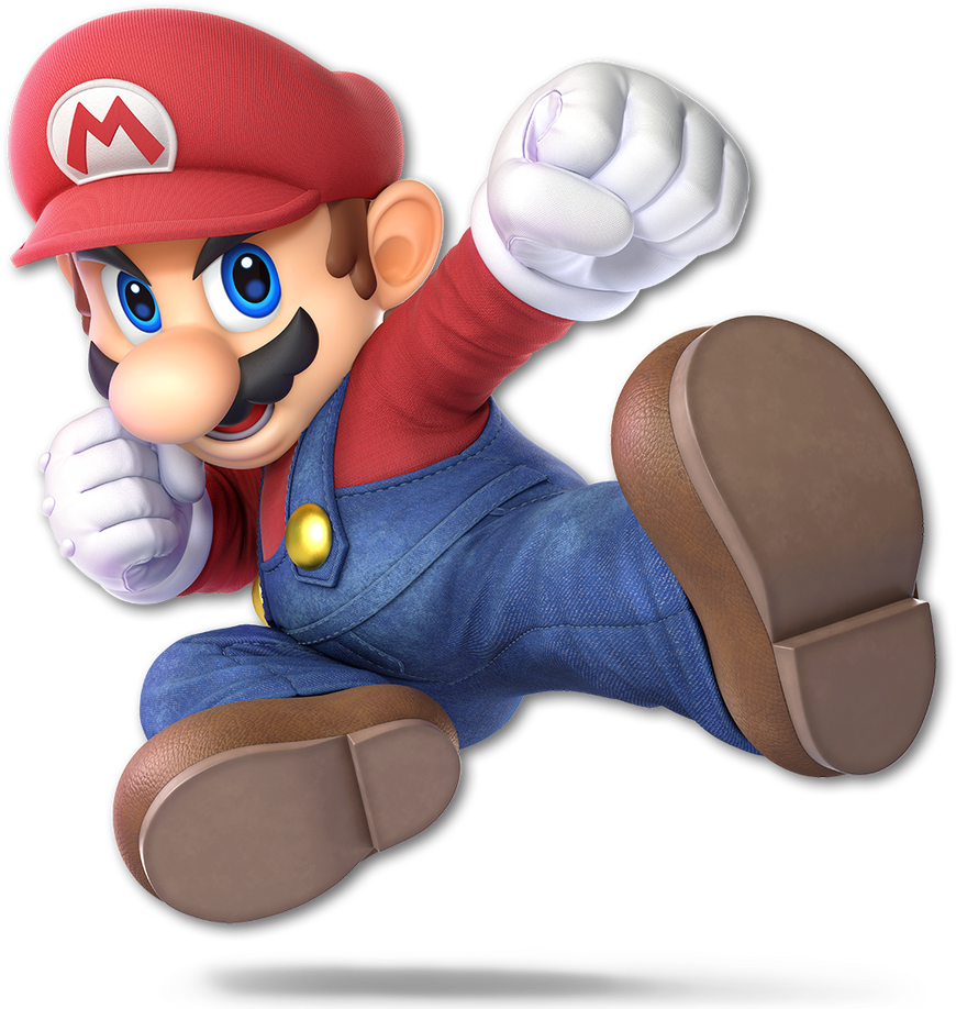
(Alt Image Link)

I'm going to be honest, at first I wasn't sure how to feel about this render. I mean, it's just Mario performing his Smash Bros Neutral Aerial, yeah? However, the more I studied it, the more I warmed up to it, and now I've realized just how freaking fantastic this render is! The energy, the detail, the expression of confidence, and to top it off with the strongest silhouette in any of his renders; I dare say this is truly one of the greats! He's leaping into action and you can easily see him flying through the air with this image as he's probably about to plant that asymmetrical left foot of his into some poor fool's face. His overall shape feels very natural for him even in a position like this, and I love how the proportions of the left foot are larger to show how much closer it is to the camera. Additional details I love: his gloves have this satisfying lining to them that follow the curve of his curled up fingers. His mustache also follows the curve of his right cheek in a rather pleasing way (his right, our left). Also, he's jumping. Mario jumps. The only way I think this could have been any better is if his right hand (our left) had a fireball in it. (Would've been godlike!)
9.5/10.

And that ends my ratings of our beloved, pesky plumber. In order of my greatest to least: :ultmario:, :mariomelee:, :mario2:, & :mario64:. All in all, Mario has some really strong renders. None are poor, and most are at least above average.

Let me know your ratings and how you feel about these renders!
 
Last edited:

Mogisthelioma

Smash Master
Joined
Aug 24, 2018
Messages
3,596
Location
Ravnica
I like the 64 render the best. Notice how as the renders progress Mario seems to be more and more....angry. His original one reflects his design best, the happy go lucky plumber hero.

64: 10
Melee: 8
Brawl: 4
Smash 4: 6
Ultimate: 4
 

CodakTheWarrior

Smash Ace
Joined
Jun 7, 2017
Messages
548
Yeah I agree with Mogisthelioma, I think his 64 render fits the character the best.

64: 9.8/10
Melee: 8/10
Brawl: 6.5/10
Smash 4: 7/10
Ultimate:8/10
 

Diddy Kong

Smash Obsessed
Joined
Dec 8, 2004
Messages
26,266
Switch FC
SW-1597-979602774
:mario64:: 9.5/10: It's exactly Mario 64's Mario, and that was the most iconic game on the N64 probably. His fire balls also worked the most satisfying I always thought.
:mariomelee:: 10/10. Captures his personality the best I feel. That denim is also awesomely detailed.
:mario2:: 6.5/10: I mean, it's Mario, we all can see, but he's seriously bland in expression and looks way more angry than justified.
:4mario:: 8/10. Still the bland expression from Brawl, but a little more lively overall. The pose is really cool however!
:ultmario:: 8.5/10. A pose he hasn't really done before, doing his neutral aerial attack with way more expression than all the other renders so far.
 

Ring-a-Sheep

Smash Ace
Joined
Sep 25, 2018
Messages
518
Location
somewhere...perhaps
64: 8/10
Melee: 5.2/10
Brawl: 6/10
Sm4sh: 8.5/10
Ultimate: 9/10

I think all of em' are pretty solid in their own ways, and i actually like the progression of the renders
 
D

Deleted member

Guest
Yea, N64 is the best but Ultimate's render looks amazing! I never liked Brawl's render because the edgy atmosphere of the game never really suited him. And Smash 4, well, he just looks mad. Which isn't the Mario we all know.

64: 9.7/10
Ultimate: 9.5/10
Melee: 9/10
Brawl: 6/10
Smash 4: 7/10
 
Last edited by a moderator:

nirvanafan

Smash Champion
Premium
Joined
Oct 14, 2016
Messages
2,746
Mario

64: 10/10
Melee: 10/10
Brawl: 7/10
Smash 4: 6/10
Ultimate: 8/10
 
Last edited:

Alternis

Ignore the user in front of you
Joined
May 28, 2018
Messages
1,304
Location
Tartarus
NNID
GeneralO
Switch FC
SW-1137-6792-9994
64: 9.5/10
Melee: 9/10
Brawl: 5/10
Sm4sh: 7/10
Ultimate: 8/10

I think the earlier renders capture Mario's general feel as a character much better. Brawl's render is just really boring and bland to me, I've always disliked it. The two succeeding renders are fine, but they try to display Mario as angrier and more combat-ready, and I don't agree with this direction. Mario looking happier and more excited is preferable, imo.
 

aarchak

Smash Ace
Joined
Jul 29, 2018
Messages
501
Location
The blast zone
Mario

64: 8/10
It has that jolly feel that I feel suits Mario to a T.
Melee: 6/10
Of course, Mario jumping. That's a classic, it's hard to wrong with it. I just wish the pose felt more dynamic, like he's still moving. He feels kinda still in this one. It makes it feel bland in a way the other poses really don't feel.
Brawl: 5/10
He's in more of a martial arts pose, which doesn't suit him. Well, it does suit him a little in a very weird way, but not really.
4: 8/10
A more dynamic pose that incorporates his signature fireball into the mix. It's really good, and I think this is a trend we'll see, where the devs really stepped up their pose game starting in Smash 4. It also makes for a really good amiibo pose (the only amiibo I have).
Ult: 9/10
Ah yes, Mario's nair. My favorite move of his besides his dunk. In all seriousness, it fits him very well, a capable fighter who will jump into the fray to save his princess. It's easily the best one in my opinion.
 

Frizz

Will Thwack You At 0%
Joined
Mar 20, 2015
Messages
1,257
Location
Massachusetts
64: 9.5/10
Melee: 9/10
Brawl: 5/10
Sm4sh: 7/10
Ultimate: 8/10

I think the earlier renders capture Mario's general feel as a character much better. Brawl's render is just really boring and bland to me, I've always disliked it. The two succeeding renders are fine, but they try to display Mario as angrier and more combat-ready, and I don't agree with this direction. Mario looking happier and more excited is preferable, imo.
I pretty much agree with this. I never really liked Brawl's artstyle to begin with, and Ultimate's render doesn't really appeal to me. I said this somewhere else before, but almost everyone else is in some sort of battle stance, whereas Mario is straight-up attacking. I can't enjoy it as much as some other people do.

Plus, I'm a sucker for the 2D artwork renders that Smash 64 has.
 

TheTrueBrawler

Smash Demon
Joined
Jul 16, 2018
Messages
816
Location
Mystery
Mario's renders in order from best to worst:

Smash 4
Smash Ultimate
Smash Melee
Smash Brawl
Smash 64
 
Last edited:

NintendoKnight

Smash Lord
Joined
Oct 26, 2013
Messages
1,735
Location
Climbing the mountain I made from a molehill
NNID
Nin-Knight
It's that time again for another character to rate!

This time it's the King of Swing, the Leader of the Bunch, the Bluto to Mario's Popeye: 02 Donkey Kong

Smash 64: :dk64:

Image Link

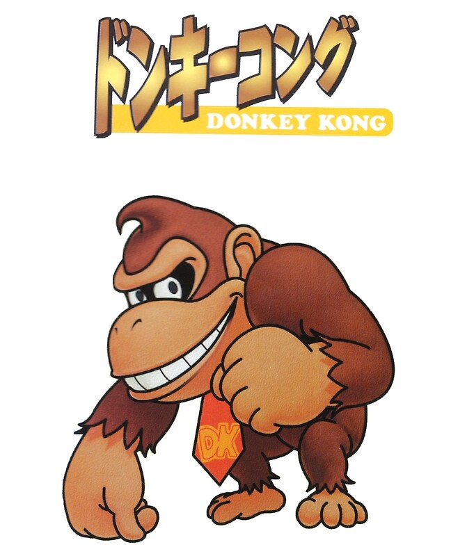
Continuing with the drawn art style of the original game, DK appears in a very unique pose that he doesn't take for any other game I've seen. It is sort of basic but that's fine as simplicity is oftentimes king. I love the silhouette on this one, and I love that fact that he's only leaning on one arm instead of both. The grin of his is pretty priceless though. I also greatly enjoy the size of his hands and head, it's like a huge exaggeration of his more notable features, though it seems to shrink his feet comparatively. Otherwise, it's clear who this big lug is and what he's good at doing (hint, he's good at punching).
8/10

Melee: :dkmelee:

Image Link

As we get to Melee artwork, we already hit a character with an alternative CSSP. Both will be judged as separate entities, but they will both be compared against each other as opposing compositions of character artwork. Let's begin!

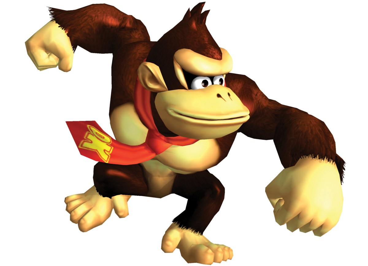
Starting with our major bit of art, DK finds himself in an unusual pose. Both arms out, one leg raised, looking off to the side. The silhouette is strong and it's clearly Donkey Kong, but I have to say that's probably the only thing this image has going for it. It's lacking a strong sense of dynamism as it's unsure if DK's moving forward or stopping a previous motion. He's no longer gazing at the camera in that self-aware sort of fashion and he's also lost that trademark toothy grin that we all hold near and dear to our hearts. All in all, this render is only decent at best. It doesn't look very interesting nor does it display anything about the character within.
6.3/10

Character Select Screen Portrait (CSSP):

Image Link

As for the CSSP, I really wish we could see all of it as it's missing context for the posing of the left arm; points are deducted for the lack of total visuality. Regardless,this pose is significantly more interesting than the primary art. The toothy grin is retained, though he lacks that cheeky camera stare. His hand is in a way more interesting, and uncommon, pose and you can clearly figure out the context of the rest of his body minus the left arm. It's a much more dynamic and fun looking pose, almost as if he's playing around. I just wish I could see more of it.
8.2/10

Brawl: :dk2:

Image Link

As we transition into Brawl, I think it's important to note that from this era and onwards DK becomes rather fascinated by the muscular poses struck by bodybuilders, and henceforth in almost all of his artworks (Smash Bros or otherwise) he tries to emulate this as a demonstration of his incredible strength, which fits rather well with his established personality.

Like Mario's artwork, Donkey Kong's form has turned more serious. However, DK is less out-of-character for this as he's been demonstrated having very serious looks in his own game portrayals. Onto the image itself, I LOVE the posing of this one. That counter balance of weight visible in the opposed shifting of the arms. A real sense of presence and density with an incredible silhouette to boot. However, he's still not looking at the camera, nor is he giving us that lovable toothy grin. I also dislike how his tie blends into the shape of his leg and isn't flowing in the wind to occupy that negative space between his arm and leg. Would've looked fantastic.
8.4/10

Smash Wii U/3DS: :4dk:

Image Link

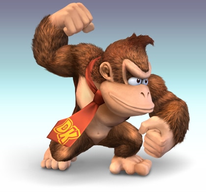
Now we're talking! This is an incredible show of posing for DK! It's easy to imagine DK was swinging through the jungle one day and as he did he saw a camera attached to a tree nearby. As he swung in front of it, he struck a pose mid-air as the camera went off from the motion-sensor. Those scientists were probably very confused to see such an amazing image sent to their labs.
The posing is fantastic! It's dynamic, it carries energy and weight, and it looks entirely intentional on DK's end which fits in line with his modern character. He's even looking at the camera again, that cheeky ape! His tie is also flowing properly in proportion to the implied motion present in the pose. It also gives off vibes of strength and athleticism. He's also giving us an open-mouth smile, but no teeth in sight. C'mon, DK! Show us your pearly whites!
8.9/10

Ultimate: :ultdk:

Image Link

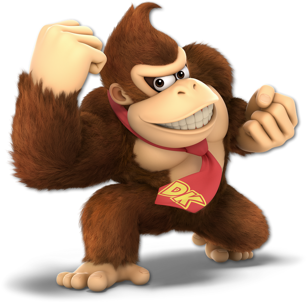
There's my boy! Look at him! DK in his PRIME! The strongest and most clearly defined silhouette, the clarity of form, the cheeky look towards the camera, the RETURN OF THE TOOTHY GRIN, all the while striking an incredibly macho pose! I love the emphasis placed on the arm in the forefront. It catches all the attention of the image and I love it! After nearly 20 years of DK's poses, this one looks to be the culmination of every pose he's ever struck in this series! It's fantastic!
9.5/10

And that's Donkey Kong! How does everyone else feel about his poses over the years? Which is your favorite?

My order of greatest to least: :ultdk: > :4dk: > :dk2: > CSSP > :dk64: > :dkmelee:.
 
Last edited:

TheTrueBrawler

Smash Demon
Joined
Jul 16, 2018
Messages
816
Location
Mystery
Donkey Kong's renders in order from best to worst:

Smash Ultimate
Smash Brawl
Smash 4
Smash Melee
Smash 64
 
Last edited:

Yarael-BJ-Poof

Smash Cadet
Joined
Mar 22, 2018
Messages
39
Location
none of your business
:ultdk:>:dk2:>:4dk:>:dkmelee:>:dk64:
Ultimate: 10/10 This IS Donkey Kong. This DEFINES Donkey Kong. I love it.
Brawl: 9/10 Seems to me like his render is the most realistically detailed of all of the ones in Brawl. Also, dat bodybuilder pose :>
Sm4sh: 8.4/10 It's a fine enough render, detailed well, but it looks bad on his amiibo. Since he was in wave 1, they felt it was necessary to have all jumping characters have brightly colored, conspicuous, and fugly stands. (Render's fine tho)
Melee: 6/10 Seems a bit goofy, but good enough for 2001 I guess.
Smash 64: 4/10 He looks too dastardly. Too out of character.
 

Persanic

Smash Rookie
Joined
Nov 27, 2017
Messages
2
Ultimate: 9/10 Really realistic and cartoony at the same time but posing doesn't feel perfect.
Brawl: 8.7/10 Perfect pose, perfect realism, just not goofy enough to fit his character entirely.
Melee: 7.9/10 Goofy, good pose, but he looks like a piece of literal crap I'm sorry.
N64: 6/10 It is simple, clean nice, and painfully average.
Sm4sh: 4.5/10 It isn't goofy, realistic, it's pose is mediocre, this is one of my least favorite renders from Ultimate.
 

aarchak

Smash Ace
Joined
Jul 29, 2018
Messages
501
Location
The blast zone
Donkey Kong

64: 4/10
Honestly, he looks more like a villain in this pic. Especially with the hunched pose and black around his eyes. I get that he was originally a villain, but Donkey Kong Country came out well before Smash Bros, and you don't see him looking that way in any other render. Really goes against his character.
Melee: 5/10
His face feel kinda expressionless, and the position of the arms is a bit weird with how open they are. They should be more forward-facing, to better sell his gorilla attributes and his steady character.
Brawl: 7/10
I don't especially like many of the Brawl renders, but this one is better than most. It sells his character well, with the determined look and steady glance.
4: 6/10
It's good, but feels a little too playful for Donkey Kong, especially with the expression and the feet in the air.
Ult: 8/10
Much better. Sells his character very well with the smile, eyes, and the placement of the feet.
 

Diddy Kong

Smash Obsessed
Joined
Dec 8, 2004
Messages
26,266
Switch FC
SW-1597-979602774
:dk64:: His in game model looks terrible. That was one of the main reasons for me not playing all that much with DK in the original game (compared to other Smash games) when I was younger. The artwork looks much like Nintendo’s original Donkey Kong artwork mixed with Rare’s modern DK, which is rather interesting. 7/10

:dkmelee:: The in game model looks a whole lot better than the model art work, with it’s awkward pose. Not sure what to rate it really because it’s just very polarizing in many ways. I’ll say 6.5/10 because of the pose and face looking so.. weird.

:dk2:: Best DK design in Smash ever. He looked just about perfect in Brawl and the model is spot-on! Easily the best ‘what if Rare was still around’ DK model, and he was very expressive as well overall in the game. I’ll rate this one a 9.5/10.

:4dk:: Not gonna lie, he’s a bit too goofy for my tastes here. I get that that is also a big part of DK’s personality, yet it’s my less preferred side. The pose is quite bad ass however, but the face looks a bit void of expression except straight goofiness. In game he looks way better. 8/10 mostly cause the fur details.

:ultdk:: Wicked design all around. Very expressive in his model, and in game he looks a bit too angry but it suits him well in Smash. Bit of a shame that his in game model has his fur a bit ‘nerfed’. That’s honestly my only gripe with it. 9/10
 

Fane

Smash Journeyman
Joined
Mar 20, 2018
Messages
355
:dk64:: 8/10, it's a very nice piece of art and imo has aged pretty well for DK.
:dkmelee:: 6/10, not too appealing imo, it's a goofy pose and the arms look a bit... twisted?
:dk2:: 7/10, better than Melee, but worse than the original art imo. It's too static and emotionless to me.
:4dk:: 8.5/10, that's much better! He's full of character now and the pose is very dynamic.
:ultdk:: 9/10, almost perfect! The attention to detail and character is far better than any of the previous iterations in my opinion.
 

Mogisthelioma

Smash Master
Joined
Aug 24, 2018
Messages
3,596
Location
Ravnica
:dk64:: 7/10. Looks a bit creepy but otherwise capture's DK' style
:dkmelee:: 8/10: Only because the Melee icon looks lie E X P A N S I O N. Otherwise 6/10.
:dk2:: 7/10: A bit too intense
:4dk:: 7/10: Better pose-wise but his facial expression.....just....no.
:ultdk:: 10/10: He actually looks perfect. Truly looks like a monkey who wants to capture a pretty girl, like it's the 1980's. Very nostalgic.
 

Mariomaniac45213

The Nintendo Villain main!
Joined
Sep 5, 2014
Messages
1,254
Location
Cincinnati, Ohio
Switch FC
SW 5604 9250 9133
I just want to start off by saying to me personally DK didn't start looking "right" to me until Ultimate. He's still been my "main" in every game as I love DK but man Sakurai has kinda failed to get the character design juuusst right (which is weird because he nailed both Diddy and Rool first time out IMO)... but anyway here we go...

:dk64: - 3.5/10 for in game model, 6/10 for render.

:dkmelee: - 5/10 for both render and in game model.

:dk2: - this was the first time DK actually started to feel and look like DK to me. Both artwork and in game model, the problem is Brawl went with the "gritty realistic" art style that simply just doesn't fit characters like DK. His angry pose/face doesn't bother me like a few of you as it was clearly taken inspiration from Jungle Beat (the most recent main console DK game at the time). So render/in game model a 7/10.

:4dk: - Okay render/design not terrible but not that great either. I give it a 7/10 also. About on par with Brawls. Maybe a little less for the pose and overly silly facial expression.

:ultdk: - 10/10 It is simply perfection in my book. The DK, Diddy, and K.Rool renders are some of the best, if not the best renders the characters have ever had IMO.
 

AirMac1

Smash Journeyman
Joined
Sep 23, 2018
Messages
462
SSB:dk64::While it does show off his strength, it looks to generic and doesn’t fit Donkey Kong’s character. 4/10
Melee:dkmelee::This render feels more in DK’s character, but doesn’t look like they changed much about it from the t-pose. Also, that blocky thing on his you know what is weird looking, especially for a Nintendo game. 3.7/10
Melee css:Definitely a major improvement! While it could be better, it fits his character, and overall, just feels normal! The only problem that I could see is that you can’t see the whole render, but I’m pretty sure that’s what all the Melee css renders look like. 7/10
Brawl:dk2::This render is probably the worst in the series. His mouth looks worse than in Melee, in which I forgot to mention the mouth issue. He isn’t smiling, which, like in Melee, makes his mouth look weird. His skin color is off, the fur texture doesn’t look right on the Wii. The list goes on. 1/10
3ds and Wii U:4dk:: This render is great, with one issue. They forgot his teeth! That’s all I have to say about this one. 8.9/10
Ultimate:ultdk::4 words. This Render Is Perfection! 10/10

Best to worst::ultdk:,:4dk:Melee css,:dk64:, :dkmelee:, and :dk2:.
 
Last edited:

VexTheHex

Smash Ace
Joined
Mar 30, 2018
Messages
567
Doing Mario as well for fun since I missed him.

:mario64: - Happy and simple. 7/10
:mariomelee: - Captures his jumping energy but pretty one note to me and the face is pretty derpy. 6/10
:mario2: - Too detailed and angry. 2/10
:4mario: - If he wasn't super angry, would of been awesome. 8/10
:ultmario: - Even angrier! Not sure the pose suits him as he is more of a stomper than a jump kicker, but it's nice. 7.5/10

So :4mario: > :ultmario: > :mario64: > :mariomelee: > > > > > :mario2:

None of Mario's worked out for me in the end. They're either pretty bland or too angry. Put in jumping and some fireball action with him looking happy. None of them managed to do this.

DK.

:dk64:- Looks villainous though fits his original game. 7.5/10
:dkmelee: - Weird shapes and ugly. 2.5/10
:dk2: - Pretty lifeless but better shaped than Melee's by far. 5/10
:4dk: - They finally found what DK's charm is again, more life than Brawl's for sure. 8/10
:ultdk: - Perfection. I like DK, but he never has been the top dog for me in terms of favorites. However, this render bring the charm and strength that makes him appealing as a hero. 10/10

DK's renders have had some really weird and funky looking ones, but I can say he at least achieved his Ultimate render in Ultimate!

So :ultdk: > > > :4dk: > :dk64: > > > :dk2: > > > :dkmelee:
 
Last edited:

Mogisthelioma

Smash Master
Joined
Aug 24, 2018
Messages
3,596
Location
Ravnica
Just curious, how long will you focus on each fighter? I'm really excited to do new ones. Maybe try doing it daily/every other day.
 

Alternis

Ignore the user in front of you
Joined
May 28, 2018
Messages
1,304
Location
Tartarus
NNID
GeneralO
Switch FC
SW-1137-6792-9994
64: 3/10 This one just looks off, somehow. DK looks off-model, maybe? I don't like it.
Melee: 6/10 Both of these poses are fine, but DK's model unfortunately just doesn't look good to me. It's aged poorly.
Brawl: 6/10 This pose feels more generic than the others, and, like Brawl Mario, looks bland.
Sm4sh: 8/10 This is much better! DK looks full of energy, while keeping his goofy-yet-tough demeanor.
Ultimate: 10/10 ...Then this render takes 4's and improves it! This is the best by far. This IS DK.
 

CaptainAmerica

Smash Master
Joined
Aug 21, 2014
Messages
3,089
Location
New York
NNID
TomOfHyrule
Oh this looks like a great game!

I think his Melee is my favorite. I'm biased against the 64 2D artwork, but it does show off Mario's personality the most. Mean Mario is okay, but Sm4sh just went too far with it.
:mario64:: 4/10
:mariomelee:: 8/10
:mario2:: 7/10
:4mario:: 6/10
:ultmario:: 5/10

For DK, Ultimate all the way. The Smash 64 one is just creepy af, there's no other way to put that. The rest of his are all similar, but I like how he's posed in the Ultimate rather than his weird floating in Sm4sh or the angry from Brawl.

:dk64:: 1/10
:dkmelee:: 7/10
:dk2:: 8/10
:4dk:: 8/10
:ultdk:: 10/10
 

NintendoKnight

Smash Lord
Joined
Oct 26, 2013
Messages
1,735
Location
Climbing the mountain I made from a molehill
NNID
Nin-Knight
Just curious, how long will you focus on each fighter? I'm really excited to do new ones. Maybe try doing it daily/every other day.
I was trying to gauge it and see how long would be a reasonable time. At first, I figured a week would've been long enough. But if you want it more frequently, I can probably get this active every few days or so.

Speaking of...

He's the Hero known through Time, Skies, Light, Worlds, and the undisputed Champion of Hyrule: 03 Link

Smash 64: :link64:

Image Link

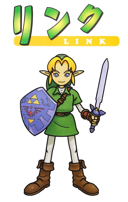
On to my favorite game character of all time, it's the Hero of Time! Again, in 64, we have that drawn art style for the character but Link's appearance is much more cartoony than the other characters. I don't dislike him in this style (other art of him in 64 look pretty great), however this particular piece of work isn't all that amazing. He's just standing there. His silhouette is clear, you can tell it's Link, but he's not doing anything interesting at all. Unfortunately, it's not a great pose.
4/10

Melee::linkmelee:

Image Link

(We're not supposed to be comparing art between different characters, but after seeing the DK Melee art, this render of Link is ULTRA CLEAN. How many polygons is that?!)

Anyway, Link takes the step into the second installment with a much better showing of a pose. He's put one foot forward, with Master Sword at his side. It's still rather basic, but I love the angle the camera is placed in. I wish you could see more of Link's right arm, but it is what it is. Still, I love the sense of motion this has. This is the last we see of the adult Hero of Time.
7.5/10

Brawl: :link2:

Alternate Image Link (Due to a lack of high-quality release-version Brawl render's the hyperlink leads to one of the pre-release Brawl renders which is identical to the final version... although the pre-release version still looks nice in my eyes.)

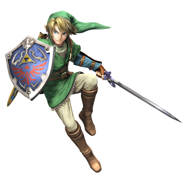
With the Hero of Twilight now stepping in to fill the Hero of Time's boots, he chose to start off with a rather basic pose as well (you've probably noticed a pattern). Though more visually interesting than the 64 pose, as it actually resembles a relaxed combat stance, it still lacks any dynamism or energy. The change in design will not save the hero from mediocre posing.
5/10

Wii U/3DS: :4link:

Image Link

Step 1, take the Brawl render. Step 2, make Link jump. Done! Amazing how one simple change can make a composition look so much better. There's really not much to say about this image that I haven't said about other images. It does convey a better sense of movement and energy than the prior renders, but that isn't saying much. Dynamism was indeed kicked up a notch or two, but it's still relatively basic all things considered. It does look really nice though. Personally, I like Link's sideways glance much more than the thousand-yard stare he's been using for past poses. This is the last we see of the Hero of Twilight.
7.4/10

Ultimate::ultlink:

Image Link

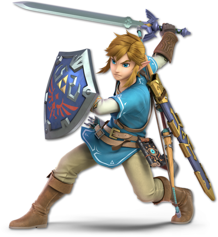
Say hello to the hero clad in the sky blue of champions! With this Breath of the Wild design comes a breath of fresh air in Link's pose. And just like how Breath of the Wild broke Zelda conventions, this new render breaks Smash conventions! Immediately, I'm engaged with the render! It's visually the most interesting shape Link's ever taken in Smash, which wasn't all that hard to accomplish really. But they made this look good! I love the positioning of each limb, clearly distinguished from each other, and you can even see Link's shield arm and can tell that the shield is not attached to his body like some sort of prosthetic limb! The fact that you can see the bow, the quiver, the sheath, and the Sheikah Slate all in one view is rather fantastic. It's clearly defined, he seems to be amidst combat, and it really works. It's not really a pose I would've expected for Link, but it's still good.
8.9/10

Scale of Greatest to Least: :ultlink: > :linkmelee: > :4link: > :link2: > :link64:

Honestly, Link has had a really hard time finding strong poses to stand out with. But as of Ultimate, I'm glad he found his niche.

Let's hear your opinions! Which render is your favorite?
 
Last edited:

Mogisthelioma

Smash Master
Joined
Aug 24, 2018
Messages
3,596
Location
Ravnica
:link64:: 4/10. Almost misgendered him when I first saw it. He looks....peaceful.
:younglinkmelee:: 9/10: Almost perfect. Looks great.
:link2:: 5/10. Looks pretty lame.
:4link:: 6/10. Also kind of bad, but a bit more energetic.
:ultlink:: 7/10. Would have rather had his version where he holds his sword down on the cover of BOTW, but this is fine.
 

Alternis

Ignore the user in front of you
Joined
May 28, 2018
Messages
1,304
Location
Tartarus
NNID
GeneralO
Switch FC
SW-1137-6792-9994
64: 3/10 - Link here is doing nothing. It's honestly boring.
Melee: 6/10 - The posing is okay here, and that's it really.
Brawl: 3/10 - I cannot endorse this. This pose is especially bland. No action, no unique facial expression. Just boring.
Sm4sh: 7/10 - This pose is much better. It has stronger motion to it.
Ultimate: 9/10 - Now this I like! Link's serious demeanor now matches his pose. And this pose is full of life, with a great feel to it. It's like he's parrying an attack, rather than just standing still.
 

CaptainAmerica

Smash Master
Joined
Aug 21, 2014
Messages
3,089
Location
New York
NNID
TomOfHyrule
Link's best is Melee in my opinion. I favor the TP look most of all, but the Brawl pose is so bland. Sm4sh's is also wonky since he looks like he's about to fall over - seriously, he needs a pee-yellow stick up his *** to make him stand upright. Ultimate's pose is better, but he still looks a bit on the awkward side. And I'm absolutely not a fan of right-handed link. But yeah, the less said about that 64 art, the better [shudder].

:link64:: 0/10
:linkmelee:: 9/10
:link2:6/10
:4link:: 5/10
:ultlink:: 7/10
 

nirvanafan

Smash Champion
Premium
Joined
Oct 14, 2016
Messages
2,746
:link64:: 1/10
:linkmelee:: 7/10
:link2:: 3/10
:4link:: 10/10
:ultlink:: 5/10
 
Last edited:

aarchak

Smash Ace
Joined
Jul 29, 2018
Messages
501
Location
The blast zone
Link

:link64:: 2/10
He looks more like a tall fairy in this image instead of the courageous hero we know him to be.
:linkmelee:: 8/10
This is pretty great. The foot forward really adds to the sense of forward movement, and the overall stance is courageous, which is what Link is all about.
:link2:: 7/10
More static, but I still like the pose a good bit.
:4link:: 6/10
Good, but I don't like the feet in the air. I think they should stay firmly planted on the ground.
:ultlink:: 7/10
Better, but I don't like how spread apart his body feels, he doesn't seem as sturdy as he should.
 

VexTheHex

Smash Ace
Joined
Mar 30, 2018
Messages
567
:link64: - 3/10 - Could be worse but doesn't really make me think of Link. I could see parents asking if that's Princess Zelda.
:linkmelee: - 8.5/10 - Good posing and general movement, but it's just a tad on the bland side.
:link2: - 6/10 - Alright posing and looks strong, but he isn't that interesting either as he looks doll like.
:4link: - 8.5/10 - More movement than Brawl's and interesting. Not entirely sure on him being in the air makes the most sense.
:ultlink: - 9/10 - I like it overall and think it's one of his better ones except for his face. Something seems a bit off, maybe the nose.

Overall I feel only 1 of his was a true full fledged miss, but I do feel the Ultimate took the best route as Melee's suffers from a duller pose while 4's may of been too much air time needing a more grounded look while Ultimate takes the good of both.

:ultlink: > :linkmelee: & :4link: > :link2: > > > :link64:
 
Last edited:

NintendoKnight

Smash Lord
Joined
Oct 26, 2013
Messages
1,735
Location
Climbing the mountain I made from a molehill
NNID
Nin-Knight
I recommend doing updates every 2/3 days since weekly is a bit slow.
Which is what I shall do. I'll be unable to update tomorrow, therefore...

She's the feared intergalactic bounty hunter, the proud exterminator of a parasitic alien species, and has a bad habit of reducing planets to space dust: 04 Samus

Smash 64: :samus64:

MUCH better Image Link (please use this to see image)

Starting off with Samus' renders, as usual with the original 12, with the comic-book art style from Smash 64. I must say, I kind of love the chibi style on Samus here. It's almost comical how big the helmet is compared to the arms. The pose is somewhat basic, but it's actually a pose that samosa commonly strikes. It's well within her character, it has a nice silhouette, asymmetrical, it's just not super dynamic. Spoiler warning, none of Samus' renders are super dynamic.
6.8/10

Melee: :samusmelee:

Image Link (Finding a half-decent version of the Melee render was next to impossible. This may be the case with future veterans down the line.)

Here we have the Melee artwork. It's an almost exactly identical pose to the previous render, further cementing this pose as something Samus just does. There's a slight bit more sass in her posture, which makes it better, but it's still not great. Another thing to note is the the camera doesn't know where it is compared to Samus. Did they use a fish-eye lens focused on her pelvis? (There is an alternate CSSP for Samus)
6.8/10

Character Select Screen Portrait (CSSP):

Image Link

Really wish we could see more of this one because this is not only the second different CSSP we've had, but this one—much like DK's—looks much better than the primary art piece. Samus taking aim with us viewers in her sights is fantastic. I also like how she's leaning in one direction as opposed to standing straight up. It's visually more interesting than the last two by far.
7.8/10

Brawl: :samus2:

Image Link

After hearing my comments on the Melee CSSP only to see some of those criticisms take hold in her Brawl render brought me a strange amount of relief. Here we have Samus actually doing something other than just standing there with her arm cannon pointed upwards. She looks ready to fire at will and we're in her way (or her targets). Nice overall shape and silhouette and she looks like she isn't just posing for the camera. Note, this is the last we see of Super Metroid Samus.
8/10

Wii U & 3DS: :4samus:

Image Link

OK, hear me out on this one... I know that the Other M design is very much hated, but let's look past that here. I just need to say... that this render is UTTERLY FANTASTIC! After first it seems sort've basic, but it really fits this sort of "angelic descent" vibe. Also not to mention it matches Ezio Auditore on the Assassin's Creed II box art. I have a large bias for this one just because of how cool she looks here. Ironically, the whole pose here is set up by the sheer lack of asymmetry and dynamism. I really don't know what to tell you other than I love it!
9.8/10

Ultimate: :ultsamus:

Image Link

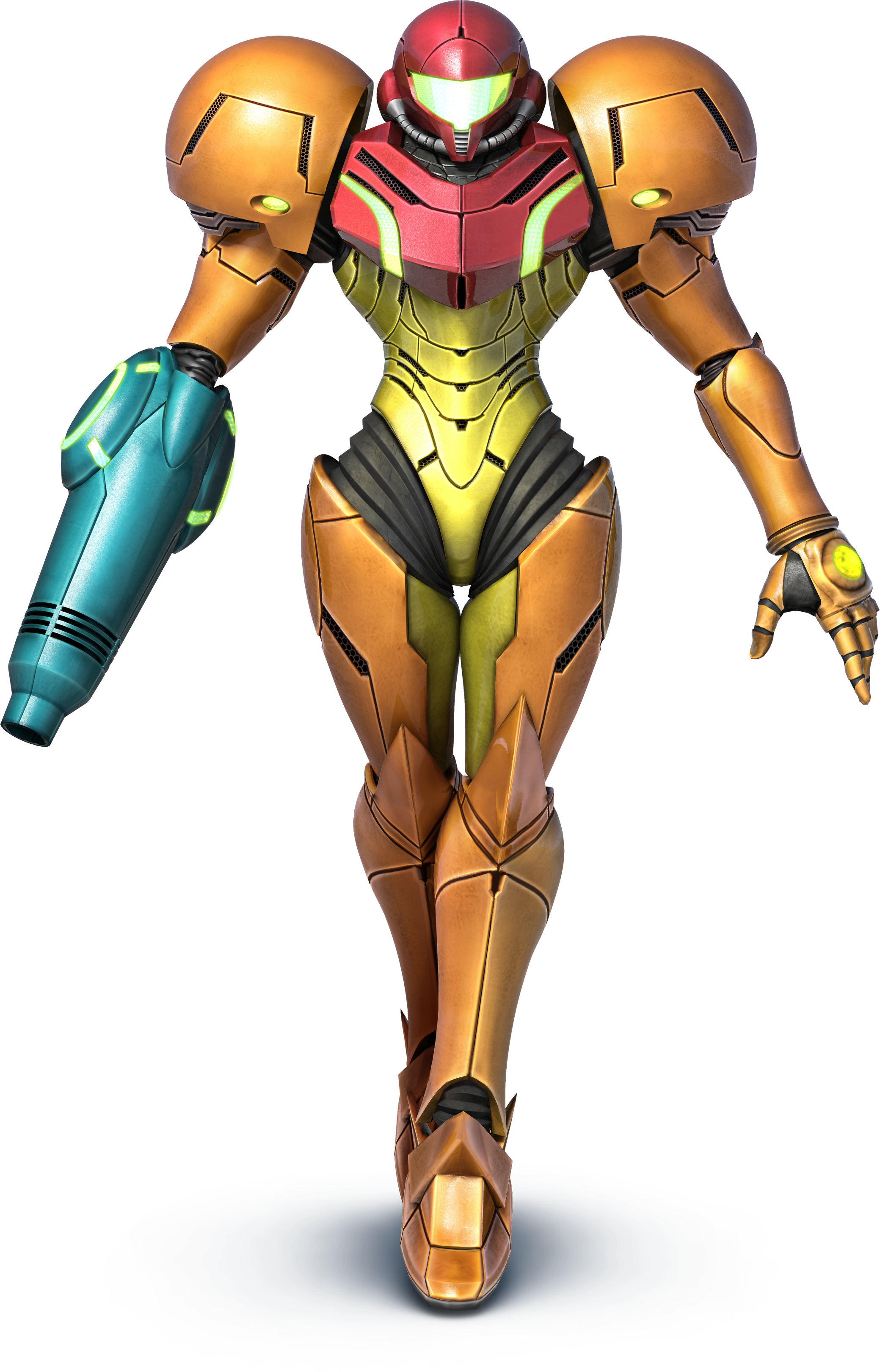
Now, we have Samus in another really fantastic pose here. She's battle ready, sharp silhouette, asymetry. It's got the makings of a good pose. However, it's lacking power. I'm just not feeling any sort of threat from her. She's just posing to me. I'll understand if people prefer this over the last one, as it's still a good pose. But it just doesn't have the "I'm here to exterminate your entire species" sort of feel to it that I think Samus really needed for her pose.
8.5/10

For the first time in my comparisons (of which there've only been 4), we now have a character whose render in Ultimate is not the best in my eyes.

Greatest to Least: :4samus: > :ultsamus: > :samus2: > CSSP > :samus64: = :samusmelee:

Can't wait to see what you guys think of this metallic femme fatale and her renders over the years.
 
Last edited:
Top Bottom