-
Welcome to Smashboards, the world's largest Super Smash Brothers community! Over 250,000 Smash Bros. fans from around the world have come to discuss these great games in over 19 million posts!
You are currently viewing our boards as a visitor. Click here to sign up right now and start on your path in the Smash community!
It appears that you are using ad block :'(
Hey, we get it. However this website is run by and for the community... and it needs ads in order to keep running.
Please disable your adblock on Smashboards, or go premium to hide all advertisements and this notice.
Alternatively, this ad may have just failed to load. Woops!
Please disable your adblock on Smashboards, or go premium to hide all advertisements and this notice.
Alternatively, this ad may have just failed to load. Woops!
Rate That Render! (Now Rating: #49 Little Mac)
- Thread starter NintendoKnight
- Start date
Alternis
Ignore the user in front of you
64: 7/10 - This image recreates Kirby's classic pose, and it's a good fit.
Melee: 5/10 - ...That said, this pose may be the same, but it definitely looks off somehow, and worse for it.
Brawl: 7/10 - I appreciate that this pose looks like his neutral air.
Sm4sh: 8/10 - Though this pose isn't very dynamic, it's very much a Kirby pose, so no complaints here. It only accentuates Kirby's cuteness!
Ultimate: 10/10 - I honestly adore this render. It suits Kirby so well, while keeping a dynamic pose for him, too! I really gives life to a literal pink ball, and that's cool.
VexTheHex
Smash Ace
- Joined
- Mar 30, 2018
- Messages
- 567
I'm pretty sure it's a take on his iconic dance ending pose.I'm pretty certain he's done this pose before in his own series, but whatever!
Kirby is pretty straight forward in a similar fashion to Yoshi. And in similar light, I feel Ultimate also did the best it could do for the little pink fluffball like it did for the green dinosaur.
Diddy Kong
Smash Obsessed
- Joined
- Dec 8, 2004
- Messages
- 26,266
- Switch FC
- SW-1597-979602774
Sorry am doing Samus and Yoshi to, if you all don't mind!
 : Hardly could make a character out of this. Even the SNES sprite is more detailed. Where those TEETH on her helmet? I always thought that... It's not exactly appealing. 2/10
 : Now this is where things started to look good! Whoa was I impressed with how much better she looked, and played. It made me instantly more curious about Metroid. In game model is realll smooth looking as well, and I wish they sticked with this design honestly. It's simple, yet very well done. Easily a 9/10. Even better than her Metroid Prime design!
 : The pose isn't well done, but the model is very polished! Again, better than the Metroid tiltes on the Wii. Slightly more complicated than needed, but still very great looking. We where all very pleased that they designed Samus around Super Metroid again back in those days. Not as solid as Melee I think, but still heaps better than what 64, Smash 4 and Ultimate bring. 8.5/10
 : The pose just doesn't work. They also styled her after Other M, which I thought was cool. The in game model looks great, and makes Samus look more slim than usual which fits with the build of Zero Suit Samus. Yet this pose in particular, makes the render worse. 6.5/10.
 : Intense dissatisfaction that they didn't use the Samus Returns 3D design/10. Yeah the pose is much better, but Other M Samus with a total different Ridley, and Dark Samus around is just.. awkward. 6/10.
 - I was never a big Yoshi fan in 64, because of the way he looked. The shapes just don't do the character justice, the overall model and design are just lacking in general. 4.5/10
 - Far more lively, and while the design is unique from all other Yoshi models till that date, it works kind of well. I like the in game model better. Looked way more like the Yoshi I was familiar with. 7/10
 - The pose is done well, never did we really saw Yoshi in such a position. He kinda tries to be cute, but when he tries he kinda fails. Not a big fan of the overall look. 6/10
 - YES! This is amazingly looking! Pictures his personality just fine, a little shorter which fits the character way better. And the render is cute too. 8.6/10
 - Mostly the same as Smash 4, but a little more polished. Even better looking. 9/10
 - Just full of personality, taken straight from the SNES and NES games it seems. Very well done overall. In game he's lacking a bit so 7/10
 - What most already said, kinda lifeless. The overall expression is just void compared to what's done before. But couldn't blame them because he's based on the N64 games. 6.5/10
 - It's kinda hard not to make Kirby expressive with the way his design works. Best render overall maybe. 8.5/10
 - Not a fan of the pose, but it's a great in game model. Also 8.5/10
 - The sole survivor in the World of Light, and you cannot even blame him for it. Very cute, very expressive, just overall well done. Nailed it perfectly with the pose and all. 10/10
TheTrueBrawler
Smash Demon
Kirby's renders in order from best to worst:
Smash Ultimate
Smash Brawl
Smash 4
Smash Melee
Smash 64
Smash Ultimate
Smash Brawl
Smash 4
Smash Melee
Smash 64
- Joined
- Jul 30, 2007
- Messages
- 15,494
- NNID
- VenusBloom
- 3DS FC
- 0318-9184-0547
Kirby is now
 Just in the Life of a Kirby: This render is the essence of Kirby in the 1990’s. Just a blob of pink. Pose wise there’s not much going on. Still better than it’s Melee render.
6 out of 10 puffballs
 Blech: I don’t like many of the Melee renders. This looks just like the 64 render but with its arm to the side.
2 out of 10 puffballs
 Ray of Pink Sunshine: Probably my fav Kirby render and one of the few that Nrawl got right. His expression and movement really shows off the character. Especially in contrast to Brawl’s grittiness.
8 out of 10 puffballs
 Slacking Off: I liked many of 4’s renders but this was just....huh? One, why is Kirby slacking off and just sitting? Two, WHY IS KIRBY SLACKING OFF AND JUST SITTING??!! Especially since this was made as an Amiibo. Just doesn’t make sense.
1 out if 10 puffballs
 Off to See The Eggplant Wizard: This one looks good. It stands out against Melee, 64, and 4 but I think it lacks what Brawl had. Still an improvement and I wish they used this one as an Amiibo.
6 out of 10 puffballs
6 out of 10 puffballs
2 out of 10 puffballs
8 out of 10 puffballs
1 out if 10 puffballs
6 out of 10 puffballs
Last edited:
- Joined
- Oct 14, 2016
- Messages
- 2,746
Yosher
Smash Ace
Oh damn. I've seen that on the news. They said the firemen even stopped trying to extinguish the fire because it's just too dangerous, and from the footage I've seen, it really is just.. everywhere. I'm glad to hear you're safe at least. ..sorry for going off-topic for a second, just wanted to say that real quick.I'm sorry everyone. I wanted to update this sooner, but I live in southern California and my family and I had to evacuate our home due to the fire. I left practically everything at my house but it's still intact as far as I know. Currently staying with my grandmother far out of town. We're safe.
Anyway, onto Kirby:
aarchak
Smash Ace
Kirby

 : 8/10
These 2 are like the exact same, so they get the same rating. It's pretty hard to do a Kirby pose wrong, but this one is pretty damn good.
 : 7.5/10
Flying in the air, but not really doing anything. A little worse.
 : 7/10
The sit is cute, but quite static. No real interest in this one.
 : 9/10
Nice reference to his victory pose, and it's cute as hell. The best one in my opinion.
These 2 are like the exact same, so they get the same rating. It's pretty hard to do a Kirby pose wrong, but this one is pretty damn good.
Flying in the air, but not really doing anything. A little worse.
The sit is cute, but quite static. No real interest in this one.
Nice reference to his victory pose, and it's cute as hell. The best one in my opinion.
BonafideFella
Smash Journeyman
I don't know, there's only so many ways you can position a pink ball with the same expressions as before...Perhaps for the next installment we should break out...Angry American Kirby. Just to deviate from the renders before it.
Last edited:
Mogisthelioma
Smash Master
64: 7/10: Looks good.
Melee: 8/10: Like 64, but better.
Brawl: 6/10: I just don't get this one.
Smash 4: 4/10: Why is he sitting? WHY IS HE SITTING?
Ultimate: 10/10: Perfection.
Melee: 8/10: Like 64, but better.
Brawl: 6/10: I just don't get this one.
Smash 4: 4/10: Why is he sitting? WHY IS HE SITTING?
Ultimate: 10/10: Perfection.
NintendoKnight
Smash Lord
- Joined
- Oct 26, 2013
- Messages
- 1,735
- NNID
- Nin-Knight
Should've done this yesterday, but oh well!
He's the hero of the Lylat War, he never gives up and trusts his instincts, and he's the leader of a space ace combat mercenary team: 07 Fox
Smash 64:

Image Link
OK, right off the bat, I have to admit that I FREAKING LOVE THIS ARTWORK! There's a lot to pull from this one image alone, so I'll try to keep it brief. The confidence this render gives off is incredible, but there's also this attitude that Fox carries in both his pose and expression. Also, take note that he's holding the blaster in his hand, this is a constant detail in his Smash renders (with one exception).
9.6/10
Melee:
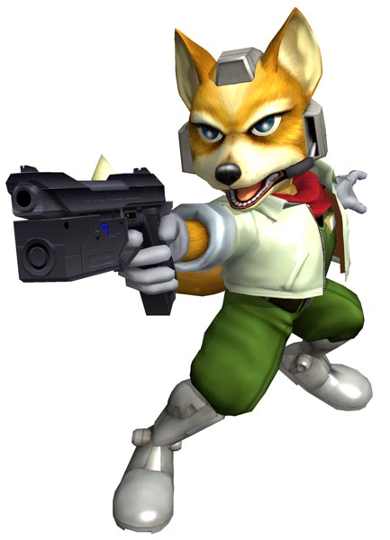
Image Link
(Remember that we're judging the renders here and not the game/character in said game. This applies for every render, not just this one.)
This pose is pretty fantastic. I love the close up of the blaster and how he's positioned; it's almost like he's dealing with a criminal in this moment. "Freeze! Put the blaster down!" It totally oozes "90's space cop!" Love the microphone on his headset. It's a more dynamic pose, but there's something about it that seems less like "Fox" if you get my drift. This is the last we see of this version of his Star Fox 64 design.
9/10
Brawl:
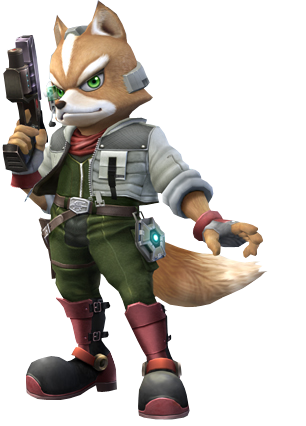
Image Link
Representing the design from his appearance in Star Fox Command, Fox comes to us with a rather simple but solid pose. I think it should be noted that this isn't even a 1-to-1 faithful recreation of his Command design, but more of an adaptation to the design implementing design elements from Star Fox 64 and Brawl's aesthetic. I love that we can see the Reflector as an actual object Fox carries on his person, as well as the newly added scouter on the headset. Outside of the design, Fox is clearly laid back here, an interesting contrast with many other Brawl renders. But I like the confidence this one brings with it.
8.9/10
Wii U/3DS:
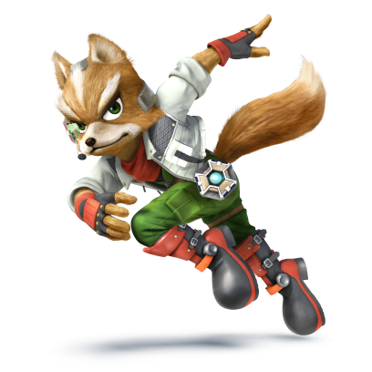
Image Link
Loving the energy and sense of movement with this one. It feels very "Star Fox-esque" to me as far as the posing goes; no, I cannot explain why that is. It's almost immaculate for Fox, save for one thing: where's his blaster? This is the only render for Fox in the Smash series that lacks the blaster. If it had the blaster, this render would've been absolutely perfect. Darn shame, really... This also marks the last we see of Fox's Command design... mostly.
9.6/10
Ultimate:

Image Link
Representing Star Fox Zero (with some touches still from Command), Fox comes into Ultimate with a pretty strong pose here! I like the focus in this one. He's clearly avoiding danger, but all the while lining up his shot in a very expert fashion. He's cool, collected, and very much in control. Also, the blaster has returned! A nice touch is the data reading on the scouter, love that little detail.
9.5/10
Overall, in my opinion, Fox has had some of the better renders in the Smash series. Consistently good renders and poses with each installment. I wish every character had this consistent level of quality with their renders.
Greatest to Least: =
=  >
>  >
>  >
> 
And with that, we've reached the second half of the Original 12! How would you guys rate his renders?
He's the hero of the Lylat War, he never gives up and trusts his instincts, and he's the leader of a space ace combat mercenary team: 07 Fox
Smash 64:

Image Link
OK, right off the bat, I have to admit that I FREAKING LOVE THIS ARTWORK! There's a lot to pull from this one image alone, so I'll try to keep it brief. The confidence this render gives off is incredible, but there's also this attitude that Fox carries in both his pose and expression. Also, take note that he's holding the blaster in his hand, this is a constant detail in his Smash renders (with one exception).
9.6/10
Melee:

Image Link
(Remember that we're judging the renders here and not the game/character in said game. This applies for every render, not just this one.)
This pose is pretty fantastic. I love the close up of the blaster and how he's positioned; it's almost like he's dealing with a criminal in this moment. "Freeze! Put the blaster down!" It totally oozes "90's space cop!" Love the microphone on his headset. It's a more dynamic pose, but there's something about it that seems less like "Fox" if you get my drift. This is the last we see of this version of his Star Fox 64 design.
9/10
Brawl:

Image Link
Representing the design from his appearance in Star Fox Command, Fox comes to us with a rather simple but solid pose. I think it should be noted that this isn't even a 1-to-1 faithful recreation of his Command design, but more of an adaptation to the design implementing design elements from Star Fox 64 and Brawl's aesthetic. I love that we can see the Reflector as an actual object Fox carries on his person, as well as the newly added scouter on the headset. Outside of the design, Fox is clearly laid back here, an interesting contrast with many other Brawl renders. But I like the confidence this one brings with it.
8.9/10
Wii U/3DS:

Image Link
Loving the energy and sense of movement with this one. It feels very "Star Fox-esque" to me as far as the posing goes; no, I cannot explain why that is. It's almost immaculate for Fox, save for one thing: where's his blaster? This is the only render for Fox in the Smash series that lacks the blaster. If it had the blaster, this render would've been absolutely perfect. Darn shame, really... This also marks the last we see of Fox's Command design... mostly.
9.6/10
Ultimate:

Image Link
Representing Star Fox Zero (with some touches still from Command), Fox comes into Ultimate with a pretty strong pose here! I like the focus in this one. He's clearly avoiding danger, but all the while lining up his shot in a very expert fashion. He's cool, collected, and very much in control. Also, the blaster has returned! A nice touch is the data reading on the scouter, love that little detail.
9.5/10
Overall, in my opinion, Fox has had some of the better renders in the Smash series. Consistently good renders and poses with each installment. I wish every character had this consistent level of quality with their renders.
Greatest to Least:
And with that, we've reached the second half of the Original 12! How would you guys rate his renders?
Last edited:
Blackwolf666
Smash Ace
- Joined
- Feb 22, 2014
- Messages
- 661
- 3DS FC
- 5000-4278-5177
Honestly, I like all the fox renders
 8.5
8.5
 8
8
 8.5
8.5
 9
9
 9
9
- Joined
- Oct 14, 2016
- Messages
- 2,746
aarchak
Smash Ace
Fox
 : 7/10
Besides the smug face, the pose and artwork is pretty cool.
 : 9/10
The pose, especially the blaster, is amazing.
 : 5/10
The standing upright doesn't feel like Fox, he should be in motion like all the rest of the art.
 : 7/10
The running is pretty cool, aside from that there isn't much to this one.
 : 8/10
The motion and blaster pose are excellent in this one, especially how he's backpedaling.
Besides the smug face, the pose and artwork is pretty cool.
The pose, especially the blaster, is amazing.
The standing upright doesn't feel like Fox, he should be in motion like all the rest of the art.
The running is pretty cool, aside from that there isn't much to this one.
The motion and blaster pose are excellent in this one, especially how he's backpedaling.
Mogisthelioma
Smash Master
ApolloMaster
Smash Rookie
- Joined
- Nov 15, 2018
- Messages
- 1
Hi! New here, saw this post and wanted to offer my thoughts, so without further ado:
 : He looks a bit static and boring, and his expression rubs me the wrong way. 3/10.
 : Dynamic, dynamic, dynamic! He looks like he just hopped out of the Arwing ready to blast Nintendo's all-stars. CAHM AWN/10.
 : Again, a bit static. Better than Smash 64, as he doesn't have that creepy expression, but still somewhat bores me. 5/10.
 : That's much better! I like the pose, it seems like he just stopped using Fox Illusion. However i feel it could've been better, so.. 7/10.
 : Pure. Awesome. Fox has never looked better, and while the melee render might be better to some, this captures everything i want in a render. 10/10.
VexTheHex
Smash Ace
- Joined
- Mar 30, 2018
- Messages
- 567
Fox at least has more to play with for his renders than some of the others we've done as of late. Fun character to cover! I only felt one complete miss with him with 64's whole face region being unappealing with a dainty pose. All the others were a huge step in the right direction, my main dissent with others is 4's motion isn't a positive as I feel he is more in danger or fleeing with a grumpy face instead of being cocky and in control! Ultimate I think hits a better attempt at motion for him while Brawl kept him looking like the man in control that 4 lacked.
Last edited:
DrPerplexion
Smash Cadet
Dang, I missed a TON since I was last here. I don't have time for everyone, so here's fox.
N64: Solid first design, not his best ever. 2.5/5
Melee: still a little eh. All the melee designs were funky 3/5
Brawl: mediocre, needs more a c t i o n 2/5
Sm4sh: now THIS is a fox render. action and personality nailed 4.5/5
Ultimate: IMO not as good as Sm4sh, but still very detailed 4/5
N64: Solid first design, not his best ever. 2.5/5
Melee: still a little eh. All the melee designs were funky 3/5
Brawl: mediocre, needs more a c t i o n 2/5
Sm4sh: now THIS is a fox render. action and personality nailed 4.5/5
Ultimate: IMO not as good as Sm4sh, but still very detailed 4/5
Yosher
Smash Ace
Good Guy Giygas
Smash Master
64: 4/10 - Not the greatest look for Fox. His face is goofy, and I can't unsee his headpiece thing as old man hair.
Melee: 8/10 - I really like this one. It exudes coolness and makes him look like a tough, action movie-esque hero.
Brawl: 6/10 - A little boring, but not bad.
Smash 4: 7/10 - I like the motion and speed it gives off, but I think he should've been holding his blaster. If he was holding it in his right hand with it pointed at the screen, it'd look way cooler imo.
Ultimate: 8.5/10 - Cool pose. It looks kinda like a still image pulled from a slow motion scene, one where Fox jumps backwards to take a very precise shot.
Alternis
Ignore the user in front of you
64: 3/10 - I don't like this one. Fox's expression here is just really bizarre and out-of-place.
Melee: 7/10 - This is a great pose, very much action-oriented. But again, Fox's expression feels off.
Brawl: 8/10 - This pose is pretty good. Even though it's calm, it still exudes some personality.
Sm4sh: 7/10 - This one is pretty fitting for Fox, in my eyes. The pose is decent, too, reminiscent of his in-game side special.
Ultimate: 9/10 - What a great pose. There's clearly action going on, and Fox is engaging with it. There's also a hint of confidence in his face, unlike his melee render. I really like it.
TheTrueBrawler
Smash Demon
Fox’s renders in order from best to worst:
Smash Melee
Smash Ultimate
Smash Brawl
Smash 4
Smash 64
Smash Melee
Smash Ultimate
Smash Brawl
Smash 4
Smash 64
Last edited:
Foxy Alopex
Smash Ace
NintendoKnight
Smash Lord
- Joined
- Oct 26, 2013
- Messages
- 1,735
- NNID
- Nin-Knight
It's that time again!
He's the yellow mouse with a shocking personality, the one who summons the thunder, and he always aims for the horn: 08 Pikachu
Smash 64:

Image Link (Please use this one to see a MUCH higher quality image)
We've finally reached our first Pokemon, and it happens to be the mascot himself, Pikachu! Don't let this cuddly exterior fool you; his cute design doesn't save him from a series of rather boring "just standing there" poses. Most of his renders are like this. The most he gets from this artwork compositionally is that his silhouette is clear and the overall pose is asymmetrical. Otherwise, he's just standing there.
5/10
Melee:
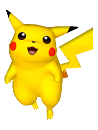
Image Link (Again, please use this link to see the much better image)
Well, here we are with Melee's render of Pikachu. I will say it is nicer than the 64 render, but not by much. I don't like how his arms are positioned, though. Man, it's sad how boring these are.
5.2/10
Brawl:
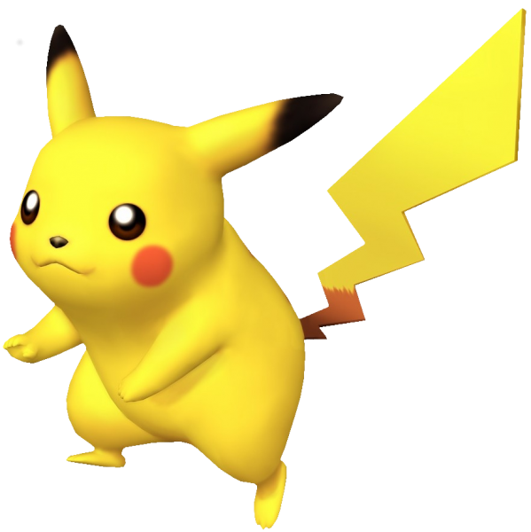
Image Link
Thank goodness Brawl is here to try and help pull us from mediocre poses. All things considered, it isn't by a large margin that it's better but it's a start. Pikachu has now oriented himself more towards to the left to show off one of his stubby arm/front leg which is slightly more interesting.
5.9/10
Wii U/3DS:
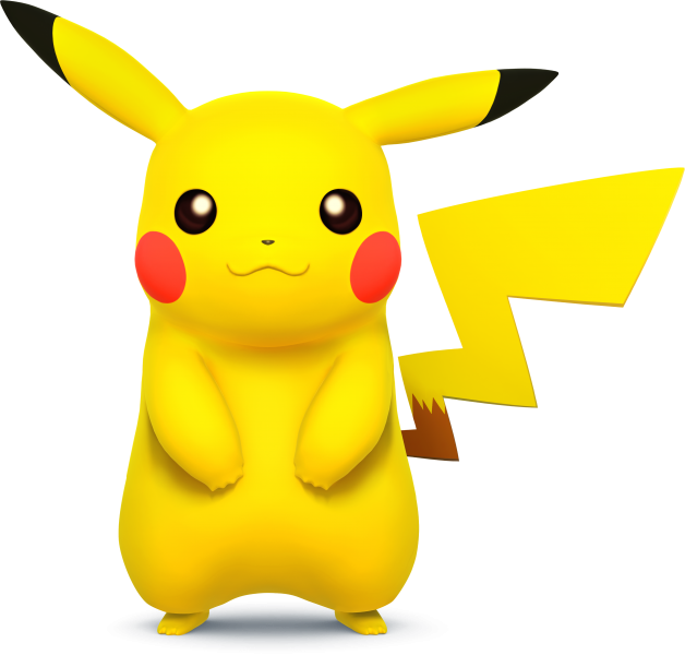
Image Link
Credit to the model design, Pikachu naturally has a much better shape overall which makes this rather bland pose a little better. I'll show mercy and give this one some props for being easy on the eyes.
6/10
Ultimate:
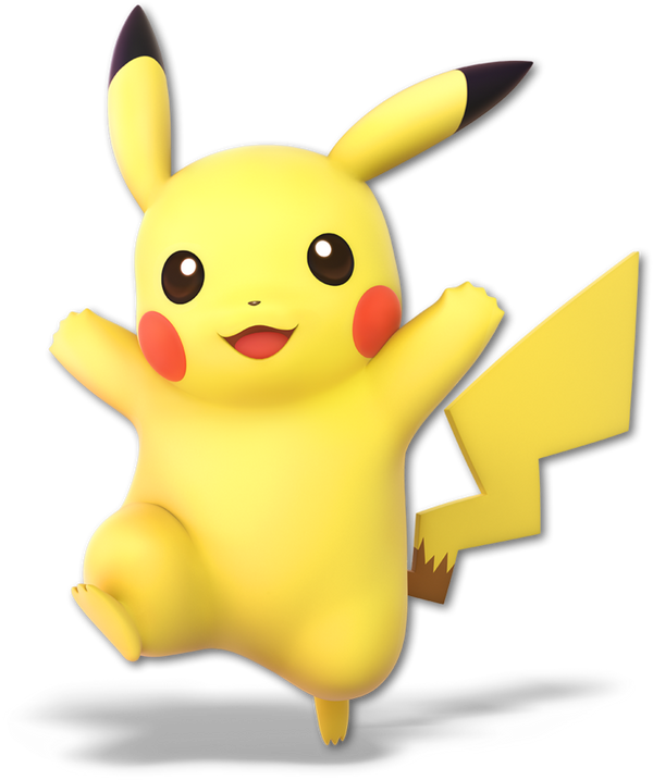
Image Link
Finally, something worth looking at for more than 20 seconds! Ultimate has yet again given us something to be happy about as it has pulled Pikachu from his mediocre chains of mediocrity! His standing on one foot, got his arms out, he looks like he's having fun, and makes me want to hug him all simultaneously. That little fold from his leg lift is a hilariously adorable detail. A great render which only took 5/6 games and 19 years to make.
8.8/10
Greatest to least: >
> >
>  >
>  >
> 
Well, that's as linear of a progressive as it can get. Unfortunately, Pikachu suffered from bland, uninteresting poses all the way up until Ultimate. A shame, really. Nearly 20 years of bad poses when we've seen Pikachu deliver much better posing in his home series. Even so far back in the day when he used to be a fat rat his official Pokemon renders looked better.
What do you guys think of Pikachu's renders for each installment?
He's the yellow mouse with a shocking personality, the one who summons the thunder, and he always aims for the horn: 08 Pikachu
Smash 64:

Image Link (Please use this one to see a MUCH higher quality image)
We've finally reached our first Pokemon, and it happens to be the mascot himself, Pikachu! Don't let this cuddly exterior fool you; his cute design doesn't save him from a series of rather boring "just standing there" poses. Most of his renders are like this. The most he gets from this artwork compositionally is that his silhouette is clear and the overall pose is asymmetrical. Otherwise, he's just standing there.
5/10
Melee:

Image Link (Again, please use this link to see the much better image)
Well, here we are with Melee's render of Pikachu. I will say it is nicer than the 64 render, but not by much. I don't like how his arms are positioned, though. Man, it's sad how boring these are.
5.2/10
Brawl:

Image Link
Thank goodness Brawl is here to try and help pull us from mediocre poses. All things considered, it isn't by a large margin that it's better but it's a start. Pikachu has now oriented himself more towards to the left to show off one of his stubby arm/front leg which is slightly more interesting.
5.9/10
Wii U/3DS:

Image Link
Credit to the model design, Pikachu naturally has a much better shape overall which makes this rather bland pose a little better. I'll show mercy and give this one some props for being easy on the eyes.
6/10
Ultimate:

Image Link
Finally, something worth looking at for more than 20 seconds! Ultimate has yet again given us something to be happy about as it has pulled Pikachu from his mediocre chains of mediocrity! His standing on one foot, got his arms out, he looks like he's having fun, and makes me want to hug him all simultaneously. That little fold from his leg lift is a hilariously adorable detail. A great render which only took 5/6 games and 19 years to make.
8.8/10
Greatest to least:
Well, that's as linear of a progressive as it can get. Unfortunately, Pikachu suffered from bland, uninteresting poses all the way up until Ultimate. A shame, really. Nearly 20 years of bad poses when we've seen Pikachu deliver much better posing in his home series. Even so far back in the day when he used to be a fat rat his official Pokemon renders looked better.
What do you guys think of Pikachu's renders for each installment?
Last edited:
aarchak
Smash Ace
Pikachu
 : 7/10
Yeah, he's just standing there, but he's still kinda cute, especially with the looking up and away. The fact it's hand drawn also helps.
 : 1/10
The weird floatiness and derpy face really kill this one. I don't know what the designers were thinking with this one.
 : 2/10
Bland, generic, and doesn't capture Pikachu at all. This is one of the many reasons I hate much of the Brawl renders.
 : 5/10
Better, but he's still just standing there.
 : 8/10
Finally, they seem to have gotten it right. The open arms especially make this one work.
And, as a bonus,
Detective Pikachu

10/10
Beautiful. I want one as a pet (or better yet, my own world-class detective).
Yeah, he's just standing there, but he's still kinda cute, especially with the looking up and away. The fact it's hand drawn also helps.
The weird floatiness and derpy face really kill this one. I don't know what the designers were thinking with this one.
Bland, generic, and doesn't capture Pikachu at all. This is one of the many reasons I hate much of the Brawl renders.
Better, but he's still just standing there.
Finally, they seem to have gotten it right. The open arms especially make this one work.
And, as a bonus,
Detective Pikachu

10/10
Beautiful. I want one as a pet (or better yet, my own world-class detective).
DrPerplexion
Smash Cadet
BoNuS!1! D. Pikachu
its deadpool as a pikachu.
11/5
Domino11332
Smash Apprentice
- Joined
- Jun 27, 2018
- Messages
- 87
NintendoKnight
Smash Lord
- Joined
- Oct 26, 2013
- Messages
- 1,735
- NNID
- Nin-Knight
Fun fact, his renders are based on some of his battle sprites from the games.
View attachment 178342
In regards to characters re-using the same poses from their source material, there are times where I'd rather they have something original as opposed to something that's already been done. I mean, it usually is a nice reference but it lacks creativity sometimes. It's hard to tell when that happens though. A good example of a re-used pose that actually works well is Sm4sh Cloud, as he borrows his original official art from FF7.
For a first appearance, I would say that it's fine to re-use a known pose for the character (like Cloud). And I'm not talking poses that characters strike in game, I mean poses used for official art of said character.
Pikachu here is an interesting point, because they began to adapt his poses from the Pokemon games instead of using their own original compositions a la 64+Melee. To which I think their original compositions for the character really weren't that good, so they fall back to known poses for something better.
To be honest, I have chosen to avoid listing all the references certain characters make with each pose because it takes more effort to list them all. But if you're familiar with art of that character, I'm certain you'd get the reference made, so I don't really do it.
TheTrueBrawler
Smash Demon
Pikachu’s renders in order from best to worst:
Smash Ultimate
Smash Brawl
Smash Melee
Smash 4
Smash 64
Smash Ultimate
Smash Brawl
Smash Melee
Smash 4
Smash 64
Mogisthelioma
Smash Master
VexTheHex
Smash Ace
- Joined
- Mar 30, 2018
- Messages
- 567
I'm generally shocked (ha) that Pikachu never got electricity tacked onto any of it's renders. Though my general concern with that route is we could see another American Kirby or Smash Mario where the character is made angry looking to go with the power... so maybe that wouldn't be the right way to go! Anyways, Pikachu had two major misses for me with Melee's being one of the ugliest renders to me that we have rated so far while Brawl's just had a rather awkward looking pose. But like some others, I feel Ultimate managed to actually hit the right spot!
Alternis
Ignore the user in front of you
64: 7/10 - Pikachu's pose is bland, sure, but I honestly love the way he's looking slightly upward here. It gives this one a different feel from the others.
Melee: 4/10 - Here, I think this pose is far worse. To me, what Pikachu is even supposed to be doing is kind of unclear, so the pose seems awkward.
Brawl: 6/10 - I appreciate the attempt to give some action to this pose, but otherwise it's still pretty bland.
Sm4sh: 7/10 - This pose is akin to 64's, but here Pikachu looks directly at us. I still like it, though.
Ultimate: 9/10 - Surprise, surprise, Ultimate's render wins out again. This pose best captures Pikachu's demeanor, and it's so dynamic relative to every previous pose. Quite a step up, in my eyes.
- Joined
- Oct 14, 2016
- Messages
- 2,746
NintendoKnight
Smash Lord
- Joined
- Oct 26, 2013
- Messages
- 1,735
- NNID
- Nin-Knight
He's the lean, green, misfiring machine, the eternal understudy, and the original Echo Fighter: 09 Luigi
Smash 64:
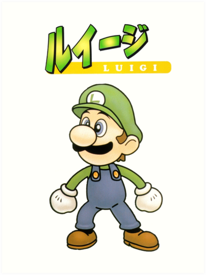
HQ Image Link
Take note that Luigi has some strange poses in his future, but we're starting off his career in Smash posing pretty strangely. He's just standing there, looking off to the side. Also, his head is disproportionately larger than the rest of him (I know that's how he looks in game, too. It's just really weird to see in the official art is all). At this point I guess you can say this is the beginning of Luigi being weird in Smash... It doesn't help the posing, though.
5/10
Melee:

Image Link
Luigi's gone off the deep end. His render was chosen to be based on his dash attack animation where he's flailing his arms like a maniac... why? I know Luigi's personality wasn't strongly established, yet, but this is really strange even for him. Visually, it IS interesting. And even further it's actually sort of comedic. But this is supposed to be the official artwork of the character, and they couldn't even have his eyes open?
5/10
Character Select Screen Portrait: CSSP

Image Link
Huh, a CSSP that's less dynamic than the official art, yet easier on the eyes. Going to be up front, I've consistently liked the CSSP's over the primary renders thus far, and that hasn't changed here. Luigi gripping the brim of his cap as he looks onward is a nice, adventurous render. Better than the primary render, if you ask me. Can you imagine playing Melee and seeing Luigi's official art used for his CSSP instead of this? It'd be a shame, really.
6.7/10
Brawl:
.png)
Image Link
As if they heard my thoughts on the Melee CSSP, Luigi comes to use with a more refined pose. It's simple, but I'd say quite effective. Luigi calmly adjusts his hat as if there's no battle to be fought currently. Or perhaps he finished a battle and is cleaning himself up? Who knows, but I've always liked this render for how simple it was.
7.2/10
Wii U/3DS:
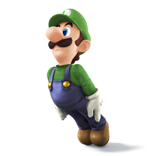
Image Link
...I'm going to come out and say it, I've never liked this render. I always thought it was a complete waste of potential for an interesting pose and they buffed it my posing Luigi at the start of his weird boat animation thing. No, not even the Michael Jackson meme saved this. It was always poor, it poorly portrayed Luigi, it isn't interesting to look at, and the only interesting thing about it is that they actually went through with it.
3/10
Ultimate:
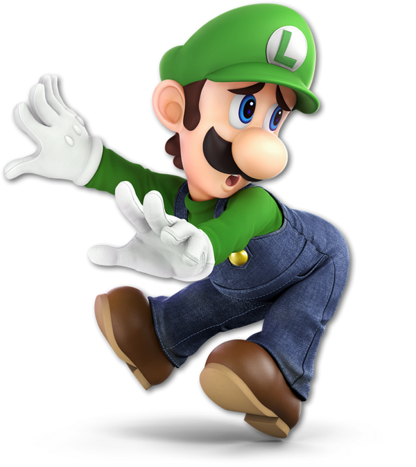
Image Link
Ah, leave to it Ultimate to make up for the prior render. THIS is Luigi. He clearly doesn't want to be here, but he is trying to be brave and is using his wacky fighting style (the third hit of his standard attack, to be specific) to the best of his cowardly ability. There's so much character in this one, it practically overwrites all the other renders. He's halfway between running for the hills and delivering the final blow.
9.7/10
From Greatest to Least: >
>  > CSSP >
  =
=  >
> 
How do you guys rate the renders of Mario's kid brother?
Smash 64:

HQ Image Link
Take note that Luigi has some strange poses in his future, but we're starting off his career in Smash posing pretty strangely. He's just standing there, looking off to the side. Also, his head is disproportionately larger than the rest of him (I know that's how he looks in game, too. It's just really weird to see in the official art is all). At this point I guess you can say this is the beginning of Luigi being weird in Smash... It doesn't help the posing, though.
5/10
Melee:

Image Link
Luigi's gone off the deep end. His render was chosen to be based on his dash attack animation where he's flailing his arms like a maniac... why? I know Luigi's personality wasn't strongly established, yet, but this is really strange even for him. Visually, it IS interesting. And even further it's actually sort of comedic. But this is supposed to be the official artwork of the character, and they couldn't even have his eyes open?
5/10
Character Select Screen Portrait: CSSP

Image Link
Huh, a CSSP that's less dynamic than the official art, yet easier on the eyes. Going to be up front, I've consistently liked the CSSP's over the primary renders thus far, and that hasn't changed here. Luigi gripping the brim of his cap as he looks onward is a nice, adventurous render. Better than the primary render, if you ask me. Can you imagine playing Melee and seeing Luigi's official art used for his CSSP instead of this? It'd be a shame, really.
6.7/10
Brawl:
.png)
Image Link
As if they heard my thoughts on the Melee CSSP, Luigi comes to use with a more refined pose. It's simple, but I'd say quite effective. Luigi calmly adjusts his hat as if there's no battle to be fought currently. Or perhaps he finished a battle and is cleaning himself up? Who knows, but I've always liked this render for how simple it was.
7.2/10
Wii U/3DS:

Image Link
...I'm going to come out and say it, I've never liked this render. I always thought it was a complete waste of potential for an interesting pose and they buffed it my posing Luigi at the start of his weird boat animation thing. No, not even the Michael Jackson meme saved this. It was always poor, it poorly portrayed Luigi, it isn't interesting to look at, and the only interesting thing about it is that they actually went through with it.
3/10
Ultimate:

Image Link
Ah, leave to it Ultimate to make up for the prior render. THIS is Luigi. He clearly doesn't want to be here, but he is trying to be brave and is using his wacky fighting style (the third hit of his standard attack, to be specific) to the best of his cowardly ability. There's so much character in this one, it practically overwrites all the other renders. He's halfway between running for the hills and delivering the final blow.
9.7/10
From Greatest to Least:
How do you guys rate the renders of Mario's kid brother?
VexTheHex
Smash Ace
- Joined
- Mar 30, 2018
- Messages
- 567
Ugh, between Melee Pikachu and Melee Luigi... I've seen some ugly render now. No matter your stance on how good Melee was, these renders were awful for sure! I never realized how... unfortunate Luigi was with his renders and how unsettling they were. Luigi is such a fun and beloved character among Nintendo, I'm shocked they struggled to give him an actual good render for this long. While smacking someone with his well rounded butt is not what I exactly think when thinking of Luigi, it's actually pretty successful in getting Luigi's personality across. He looks like that good hearted guy that you want to hug and protect cause misfortune loves him, but he'll keep trying and being there for everyone.
Last night and today I feel more Pro Luigi than I ever have been. I always played him a decent amount in games, but I may try to bump him to a main for Ultimate. He's a good boy and deserves better.
HotelSoapy!
Smash Apprentice
- Joined
- Jun 17, 2018
- Messages
- 96
Melee CSSP- 10/10
 10/10
10/10
 6/10
6/10
 3/10
3/10
 2/10
2/10
 1/10
1/10
