• Welcome to Smashboards, the world's largest Super Smash Brothers community! Over 250,000 Smash Bros. fans from around the world have come to discuss these great games in over 19 million posts!

    You are currently viewing our boards as a visitor. Click here to sign up right now and start on your path in the Smash community!

Rate That Render! (Now Rating: #49 Little Mac)

ps_

Banned via Warnings
Joined
Nov 1, 2018
Messages
113
Location
Teufort, New Mexico
:samus64:
My favorite design from a purely artistic standpoint. The wide, flat helmet is a reference to her earliest design while the rest of her body is more reminiscent of her look in Super Metroid. This mix is interlaced with the (generally) pleasing, comic book-y style Smash 64 awarded everybody, making Samus look like she jumped out of an early manga. "Mute intergalactic bounty hunter" character is well-conveyed. A+

:samusmelee:
A strict, loyal interpretation of the Super Metroid look. Melee served as a huge visual upgrade for the Smash series and Metroid Prime was around the corner, cementing Samus' general 3D look across both games and (for now) doing away with all evidence of Samus' early design. The render itself is... okay. It looks like the 64 pose with a touch more personality. A-

:samus2:
More Prime than Super Metroid (you can tell by the green flare on her chest), this marks the last appearance of a Varia Suit I actually like. That fact, combined with the super dynamic pose, makes it difficult to rate this render low, even if I think Brawl's art style has aged worse than disco. I never thought I'd be caught complimenting Brawl. A

:4samus:
There it is, the Other M suit. Any fan of Metroid who isn't Andrew Dobson can tell you why Other M is reviled throughout the universe... which extends to this suit. And like a Benedictine monk forced to painstakingly illustrate a manuscript about dog crap, the Smash team has instilled various "qualities" of Other M in this render. The dainty "tee-hee I'm a lady" bride stride. The tiny, nipple-like cannon that wouldn't intimidate a Glow Fly. The suit's high heels aren't entirely visible, but logically explain why Samus is walking like a 6 year-old girl wearing her mom's shoes. It's a well-crafted, competent render inspired by garbage. C-

:ultsamus:
Oh. We're not going to do the Samus Returns suit? The one that perfectly blends every prior design? Well... okay.

In reality I'm fully aware that Samus Returns began development after Smash Bros. Ultimate, giving the team an excuse for not using it, but Other M was such a flop with critics & fans that I honestly expected a return to Brawl's design. Even Ridley looks more like he did in Super Metroid than the abhorrent duck-creature Other M conjured up. The Varia Suit's heels are gone, but the nipple cannon is not. At least we can confirm it's really Samus in there based on how she's holding the cannon. C+
 
Last edited:

Mogisthelioma

Smash Master
Joined
Aug 24, 2018
Messages
3,596
Location
Ravnica
:samus64:: 4/10: Samus looks more interested n her arm cannon than anything else.
:samusmelee: (Character select screen): 7/10: She looks more intense, but at the same time in an awkward pose.
:samus2:: 8/10: Samus is firing at something. Neat.
:4samus:: 6/10: I just don't get this one. She looks like she's leisurely walking into a room.
:ultsamus:: 10/10. Now that's what I'm talking about! She looks like she's reloading after just firing her arm cannon, perhaps at Ridley?
 

VexTheHex

Smash Ace
Joined
Mar 30, 2018
Messages
567
:samus64: - 5/10 - Looks kind of goofy but fits the cartoony vibe the original renders seem to of had.
:samusmelee: - 4/10 - Nothing special and her shoulders look really, really huge on this one.
:samus2: - 8/10 - She looks stronger here and ready for a fight. Having her arm point at the viewer reduces how much you see of it though.
:4samus: - 4.5/10 - She doesn't look intimidating or fierce. It lacks any sort of power feeling to her as she slowly floats down by the looks of the image.
:ultsamus: - 9.5/10 - Makes me think of soldiers or swat teams, so I think it does a good job capturing her role killing fierce aliens.

Most of her's were pretty lacking, but she is a serious character in demeanor while not having facial expressions to help differ the renders which hurts how much they can play around with her and what can be accomplished.

:ultsamus: > :samus2: > > > > > :samus64: > :4samus: > :samusmelee:
 

Arthur97

Smash Master
Joined
Jun 7, 2016
Messages
3,463
:samus64:
My favorite design from a purely artistic standpoint. The wide, flat helmet is a reference to her earliest design while the rest of her body is more reminiscent of her look in Super Metroid. This mix is interlaced with the (generally) pleasing, comic book-y style Smash 64 awarded everybody, making Samus look like she jumped out of an early manga. "Mute intergalactic bounty hunter" character is well-conveyed. A+

:samusmelee:
A strict, loyal interpretation of the Super Metroid look. Melee served as a huge visual upgrade for the Smash series and Metroid Prime was around the corner, cementing Samus' general 3D look across both games and (for now) doing away with all evidence of Samus' early design. The render itself is... okay. It looks like the 64 pose with a touch more personality. A-

:samus2:
More Prime than Super Metroid (you can tell by the green flare on her chest), this marks the last appearance of a Varia Suit I actually like. That fact, combined with the super dynamic pose, makes it difficult to rate this render low, even if I think Brawl's art style has aged worse than disco. I never thought I'd be caught complimenting Brawl. A

:4samus:
There it is, the Other M suit. Any fan of Metroid who isn't Andrew Dobson can tell you why Other M is reviled throughout the universe... which extends to this suit. And like a Benedictine monk forced to painstakingly illustrate a manuscript about dog crap, the Smash team has instilled various "qualities" of Other M in this render. The dainty "tee-hee I'm a lady" bride stride. The tiny, nipple-like cannon that wouldn't intimidate a Glow Fly. The suit's high heels aren't entirely visible, but logically explain why Samus is walking like a 6 year-old girl wearing her mom's shoes. It's a well-crafted, competent render inspired by garbage. C-

:ultsamus:
Oh. We're not going to do the Samus Returns suit? The one that perfectly blends every prior design? Well... okay.

In reality I'm fully aware that Samus Returns began development after Smash Bros. Ultimate, giving the team an excuse for not using it, but Other M was such a flop with critics & fans that I honestly expected a return to Brawl's design. Even Ridley looks more like he did in Super Metroid than the abhorrent duck-creature Other M conjured up. The Varia Suit's heels are gone, but the nipple cannon is not. At least we can confirm it's really Samus in there based on how she's holding the cannon. C+
I get it, you don't like Other M, but could you keep it more about the renders.
 

ps_

Banned via Warnings
Joined
Nov 1, 2018
Messages
113
Location
Teufort, New Mexico
User was warned for this post; flaming
Judge it on its own merits.

Also, not everyone agrees.
"The dainty "tee-hee I'm a lady" bride stride. The tiny, nipple-like cannon that wouldn't intimidate a Glow Fly. The suit's high heels aren't entirelyvisible, but logically explain why Samus is walking like a 6 year-old girl wearing her mom's shoes. It's a well-crafted, competent render inspired by garbage. C- "
Get back in the dumpster, Other M fanboy.
 
Last edited:

Primid

Smash Apprentice
Joined
Aug 6, 2011
Messages
157
Location
A Distant Planet
:samus64: - 7/10 - Cartoony, but also charming in a way. Look like something you'd see in a comic or on a cereal box and I kinda dig it.
:samusmelee: - 5/10 - Not super keen on this one, mostly because of how saturated the colors always looked. She looks like she's made of candy (like Runts or gumballs or something idk...)
:samus2: -9/10 - Very Prime-esque. It's rad.
:4samus: - 7/10 - Really like the sleeker design and the knee-spikes, though I'm hesitant to give this one a perfect score because she kinda looks like she's T-posing.
:ultsamus: - 10/10 - Badass and SHINY! She looks like she's ready to blast some space pirates!
 
Last edited:

Alternis

Ignore the user in front of you
Joined
May 28, 2018
Messages
1,304
Location
Tartarus
NNID
GeneralO
Switch FC
SW-1137-6792-9994
64: 6/10 - This one is quaint. It looks good enough, though it's fairly plain.
Melee: 7/10 - I like how this render improves on 64's, and the pose itself has a little more personality.
Brawl: 5/10 - I'm not a fan on this pose, it feels more boring than the others.
Sm4sh: 5/10 - I'm mixed in this one. What were they going for? It's got a nice pose, but it also feels boring.
Ultimate: 8/10 - I like this one more than the others, simply because it introduces a more dynamic pose, and one that fits samus well.
 

Crystanium

Smash Hero
Joined
Apr 28, 2008
Messages
5,921
Location
California
As much as I enjoyed the bulky powered armor in Metroid: Samus Returns, Metroid: Other M's version is streamlined and the pauldrons aren't unnecessarily large. In the cut-scenes of MOM, the helmet looks very realistic, rather than just a nigh-spherical shape. I find Super Smash Bros. Brawl's pose to be action-packed compared to the previous kinds, which are just Super Metroid poses. Since Super Smash Bros. Ultimate's seems only different in terms of lighting, I'll put SSB4 and SSBU together.

1. SSB4/SSBU
2. SSBB
3. SSB
4. SSBM
 

Venus of the Desert Bloom

Cosmic God
Super Moderator
Premium
BRoomer
Writing Team
Joined
Jul 30, 2007
Messages
15,494
NNID
VenusBloom
3DS FC
0318-9184-0547
Ohh boy, why didn’t I find this thread sooner? I love comparing renders!

One thing about Samus is that she has had seriously awful renders in the past. Either they are generic as **** or cringeworthy as ****. I think they look plain awful. Now, when considering the art style, they aren’t as bad. They always do a great job in capturing her armor lights and the gleam bouncing off from it. It looks great, especially in 4 and 5. It’s the poses that really suck...

:samus64: 4/10
It’s the first render for her and sets the tone for the generic Samus poses later on down the road. At least she puts her hand on her hip for sassiness. But when compared to her Melee render, this one is very meh.

:samusmelee: 6/10
Basically the same as her 64 render but with her arm cannon titled slightly towards her and her body facing more towards us. This looks more like she is interacting with us and there’s more connection. Still, it’s the same ****ing generic posture that I hate about Samus. Still, I would consider this the best of her renders.

:samus2: 5/10
Blech... sure, they turned her to us to the point she’s not directly facing us. But nothing else beyond that point. I understand her arm cannon is the focus point of Samus but, seriously, can we have something else beyond her pointing or holding it up with very little action? This is better though than what’s to come...

:4samus: 2/10
Ok, I get them credit for trying to go outside the box and trying to make Samus look different with this angelic pose but...I think it backfired. It’s very boring and looks just....I don’t even know. Is she trying to hug a Metroid? Is she like trying to taunt us to start a fight? I get the pose but it just doesn’t work. I would of preferred if she was tilted slightly to our left with a more upward angle. And starting from 4, renders have become more important due to they are used for Amiibos! Mario had fire coming from his hand. Little Mac was showing his muscles. Zelda was JoJo-licious? Why can’t Samus be firing a missile or a charged shot? Whipper her grapple hook around? Begin entering into her Morph Ball? She’s not Jesus ****ing Christ.

:ultsamus: 4/10
Better than before but still same old “generic arm cannon without any sort of action” pose. She could of been holding it while charging up her shot. I have no idea why they don’t go that route while other characters all have pretty fun poses. Look at Duck Hunt! That’s an awesome pose! So does Olimar. Ultimate renders are full of action and fluidity. This Samus is just like...”hey, I got an arm cannon. But I can’t use it when the camera is on me. I’m camera shy.”

Here’s my ideal Samus render: Samus is in mid-jump and aiming her arm cannon at a slightly downward angle. Her body is slightly turned away to us and facing our left. She has just entered into her Final Smash so her arm cannon has opened up and begun doing crazy ****. The render would capture meme moments before firing it off so there are various electrical particles in front of the cannon. In addition, her jump boosters are also active for additional awesomeness.

On the plus side, Samus renders are super easy to recolor and easily my favorite to die because of all the fun options out there.
 
Last edited:

TheTrueBrawler

Smash Demon
Joined
Jul 16, 2018
Messages
816
Location
Mystery
Samus’s renders in order from best to worst:

Smash Ultimate
Smash Brawl
Smash Melee
Smash 64
Smash 4
 
Last edited:

NintendoKnight

Smash Lord
Joined
Oct 26, 2013
Messages
1,735
Location
Climbing the mountain I made from a molehill
NNID
Nin-Knight
Ohh boy, why didn’t I find this thread sooner? I love comparing renders!

One thing about Samus is that she has had seriously awful renders in the past. Either they are generic as **** or cringeworthy as ****. I think they look plain awful. Now, when considering the art style, they aren’t as bad. They always do a great job in capturing her armor lights and the gleam bouncing off from it. It looks great, especially in 4 and 5. It’s the poses that really suck...

Here’s my ideal Samus render: Samus is in mid-jump and aiming her arm cannon at a slightly downward angle. Her body is slightly turned away to us and facing our left. She has just entered into her Final Smash so her arm cannon has opened up and begun doing crazy ****. The render would capture meme moments before firing it off so there are various electrical particles in front of the cannon. In addition, her jump boosters are also active for additional awesomeness.

On the plus side, Samus renders are super easy to recolor and easily my favorite to die because of all the fun options out there.
I know somebody already said it, and I was trying to avoid saying it but...

...literally ANYTHING from Samus Returns would've been MORE than enough. Pose inspiration, armor style, all of it.


I find it best not to dwell on it however. It's the only way to make it past the disappointment phase.

Judge it on its own merits.

Also, not everyone agrees.
Also, this. Thank you. I was going to say something but you beat me to it.
 
Last edited:

ps_

Banned via Warnings
Joined
Nov 1, 2018
Messages
113
Location
Teufort, New Mexico
I know somebody already said it, and I was trying to avoid saying it but...

...literally ANYTHING from Samus Returns would've been MORE than enough. Pose inspiration, armor style, all of it.


I find it best not to dwell on it however. It's the only way to make it past the disappointment phase.


Also, this. Thank you. I was going to say something but you beat me to it.
You were going to get a Like for mentioning Samus Returns would have been a better fit for Ultimate, but you ruined it by complimenting Other M.
 

aarchak

Smash Ace
Joined
Jul 29, 2018
Messages
501
Location
The blast zone
Samus

:samus64:: 5/10
Um, is she looking at her gun? Okay, that's kinda weird. Not much of a fan.
:samusmelee:: 7/10
Much better. Most of these renders draw attention to the arm cannon, and this one does it pretty well.
:samus2:: 9/10
By far one of the best Brawl renders. Very well captures the essence of Samus, which I feel a lot of the renders from this game fail to do.
:4samus:: 7/10
Good, more mysterious and towering, but it feels less dynamic.
:ultsamus:: 8/10
Very good. I don't like that it feels a bit stiff though. It feels like Samus should have her body facing to the side.
 

NintendoKnight

Smash Lord
Joined
Oct 26, 2013
Messages
1,735
Location
Climbing the mountain I made from a molehill
NNID
Nin-Knight
We're at that time again for our next comparison!

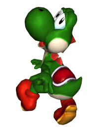
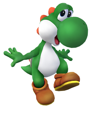
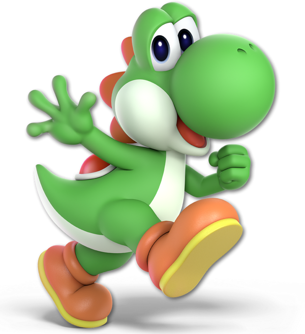
He's the devourer of Shy Guys, the faithful steed of a legendary plumber, the goofy green dinosaur that uses eggs as weapons: 05 Yoshi

Smash 64: :yoshi64:

Image Link

Starting us off with Yoshi's debut in Smash, we have the classic comic-book styled render here that harkens Yoshi's look back to the days of Super Mario World. In this day and age Yoshi was supposed to more closely resemble a dinosaur, with the tiny arms and crescent shaped body. As far as poses go, it's not bad. All the 64 poses more or less look plain in comparison to other renders, but as far as it goes it doesn't look bad at the very least.
5.7/10

Melee: :yoshimelee:

Image Link

As we get to Melee, I should warn us not to judge this render too harshly based on the model used for the character. They tried to go for a more "realistic" approach to Yoshi. Needless to say, it didn't work.

Anyway, this render is immediately more interesting because Yoshi is doing more than standing there. Though I dislike how he has his back turned to us. They did make a point to keep his face at that profile shot so we can see his big round nose. He does look a lot happier (despite his eyelids disagreeing with him) and I feel this image works than the previous one.
6.4/10

Brawl: :yoshi2:

Image Link

Getting to Brawl, I'm quite happy to say that I love how this pose is framed. Yoshi looks like he's skipping merrily like a child. I also love that the pose is viewed from the front, but still keeps yoshi's head at a sideways glance. That is his good side, you know. I love the silhouette of this pose, and there's a joyful energy about it.
8.4/10

Wii U/3DS: :4yoshi:

Image Link

Another Yoshi walking pose. He lost that Super Happy smile he's worn since Melee, and he's now giving us his backside again. The pose is alright, I just wish he'd show more character.
7/10

Ultimate: :ultyoshi:

Image Link

OK, this is fantastic! Yoshi is still doing his walking thing, but with that bright smile on his face and that adorable wave of the hand as a passing salutation, I have to say it's pretty good for Yoshi. It's not the "most interesting" it could be, but it's cute. He looks cuddly and joyful as he greets you. It fits his character to a T. (Side note, I love how "froggy" his fingers look.)
8.8/10

Greatest to Least: :ultyoshi: > :yoshi2: > :4yoshi: >:yoshimelee: > :yoshi64:

All in all, Yoshi has really basic poses. He's either walking, showing us his backside, or both. As long as he retains that overjoyed demeanor, he's OK.
 
Last edited:

Jexulus

Omnivore of the Year
Joined
Feb 4, 2011
Messages
356
NNID
Jexulus
3DS FC
3883-5870-2795
:ultyoshi:/:4yoshi:/:yoshi2:/:yoshimelee:/:yoshi64:: 0/10 Not enough Shun Goku Satsu

maxresdefault.jpg
 

Good Guy Giygas

Smash Master
Joined
Jul 7, 2013
Messages
3,154
Location
Official Doomguy Hype-Man®
Switch FC
SW-6635-8915-7294
:yoshi64: - 7/10. A classic-looking Yoshi pose. Nothing too special though.
:yoshimelee: - 6/10. Kind of a weird angle. It's also kinda dark and doesn't really embody Yoshi very well.
:yoshi2: - 8/10. He looks really happy here, as he should.
:4yoshi: - 4/10. Really boring pose. Says nothing about Yoshi as a character. It looks like he's just walking away in a huff.
:ultyoshi: - 9/10. Definitely the best one so far. He's smiling and waving, and overall this render has a lot of character.
 

aarchak

Smash Ace
Joined
Jul 29, 2018
Messages
501
Location
The blast zone
Yoshi

:yoshi64:: 5/10
Why is he looking at me so suggestively? It's making me uncomfortable.
:yoshimelee:: 4/10
With the rapper hands and that he's facing away, I don't really like this one.
:yoshi2:: 5/10
I can't bring myself to like this one. It just exudes the wrong energy for Yoshi.
:4yoshi:: 8/10
Yes, much better. I like the walk especially.
:ultyoshi:: 8/10
Basically the same thing here, but he's saying hi and I like that.
 

Zinith

Yoshi is Thicc in S P I R I T
Joined
May 13, 2018
Messages
24,794
Location
All around you, awaiting to consume your soul
Switch FC
SW-4624-0132-9722
YUSH!!! By all means...

:yoshi64: 8.5/10 Smug Yoshi will always have a place in my heart even if it's woefully out of character...
:yoshimelee: 4/10 I know you said not to judge it by the model, but I just.... I don't even know what he's doing here...
:yoshi2: 7/10 Brawl Yoshi tried his best to look cute in that render, it's just the circumstance surrounding Brawl's tone and his color scheme that takes it down a notch...
:4yoshi:9.5/10 This is such a bizarre pose that I can't help but love...
:ultyoshi: 10/10 However, NOTHING will top this render...
 

Arthur97

Smash Master
Joined
Jun 7, 2016
Messages
3,463
Actually, does his Ultimate render look familiar to anyone else? Did he have that pose before in another game?
 
Last edited:

NintenRob

Rising YouTuber
Writing Team
Joined
Feb 8, 2014
Messages
5,505
Location
Australia
NNID
trpdm.wilton
I'm probably going to like Ultimate the best for most of these, but it's good read anyway
 

Alternis

Ignore the user in front of you
Joined
May 28, 2018
Messages
1,304
Location
Tartarus
NNID
GeneralO
Switch FC
SW-1137-6792-9994
64: 5/10 - While this pose is kinda bland, and I think it looks off, it doesn't necessarily look bad.
Melee: 7/10 - I like this pose. It fits Yoshi, and is pretty dynamic.
Brawl: 9/10 - Unusually for me, I like this Brawl pose. Yoshi just looks so happy here! It's adorable and fitting.
Sm4sh: 8/10 - This pose is perhaps the one I feel fits Yoshi the best, though I do the prefer the Brawl one. Nonetheless, this is a great pose, it's very dynamic.
Ultimate: 8/10 - This one is about even with the previous. Here Yoshi looks happy like before, but I feel he's lost just a bit of movement here. It's still great, though.
 

NintenRob

Rising YouTuber
Writing Team
Joined
Feb 8, 2014
Messages
5,505
Location
Australia
NNID
trpdm.wilton
Could I make a suggestion NintendoKnight NintendoKnight , if you are comparing both css render and official render for melee, why not include mural renders for Smash Ultimate? They're very unique and I think deserve a mention
 

Venus of the Desert Bloom

Cosmic God
Super Moderator
Premium
BRoomer
Writing Team
Joined
Jul 30, 2007
Messages
15,494
NNID
VenusBloom
3DS FC
0318-9184-0547
:yoshi64:Derpy Yoshi: the quintessential Yoshi pose that probably looked normal back then but now looks like how we look at old fashioned dinosaurs. He looks as if he’s about to commit some sort of evasion involving financial responsibility...

3 out of 10 eggs

:yoshimelee:Leftist Yoshi: Looks kind of dark and dreary. Definetely not the happy-go-lucky character I knew and love. Still, one of my more favorite ones. Maybe it’s thinking of joining the Left and becoming a Democratic Socialist?

7 out of 10 eggs

:yoshi2:The One Yoshi No One Else Likes
This is the Yoshi that is an over-achiever in class and generally licks butt to get what it wants while looking happy and cheerful. The entire skip within its step belies a underhanded nature. Yoshi is a happy dinosaur but this looks like all kinds of wrong. I kinda wanna kick it.

3 out of 10 eggs

:4yoshi:Rightist Yoshi

This is basically the Melee render but flipped and altered. Same sort of looking back behind it but now to the right. I have no feelings about this one. I guess it supports Make Yoshi Great Again agenda.

4 out of 10 eggs

:ultyoshi:Yoshi on the Go

I feel this render captures what Yoshi is all about- running around like a dweeb. He’s like “Hi there! Bye there!” I wanted to see it jumping or using some eggs or slurping but it’s a bit better than what we had plus shows it off his more upright form better than his Smash 4 render.

8 out of 10 eggs

Preferred Yoshi Render: As I mentioned earlier, I wanted to see him performing one of his attacks rather than looking at us as he walks off. I especially support him using one his eggs in the render as that’s something true to his character.

Here’s my past ratings for Mario, DK, and Link:

:mario64: 8/10 mushrooms
:mariomelee: 5/10 mushrooms
:mario2: 2/10 mushrooms
:4mario: 4/10 mushrooms
:ultmario:1/10 mushrooms
:dk64:4/10 bananas
:dkmelee: 6/10 bananas
:dk2: 3/10 bananas
:4dk:9/10 bananas
:ultdk:7/10 bananas
:link64: 10/10 rupees
:linkmelee: 5/10 rupees
:link2: 1/10 rupees
:4link: 6/10 rupees
:ultlink:7/10 rupees
 
Last edited:

NintendoKnight

Smash Lord
Joined
Oct 26, 2013
Messages
1,735
Location
Climbing the mountain I made from a molehill
NNID
Nin-Knight
YUSH!!! By all means...

:yoshi64: 8.5/10 Smug Yoshi will always have a place in my heart even if it's woefully out of character...
:yoshimelee: 4/10 I know you said not to judge it by the model, but I just.... I don't even know what he's doing here...
:yoshi2: 7/10 Brawl Yoshi tried his best to look cute in that render, it's just the circumstance surrounding Brawl's tone and his color scheme that takes it down a notch...
:4yoshi:9.5/10 This is such a bizarre pose that I can't help but love...
:ultyoshi: 10/10 However, NOTHING will top this render...
I knew this would summon you. Glad to see your input here.

Could I make a suggestion NintendoKnight NintendoKnight , if you are comparing both css render and official render for melee, why not include mural renders for Smash Ultimate? They're very unique and I think deserve a mention
As much as I'd love to do that—and it is a great suggestion—there are a few reasons why I will not: first, we don't have the individual, unobstructed renders from the mural. And second, even if we did have access to the individual renders of the mural, a large number of the renders on the mural are contextually based.

Take Dr. Mario or Mr. Game & Watch, for example. Their renders on the mural are totally reliant on each other which makes them hard to judge or appreciate for sake of comparison. Wario and Dedede follow a similar pattern of being unusual without the context. Looking at them in a vacuum without the rest of the mural takes a lot away from what makes the mural amazing. These characters aren't just posing together in one photo, some of them are reacting to each other. One of the focuses of this thread is to compare and rate the renders and poses in a vacuum, where other factors don't apply (such as the Smash game it's from, the game the character's design comes from, so on and so forth).

In my opinion, the mural is best left admired just as it is; the entirety of the piece is what makes it so great to see. But I appreciate your feedback and willingness to try and add to the idea for this thread.
 
Last edited:

VexTheHex

Smash Ace
Joined
Mar 30, 2018
Messages
567
:yoshi64: - 2.5/10 - What a strange and creepy image of Yoshi.
:yoshimelee: - 2/10 - Pretty awful. It's kind of dark and with his back to us with his mouth open. Just bad.
:yoshi2: - 6/10 - Oh what a turn around! It's improvement but somehow still feels a bit off.
:4yoshi: - 8/10 - He's cutely matching off. It looks pretty solid overall, but a little boring. I think they wanted to really show his saddle off for the most part.
:ultyoshi: - 10/10 - This is probably the closest to perfect they can do for Yoshi. He needs to look friendly and bright with this render accomplishing it.

Yoshi started off pretty rough but found his happiness (did he steal Mario's?) as games passed. Not sure what the perfect Yoshi render would be as there is only so much one can do with him without losing his happy and simple self. Maybe if he just had a cute little egg at his feet or in his hand? Idk, might be too much. On further thought, I bumped it to a 10 cause I think any other addition to it would detract.

:ultyoshi: > :4yoshi: > :yoshi2: > > > > > :yoshi64: > :yoshimelee:


Actually, does his Ultimate render look familiar to anyone else? Did he have that pose before in another game?
I was thinking it matches with a Mario Party render.
 
Last edited:

Yosher

Smash Ace
Joined
Jul 18, 2007
Messages
631
Location
Yoshi's Island, of course
NNID
Yosher
Here are my thoughts on all the Yoshi renders.
:yoshi64: - 8/10 - I'm admittedly a sucker for the Smash 64 drawing pieces of artwork. Not to say I dislike the renders they used ever since, but these old pieces make it feel very child-like to me for some reason, which is very much in tone with the original Smash Bros being simply a child playing with its toys, too. I could imagine all the Smash 64 pieces of artwork being on the boxart for all those toys that kid got. As for Yoshi, yes he's just standing there, but he's standing there doing what he does best: being adorable, and practically giving you the puppy-dog eyes. Sorta. I love it.
:yoshimelee: - 6.5/10 - Not too much of a fan of this one in particular, the pose is a little bit awkward and I'm not really sure what he's supposed to be doing. He was walking, and then noticed the player and gave them a glance? I dunno. I don't necessarily see a smile on his face either, admittedly. I still like it somewhat though.
:yoshi2: - 7/10 - Admittedly, I never was that big a fan of this pose either, it looks a little awkward with how he's standing. But it still looks really cute.
:4yoshi: - 8.5/10 - Yoshi simply walking, but he looks about ready for action while doing so. I don't really get the argument of him showing his back to you. To me, that just gives a 'come on, hop on!' kind of vibe, like he wants to give you a ride, the thing he's been doing pretty much since his debut in Super Mario World, and this pose really emphasises on that aspect, even if Smash doesn't actually allow anybody to hitch a ride on Yoshi (aside from that one SubSpace Emissary cutscene).
:ultyoshi: - 10/10 - This is definitely the best one. There's no arguing Yoshi is one of, if not the most adorable in Smash Bros, and this pose definitely shows it. The happy smile, the friendly wave, the cute strut he's going on. Everyone's saying ''how can you bash Isabelle in the face'', but really, when you look at Yoshi's face here, how can you bash on HIS face?! I certainly can't. Yoshi was just made to be adorable and this render definitely shows that. Love it.

So for me it's basically: :ultyoshi: > :4yoshi: > :yoshi64: > :yoshi2: > :yoshimelee:

As for past renders:
Mario:
:mario64: - 8/10 - You can get a good chunk of my reasoning for this with my description for Yoshi's N64 render, but Mario's is just a liiittle more dynamic with a more iconic pose for him, giving the peace/victory sign, and it just really fits him.
:mariomelee: - 7/10 - Very good pose that shows off a happy Mario jumping, just that thing he's known for best.
:mario2: - 5/10 - I always thought people were maybe a little too harsh on this version of Mario, but they're definitely not wrong. Mario should be happy, and this version looks... more neutral than anything. A little boring honestly.
:4mario: - 7/10 - Sometimes, it's cool to see a more serious side for Mario. It's not the happy-go-lucky Mario we all know and love, but this Mario looks to be ready to protect the Mushroom Kingdom and stop anything that comes his way.
:ultmario: - 8.5/10 - The pose looks decent, but I would have liked it a little more if they had a more happy pose to go along with the expression on his face. I still really like it though, happy Mario has finally returned and this render definitely shows it.
:ultmario: > :mario64: > :mariomelee: = :4mario: > :mario2:

Donkey Kong:
:dk64: - 4.5/10 - I'll be perfectly honest, I never really liked Donkey Kong very much, and that might show in my scoring, but I'll try to be objective. I like this render mostly for the same reason as given with Yoshi's description, but I also don't like it because it just kind of... looks weird? I don't know, the pose just looks like he's ready to... uh, do something behind some bushes. And that's not something I like thinking about whatsoever.
:dkmelee: - 6/10 - This DK just looks way too dark-furred for my liking, and aside from that it's again a little bit of a weird pose. Like with Brawl Mario, the expression looks more neutral than anything which doesn't add much.
:dk2: - 7/10 - This addresses most of the issues I have with Melee's render, DK looks much better here and he looks like he's ready for action. Still a boring expression though.
:4dk: - 6/10 - Again kind of a weird pose for me. I don't even know why but.. I just don't like it too much.
:ultdk: - 9/10 - Now THIS is a really good render for DK. He looks really cool here, ready for action, he's got that 'oh yeah, bring it on!' look on his face while taking on a pretty cool and dynamic pose and for me captures the true essence of the character. Definitely my favourite by far.
:ultdk: > :dk2: > :dkmelee: > :4dk: > :dk64:

Link:
:link64: - 7.5/10 - This may be relatively simple from what you'd expect from Link, but I still quite like it. Unlike what people might expect, Link CAN in fact smile, and I don't think it's unsuitable for him. He just looks happy to be a part of the gang in my eyes, and I like the cartoony look for him.
:linkmelee: - 7.5/10 - He looks pretty good here, and this is definitely my favourite rendition of the Hero of Time even to this day. Well, the adult version anyway. And the Hero of Time also happens to be my favourite Link. The pose is sliiightly boring though, but it's not bad.
:link2: - 6/10 - An even more boring pose than before, I don't like it all that much. He's just kind of.. standing there, giving you a weird look.
:4link: - 7.5/10 - Getting back up there with a more dynamic pose, and I like it. It's definitely not bad.
:ultlink: - 9/10 - A lot of these Ultimate renders really just seem to be the best so far and Link's is no exception. The dynamic pose, the way it's detailed... and somehow the expression just looks a lot more focussed here for some reason as well, despite not changing too much from what Melee, Brawl and Smash 4 did.
:ultlink: > :link64: = :linkmelee: = :4link: > :link2:
Samus:
:samus64: - 7/10 - I think this artstyle doesn't fit Samus quite as well as it does for most other characters, but it still has that action-figure-boxart drawing going on and that's still pretty neat.
:samusmelee: - 7/10 - Very much the same as Smash 64's artwork and for that it is a little bit boring by comparison, but it's a pose that works still for Samus.
:samus2: - 7/10 - Not too much of an improvement over the previous pieces of artwork admittedly. It looks cool, but that's about it.
:4samus: - 9/10 - This render is just really fantastic, as it gives her a sense of mystery and elegancy and I really like that.
:ultsamus: - 8/10 - Unlike some other characters, Samus has a fairly boring piece of Ultimate artwork by comparison, but it's still pretty good and shows her ready for action.
:4samus: > :ultsamus: > :samus64: = :samusmelee: = :samus2:
 

Mogisthelioma

Smash Master
Joined
Aug 24, 2018
Messages
3,596
Location
Ravnica
:yoshi64:: 5/10: Yoshi looks like he's trying to smile at a party while containing his inner depression....no.
:yoshimelee:: 4/10: Yohsi, is everything Ok--YOSHI!!
:yoshi2:: 6/10: He's a habby boi. He looks like he's about to step on someone.
:4yoshi:: 8/10: At least now he's performing an action.
:ultyoshi:: 10/10: Perfection.
 

NintendoKnight

Smash Lord
Joined
Oct 26, 2013
Messages
1,735
Location
Climbing the mountain I made from a molehill
NNID
Nin-Knight
I'm sorry everyone. I wanted to update this sooner, but I live in southern California and my family and I had to evacuate our home due to the fire. I left practically everything at my house but it's still intact as far as I know. Currently staying with my grandmother far out of town. We're safe.

So Kirby when?
Kirby when?

Kirby Now.

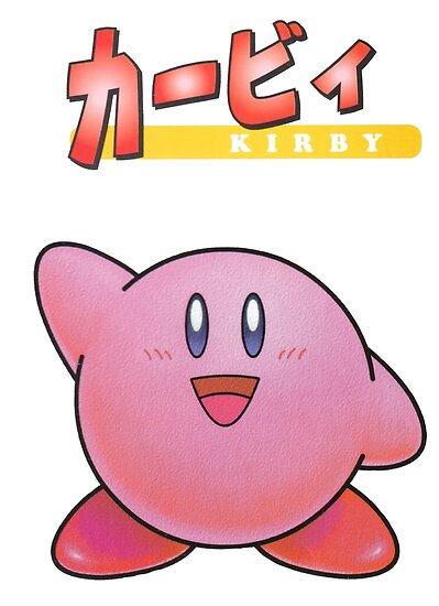
He's the devourer of all things Waddle and Dee, the pink puffball protector of Popstar, and the Nintendo version of DBZ's Majin Buu: 06 Kirby

Smash 64: :kirby64:

Image Link

Starting off with Smash 64's comic-style, we have Kirby. Now, due to Kirby's design, it's actually pretty easy having him sit there, doing nothing and looking fine. He's a round blob with shoes; really hard to make that dynamic outside of a leg lift here and there. As such, I'll be going easy on the lil' fella' with my ratings. This articular render is well enough, he's standing there with one armed raised. He's waving hello! Hello Kirby!
6.5/10

Melee: :kirbymelee:

Image Link

Well, now. THIS is interesting! Kirby and Samus share a trait in that their Melee render matches their SSB64 render. Imagine that. As cute as the reused pose is, and as cute as Kirby himself is, I'm going to say the Melee one is less "alive" than the 64 one. I think it may have to do with the mouth and the eyes in the render. Perhaps having identical poses in renders is not the best way to go?
6/10

Brawl: :kirby2:

Image Link

Now THERE'S the life I was looking for! Ironically Brawl is the game to give Kirby more of a colorful pose and expression than in Melee. He's spread out like he does during his neutral aerial. He's almost star-shaped when he does this, so it's actually very fitting and kinda cute. They also massively improved his mouth and eyes.
8/10

Wii U/3DS: :4kirby:

Image Link

I think I know what happened here. I think when deciding Kirby's pose they thought to themselves, "What pose will make him the cutest? Ooh, I know! Sitting down!"

...And they were right. He's absolutely adorable! Honestly I'm not even all that big a fan of Kirby and I have to say that this render was entirely focused on him looking cute; no ifs, ands, or buts about it. It's fine that they do that, but by this point Kirby has had some amazing renders from his own series; I KNOW he can amaze us with more.
8.2/10

Ultimate: :ultkirby:

Image Link

This. Is. EXCELLENT! A MARVELOUS display of some of Kirby's finest posing. I'm pretty certain he's done this pose before in his own series, but whatever! He's cute, he's doing something dynamic, retaining well into his character, his silhouette is easy to discern: it's overall fantastic!
10/10

(My first 10 out of 10 render, and for Kirby!)

It's easy to say that Kirby has has bland renders, but he's a pink ball with limbs. He's doing pretty well with what he's got, if you ask me.

Greatest to least: :ultkirby: > :4kirby: > :kirby2: >:kirby64: > :kirbymelee:

And with that, that's Kirby! I hope you guys have fun rating him!
 
Last edited:

osby

Smash Obsessed
Joined
Apr 25, 2018
Messages
23,980
64: 3/10
Melee: 4/10
Brawl: 9/10
For: 7/10
Ultimate: 10/10

Kirby pretty much only gone up in terms of render quality. He's ugly like every other character in 64, he looks weird in Melee and cute in rest. Ultimate did a pretty good job at giving him a dynamic pose.
 
Top Bottom