• Welcome to Smashboards, the world's largest Super Smash Brothers community! Over 250,000 Smash Bros. fans from around the world have come to discuss these great games in over 19 million posts!

    You are currently viewing our boards as a visitor. Click here to sign up right now and start on your path in the Smash community!

Rate That Render! (Now Rating: #49 Little Mac)

Cyberfire

Smash Journeyman
Joined
Dec 20, 2013
Messages
300
Location
London
:diddy: 4/10 - His head is not in proportion with his body, and his arms look weightless, and his tail is too thin. Pose is good though.

:4diddy: 7/10 - Think the colours are too much here, but I love the **** eating grin on his face. Pose is a weird choice I must say.

:ultdiddy: 9/10 - Fur detail is amazing, his limbs have weight to them, and the lighting is great. Loses a mark because seeing toenails freak me out.
 
Last edited:

NintendoKnight

Smash Lord
Joined
Oct 26, 2013
Messages
1,735
Location
Climbing the mountain I made from a molehill
NNID
Nin-Knight
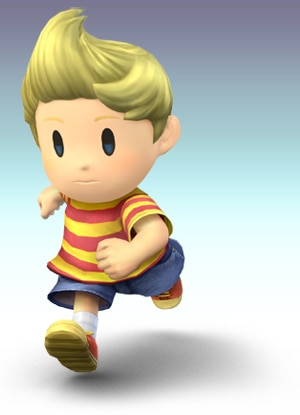
The PK Thunder from down under, came straight outta Nowhere, the second boy bound to mother earth: #37 Lucas

Brawl: :lucas:

image link

With a blank, bland expressionless face, Lucas rushes headlong into... battle, I guess? Don't know, it's not a pose that screams "DETERMINATION" as it goes about its business. The pose itself is fine, but there's not enough energy in spite of it.
6/10

Wii U/3DS: :4lucas:

image link

Less dynamic than the previous, but a little more intense. It's actually supposed to contrast with Ness' pose in Sm4sh, and go alongside it as a counterpart render. He looks a bit aggressive, which also contrasts with the smile Ness wears in his pose. Though, too be fair, Lucas has a lot less to smile about in his game. Still the render's decent.
7/10

Ultimate: :ultlucas:

image link

Honestly, I expected a little bit more from this render. The idea they went with is not what I expected or thought they'd go with, but it's fine. I found it a nice nod to his game with the Rope Snake, but confused as to why they chose the Rope Snake to be the main feature of his render. It's almost like it confuses the idea of how Lucas plays in Ultimate. It doesn't really display his personality because Lucas never used the Rope Snake in Mother 3. How odd. Anyway, the render itself is fine, but nothing about it truly stands out.
7/10

Greatest to least: :ultlucas: = :4lucas: > :lucas:

What do you guys think of Lucas' renders?
 

osby

Smash Obsessed
Joined
Apr 25, 2018
Messages
23,980
:lucas:: 7/10. A simple, cute, dynamic pose. Though his face looks kinda vacant.
:4lucas:: 7/10. It's an effective pose but I'm not really fond of the face again, Lucas looks unnecessarily angry in it.
:ultlucas:: 9/10. This one is great. He has a distinct silhouette with Rope Snake, his posture and facial expression looks appropriately childish. You can see both his timid and headstrong sides at the same time.
 

OnyanRings

Smash Ace
Joined
Mar 11, 2019
Messages
711
Location
The Cale-Zone
Switch FC
SW-4662-0014-5533
:lucas:: 5
:4lucas:: 7.5
:ultlucas:: 9

Lucas's Ultimate render is very odd with the use of the rope snake indeed but i love that lil' bugger so it doesn't bother me.

Brawl's though... Man, a lot of them looked rough :T
 
Last edited:

Cyberfire

Smash Journeyman
Joined
Dec 20, 2013
Messages
300
Location
London
:lucas: 5/10 - whyareyourunning.gif
:4lucas: 9/10 - Colours are miles better than Brawl's washed out look. And I adore that it contrasts with Ness' render.
:ultlucas:8/10 - The render that probably best showcases his personality, however I'm not a fan of the ropesnake being there, mainly because it implies a different playstyle.
 

NintenRob

Rising YouTuber
Writing Team
Joined
Feb 8, 2014
Messages
5,505
Location
Australia
NNID
trpdm.wilton
Can we talk about his eyes in Wii U render, looking right at us, dead, and empty.
 

PhaseDistorter

Smash Rookie
Joined
Apr 15, 2019
Messages
15
:lucas:- The running pose is kind of dynamic, but his face still shows his timid nature. Bonus nostalgia points for when Lucas was first confirmed though. 7/10
:4lucas:- The fact that it mirrors Ness' pose is a plus, but other than that it's pretty standard. The silhouette reads better than his first render. 8/10
:ultlucas:- I actually dig his new Ultimate render a lot. Like most Ultimate renders, there's a lot more energy put into the pose, and the Rope Snake helps with that. I know people mentioned it doesn't make sense for him to have it, but I think it makes the line of action better. 9/10
 

slamallama

Smash Journeyman
Joined
Oct 3, 2018
Messages
268
Location
the cold void of space
:lucas:5/10: Not bad, not great. Exists, and that's about it.

:4lucas:9/10: One hand balled in a fist, and the other with fingers splayed, palm-out in a very commanding pose: this kid clearly has supernatural abilities, and his expression says he's not afraid to use them on you.

:ultlucas:7/10: Not sure why the render centers around him "ooo-ing" at the Rope Snake, but it's cute nonetheless.
 
Last edited:

SUfan

Smash Rookie
Joined
Dec 22, 2018
Messages
20
:diddy::4diddy::ultdiddy:: 8 (All Good in their own right)
:lucas:: 6 (Gets the job done)
:4lucas:: 8 (Looks Great, although it doesn't fir the character)
:ultlucas:: 7 (Why is he oo-ing at the snake)

Top 5:
5. :ultsnake:
4. :mariomelee:
3. :ultganondorf:
2. :4kirby:
1. :ganondorfmelee:

Bottom 5:
5. :ivysaur:
4. :fox64:
3. :squirtle:
2. :dk64:
1. :4ganondorf:
 
Last edited:

NintendoKnight

Smash Lord
Joined
Oct 26, 2013
Messages
1,735
Location
Climbing the mountain I made from a molehill
NNID
Nin-Knight
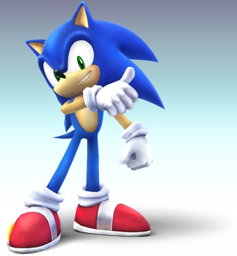
He's the blue blur, the fastest thing alive, and has enough time for a chili dog or two: #38 Sonic

Brawl: :sonic:

image link

Starting off with one of the best reveals as a Smash character, Sonic gives us a pretty great render in my opinion. It's rather static, with no feel of movement or motion whatsoever, but it instead brings a crap-ton of attitude which Sonic has in spades. All of it works so well: the expression on his face, the cocky tilt of the head, the too-cool-for-school arm across chest position followed with a thumbs-up, all within a really confident stance.
"I'm awesome and you know it!"
8.6/10

Wii U/3DS: :4sonic:


image link

With Sm4sh, Sonic was announced during a real rough part of my life, so he helped me find joy in a moment where I needed it most. But does his render reflect that? Well, it's Sonic, that's for sure. He's in his signature running form, ironically in a render that doesn't feel as dynamic as it seems it should. Maybe if his head and torso were arched forward more? It's more like a casual jog as opposed to going fast. But all that said, it's still a pretty good render if you ask me. The hilarious amount of negative space around his front leg is eye-catching, though. Kudos for that.
8.3/10

Ultimate: :ultsonic: (Aw man, even his stock token is cool)

image link

Hoo boy, I'm getting major Sonic Adventure vibes... and for me, that's a good thing. I love how freeform he looks here, as if gravity doesn't matter all that much to our hedgehog friend. It doesn't even look like he's kicking, he's just putting his leg in the air because he freaking can. I think everything that Sonic embodies is represented well here: free spirit, weightless and unrestricted, cockiness and confidence, he's even got the "I'm better than you" smirk which doubles as an "I'm having a ton of fun right now" smile. The silhouette is amazing (though the previous renders had good ones too) and really shows off a nice example of Sonic's overall shape.
9.5/10

Greatest to least: :ultsonic: > :sonic: > :4sonic:

What do you guys think of Sonic's renders? Overall, I think blue boy's had some incredible renders over the years.
 
Last edited:

Roguewolf

Smash Lord
Joined
Jul 23, 2018
Messages
1,473
Location
Where the caribou roam
brawl 8/10 I love how he gives off an aura of "I don't even need to be running because your too slow"
4 7/10 I like it but it seems a little generic sonic
Ult 8.5/10 woah hes movin I like how it looks like he's about to run its cool
 
Last edited:

MainJPW

M.T.A
Joined
Sep 13, 2014
Messages
7,834
Location
Angel Island Zone
Brawl: Despite the lack of motion or movement this pose embodies Sonic’s confidence and cockiness to a T; you really get this sense of readiness to kick some ass while also looking good in the process.

8/10

Smash 4: Simple signature Sonic run pose. While it’s fine it lacks a sort of dynamism that you’d get with SEGA’s official renders where Sonic is dipicted in a running position:


You can really see the vigor, the liveliness and the power in these render/artwork and I’m just not really seeing that in his Sm4sh render.

Could’ve been a lot better but it’s not bad.

6/10

Ultimate: NOW we’re talking.


NintendoKnight hits the nail on the head when describing this render:

Hoo boy, I'm getting major Sonic Adventure vibes...
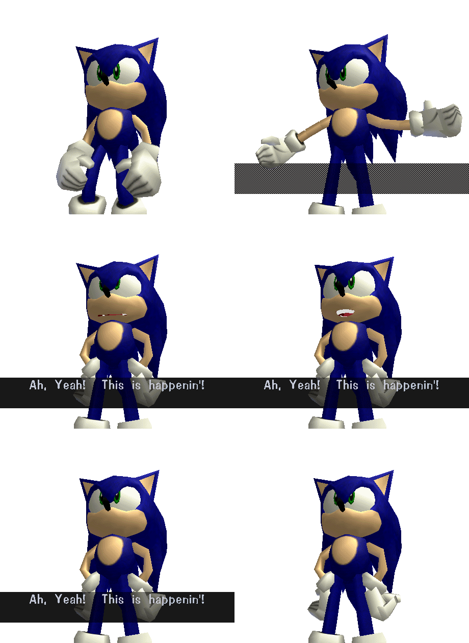
That’s because this render embodies Sonic character designer Yuji Uekawa’s design philosophy; he’s infamous for drawing and posing the characters with a graffiti ideology which helps tremendously in communicating constant movement.


- This pose was repurposed from Uekawa’s concept art for Sonic’s redesign; it ended up being used for Sonic R promotional material which predates Sonic Adventure’s official reveal (August 1998).


The pose is dynamic, communicating freedom of movement and agility in ways that his type of character design allows. What makes it even better is that Uekawa-san has drawn the pose:


This appears on SEGA’s official Twitter account.

10/10
 

OnyanRings

Smash Ace
Joined
Mar 11, 2019
Messages
711
Location
The Cale-Zone
Switch FC
SW-4662-0014-5533
Wether you hate him or love him, you can't deny that he has one of the best set of renders in the whole cast.

:sonic: : 9/10
Look at this cocky son of a gun, he's got that "They delayed the whole game just to include me, radical !" look.

:4sonic: : 8/10
Not as cheeky (and a bit creepy) but still very good.

:ultsonic: : 10/10
F A S T AS FLIPP
 
Last edited:

MacSmitty

Smash Journeyman
Joined
Aug 12, 2014
Messages
499
Location
Queens , New York
NNID
Seeker624
Switch FC
SW 1823 5909 5682
:sonic: 8/10
:4sonic: 7/10
:ultsonic: 10/10

I love Sonic's Ultimate render the most since it captivates his personality in all the right ways. And the art shown above makes me wish that Brawl newcomers got posters/artwork like Smash 4 did. It would've been pretty cool to see Yuji Uekawa draw Sonic going against Mario and the other fighters to an extent.
 

CallMeKnux

Smash Ace
Joined
Oct 24, 2018
Messages
933
Location
20,000 feet under the sea
Switch FC
SW-0424-3957-0991
:lucas:: 6/10, really boring but also has a very depressed face so at least it’s source accurate lmao
:4lucas:: 7/10, I’m not sure I get what it’s going for besides a basic telekinetic Silver the hedgehog ass pose, but whatever, cool enough
:ultlucas:: 9.5/10, ****ing perfecto. You got the Rope Snake, and you got this confused Lucas face that symbolizes the weird nature of his world and the demeanor/personality of Lucas, while having a pose that shows you that he can still probably kick your ass

:sonic:: 8.5/10, snarky, cocky, and just over all a classic Sonic render.
:4sonic:: 8/10, about what you’d expect. Pretty base line cocky arrogant Sonic render.
:ultsonic:: 10/10, ACTUALLY AMAZING. His pose is so lively and dynamic, it’s like Adventure style but it just gives off the kind of life that the godlike Sonic Mania animation given 3D modern life! And that smile, it shows his cockiness and prideful ness but also that “just here to have some fun” demeanor! It’s beautiful, beautiful! Mwah, mwah!
 
Last edited:

SUfan

Smash Rookie
Joined
Dec 22, 2018
Messages
20
:sonic:: 10 (Gives the perfect Sonic vibe)
:4sonic:: 8 (Still pretty good)
:ultsonic:: 10 (Even the Stock icon is a 10)

Top 5:
5. :ultganondorf:
4. :ultsonic:
3. :4kirby:
2. :ganondorfmelee:
1. :sonic:

Bottom 5:
5. :ivysaur:
4. :fox64:
3. :squirtle:
2. :dk64:
1. :4ganondorf:
 

NintendoKnight

Smash Lord
Joined
Oct 26, 2013
Messages
1,735
Location
Climbing the mountain I made from a molehill
NNID
Nin-Knight
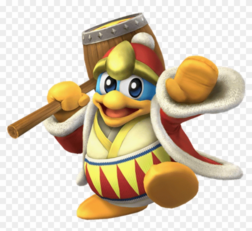
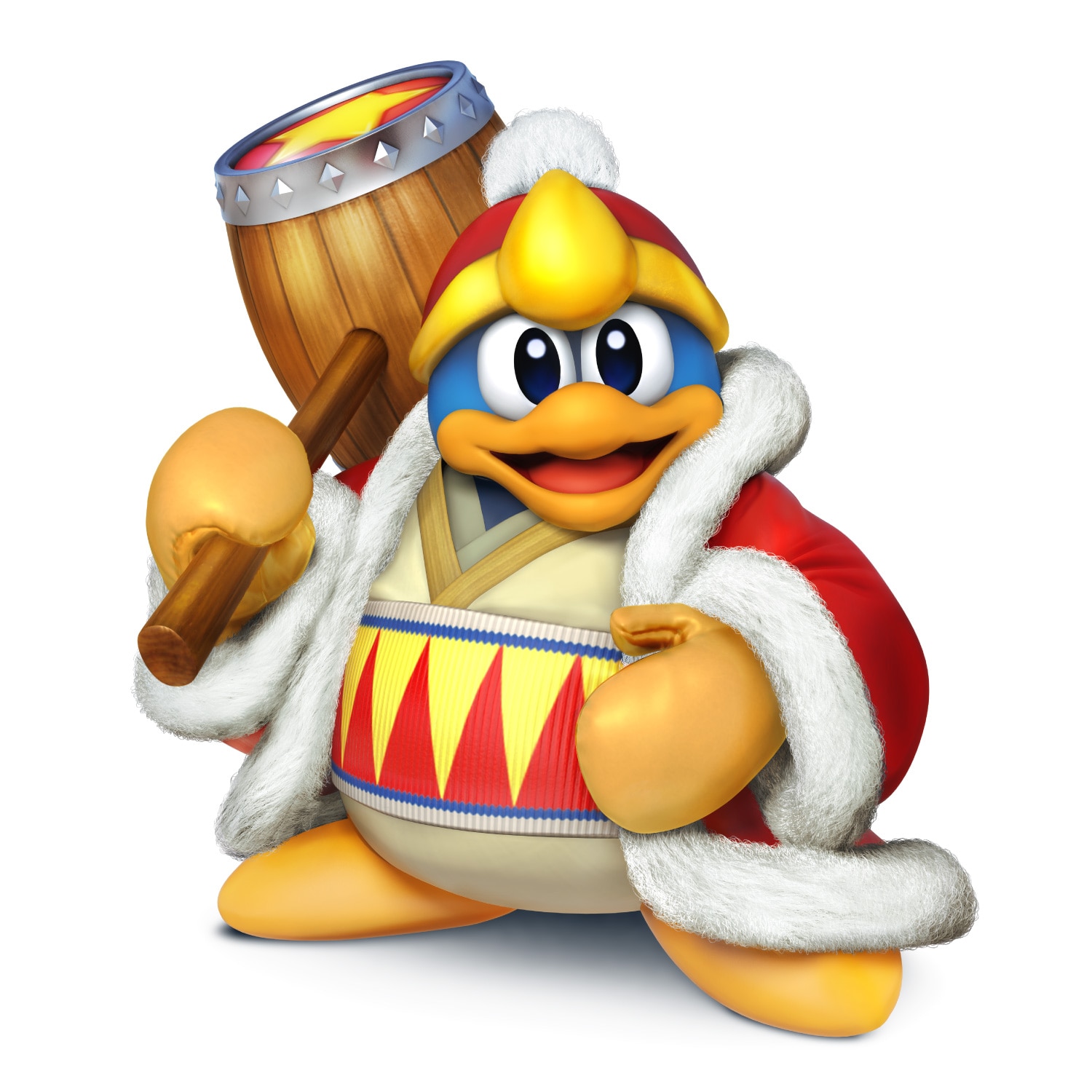
He's selfish and gluttonous, he's gotta clobber dat dare Kirby, and he's the self-proclaimed King of Dream Land: #39 King Dedede

Brawl: :dedede:

image link

Here we have D3 in an upbeat sort of, dynamic type of pose. He looks rather happy despite the Serious Brawlitis that infected much of the happier cast members. Though this is an interesting pose, something about it seems... I don't know, the only way I can describe it is that it seems... poorly composed?
6/10

Wii U/3DS: :4dedede:

image link

While I like this static pose a bit more, something else screams really awkward about this render. So it's a sort of trade-off where the pose becomes more relaxed and better fitting, yet there's some aspect to it that still feels off. I just can't place it.
6/10

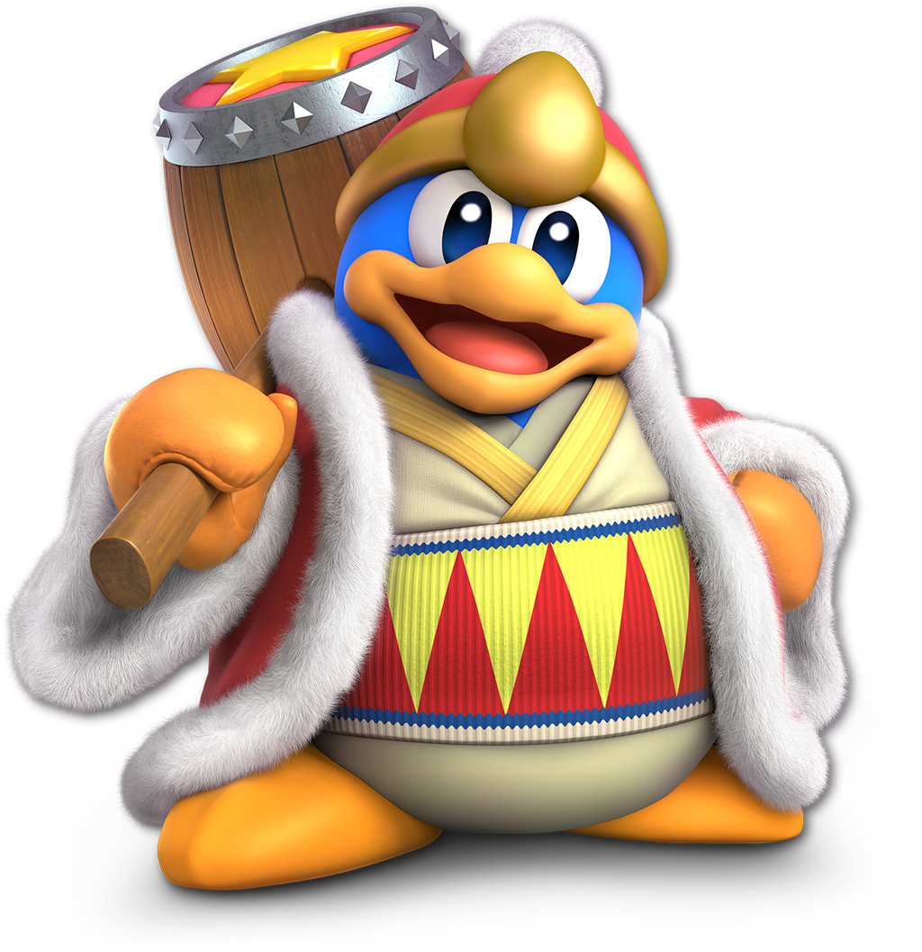
Ultimate: :ultkingdedede:

image link

Whatever strangeness the previous render had is straight up GONE here. The pose is relaxed, static, and really easy on the eyes. It really doesn't take very much to make Dedede look visually interesting since his design is very unique and visually distinct. The various amount of texture types on the model itself is pretty impressive. Wood, metal, 3-4 different types of cloth, fur, rubber, whatever the rim of his hat is made of, and of course his own body. Just standing there, all still and whatnot is all that's necessary. Also, the slight head tilt really sells it.
8.5/10

Greatest to Least: :ultkingdedede: > :4dedede: = :dedede:

What do you guys think of Dedede's renders?
 

OnyanRings

Smash Ace
Joined
Mar 11, 2019
Messages
711
Location
The Cale-Zone
Switch FC
SW-4662-0014-5533
King DaDleDingo :

:dedede:: 4/10
The pose is strange and those eyes... It's like they're piercing my very soul...

:4dedede: : 3/10
This one ain't better, i'd even say it's worse and please stop giving me that look..

:ultkingdedede: : 9/10
Now that's amore ! His expression and stance actually look friendly in this one, i just want to give him a big ol' hug <3
 

Mogisthelioma

Smash Master
Joined
Aug 24, 2018
Messages
3,596
Location
Ravnica
:dedede:: 7.5/10: He's doing a happy little dance. See? his one of his taunt animations.
:4dedede:: 8/10: This one is more relaxed but his eyes are staring into my soul.
:ultkingdedede:: 10/10: This one is great. He's relaxed, chill, letting his robes flow and fat gut stick out as he normally would.
 

Wunderwaft

Smash Master
Joined
Mar 21, 2019
Messages
3,498
DDD

:dedede:: 4/10
It's weird looking and a bit janky. Why is he making a weird pose like this?

:4dedede:: 7/10
Much better, but it's a little bit static and cold. It doesn't have much life to it and DDD just looks creepy as he's staring straight in front of him.

:ultkingdedede:: 9/10
Perfection! The pompous stance and pose, the way he looks downwards while holding his hammer! This is the DDD I know!
 

LoZ00

Smash Journeyman
Joined
Dec 11, 2015
Messages
359
Location
Italy
Let's keep going, shall we? Last time, we did the veterans up until Charizard, as well as the Pokémon Trainer. So now let's go on.

Diddy Kong
:diddy: 7/10: a solid render. It conveys the general idea of the character, being jolly and athletic, but it has nothing that really stands out. However, I like the fact that it looks like he's waving.
:4diddy: 9/10: a very, very great render for Diddy. Take everything I said for Brawl's iteration and crank it up to eleven. The best part has to be his left hand, which is used as a third foot. This is great since we can easily picture how dynamic Diddy is. This is dynamicity done right!
:ultdiddy: 8.5/10: not gonna lie, I do really like this render too. Once again, his left hand is the best part of the render: I especially love the way he holds his cap, with his middle finger flexed. It's very similar to his Brawl's render, but it's much better in every aspect.
Overall: :diddy:<:ultdiddy:<:4diddy:

Lucas
:lucas: 4/10: <<Hello human. I'm Lucas. I'm running. I'm fast. I'm alone.>> These are the vibes this render gives to me. It's so underwhelming, it's so basic. It's just a sad Lucas dashing.
:4lucas: 4.5/10: once again, very bad render. The only thing that makes this render better than the Brawl one, at least to me, is the fact that looks like a mirrored version of Ness's render in Smash 4. But this angry expression really doesn't suit Lucas at all.
:ultlucas: 3/10: a terrible render. I really dislike this one. Why did they add the Rope Snake? I'll go over the fact that it has nothing to do with Lucas in the first place (and so do his special moves), but don't make it such an important part of his character design that we see it in the render too. The best part about it is by far the expression, which is, for once, appropriate.
Overall: :ultlucas:<:lucas:<:4lucas: (as a side note, Lucas and Roy have an argument for the worst renders in the series, but I think I'll do a general review of the renders once we finish the series).

Sonic
:sonic: 8/10: a perfect render for perhaps the greatest character reveal in the entire Smash Bros. series. It shows Sonic's cocky attitude perfectly. The expression goes perfectly with the fact that the game was delayed because of him, almost as is he said: "They say better late than never, huh?".
:4sonic: 9/10: for some weird reasons, I love this render, despite my deep hatred for Sonic, inside and outside the Smash series. Maybe it's just because this is Sonic's only render where he runs, something he's been doing ever since he was released...
:ultsonic: 6/10: not a great fan of this one. It's too weird: the hands, the feet, everything about it is weird and situational. As a side note, his stock icon is unarguably the best one in Ultimate and possibly the best in the entire series, alongside Falcon's in Smash 64.
Overall: :ultsonic:<<:sonic:<:4sonic:

King Dedede
:dedede: 7.5/10: I like this render since Dedede is waving at his people like a true King, which he indeed is (I'm looking at you, Fake-King K. Rool [jk, I love you too, K. Rool]). Other than that, there's nothing too special about it.
:4dedede: 8/10: I think I like a more static render for Dedede a bit more. However, this one has such a weird face. I don't know why, but it looks a bit strange...
:ultkingdedede: 9/10: hail to the true king! Such a detailed render for such a glorious character! I've always loved King Dedede and this is by far his best render in any game, even outside Smash Bros., period.
Overall: :dedede:<:4dedede:<:ultkingdedede:
 

CallMeKnux

Smash Ace
Joined
Oct 24, 2018
Messages
933
Location
20,000 feet under the sea
Switch FC
SW-0424-3957-0991
:dedede:: 6.5/10 proud and flexing but kinda janky
:4dedede:: 5/10 pose is fine but it looks strange, especially his beak it looks like a Chuck E. Cheese animatronic
:ultkingdedede:: 9/10 proud, powerful, and ****ing godly. it’s the king of the show, that will holler and hoot, and that will give Kirby the boot
 

Necro'lic

Smash Ace
Joined
Aug 9, 2015
Messages
654
My fav smasher of the entire series!

Brawl <<<<<<<<<<< 4 <<<<<<<<<<<<< Ultimate

Ever since Smash 4 released, I've absolutely despised the dead eye stare Dedede has in Brawl everywhere outside of SSE cutscenes. And while 4 and Ultimate are technically the same sort of pose, the (for a lack of a better word) haughtiness of his Ultimate render with his hand on his hip and chest puffed out and less forward stare makes it miles better than 4's despite changing very little in dynamism.

All hail the King. :D
 

slamallama

Smash Journeyman
Joined
Oct 3, 2018
Messages
268
Location
the cold void of space
:dedede:5/10: It feels like the image is distorted. Maybe my eyes are playing tricks on me, but it seems like his head and eyes are just a tad too big. Other than that, a good render.

:4dedede: 3/10: Dedede is one of few characters who can pull off looking at the camera. However, his eyes AND his head are staring dead at the viewer here, which is a bit too far. The composition isn't very dynamic at all: the camera is level with him and no part of him is posed or angled interestingly. He looks robotic: the hammer isn't resting on his shoulder, rather hovering a bit above it, and I don't even know what his other hand it doing- if it's supposed to be patting that glorious tum-tum, it doesn't look active enough. His pose reminds of those lame kinds of actions figures who don't have articulated elbows and knees.

:ultkingdedede:10/10: Now that's looking better.
 
Last edited:
D

Deleted member

Guest
#1 :dedede: Love the happiness.
#2:4dedede: Quite boring, but it's grown on me.
#3:ultkingdedede: Decent, doesn't fit him too much.

#1:sonic: Perfectly fits his personality.
#2:4sonic:Basic, but goes with his speed.
#3:ultsonic:He looks stupid. And nothing about his pose says "Sonic" to me.
 
Last edited by a moderator:

NintendoKnight

Smash Lord
Joined
Oct 26, 2013
Messages
1,735
Location
Climbing the mountain I made from a molehill
NNID
Nin-Knight
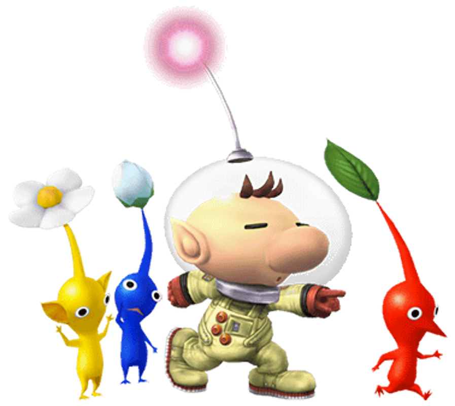
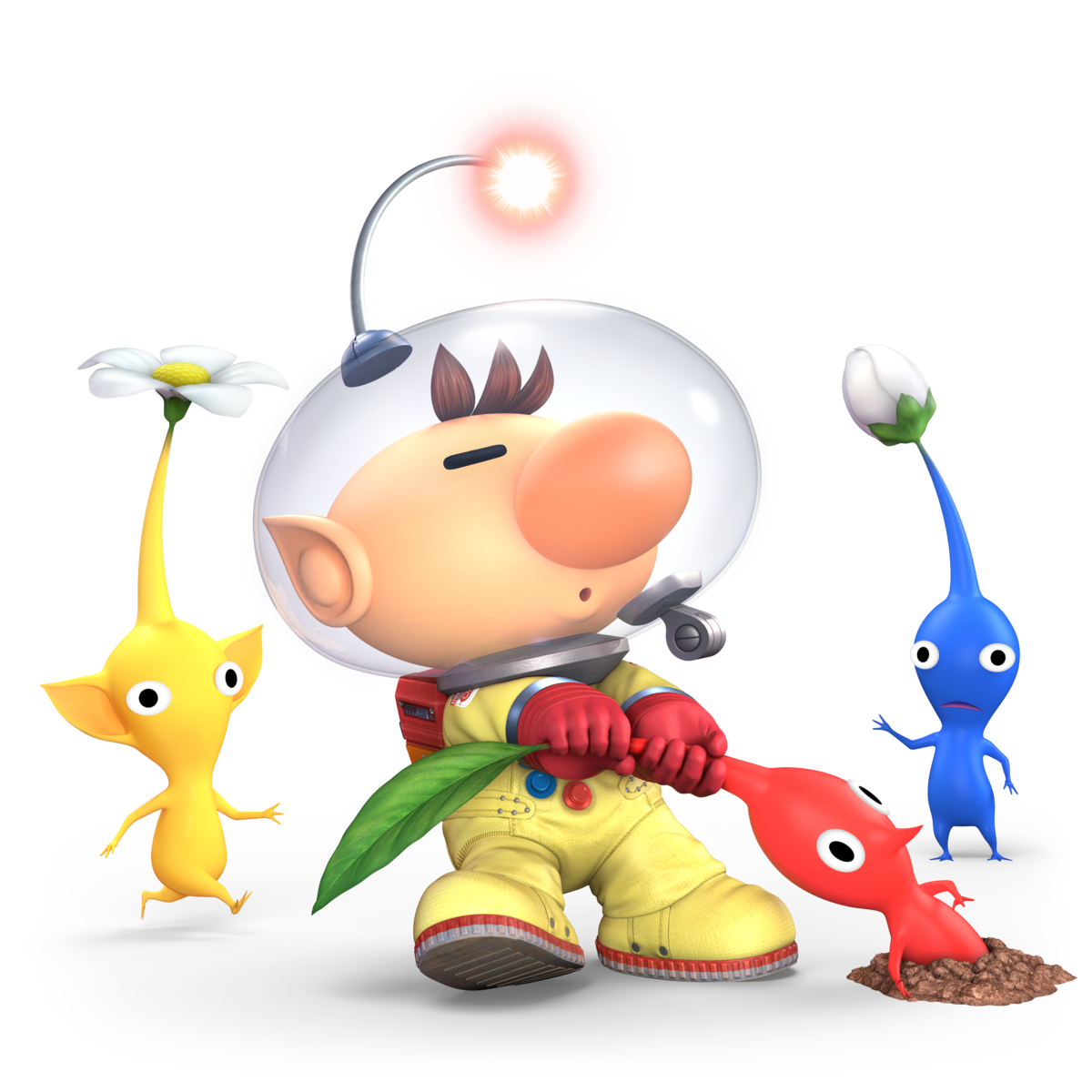
He's the Pikmin plucking space explorer, the scavenger of ship parts, and leader of an army of vegetable people: #40 Olimar

Brawl: :olimar:

image link

Here we have Olimar... and that's pretty much it. He's pointing forward and commanding his Pikmin. Personally, I view the character's overall design as somewhat weak, ad thus translates into most of his renders as very uninteresting. I'm sure this means a lot to Pikmin fans, but as someone who couldn't get into the games nor enjoy his design, I have to say this render isn't all that interesting.
4/10

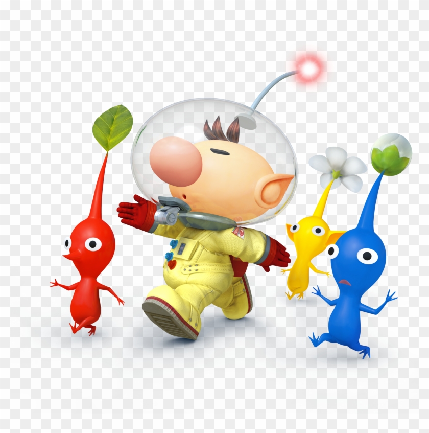
Wii U/3DS: :4olimar:

image link

This render is different enough from the other one to warrant comment, he's marching with the Pikmin beside him. as opposed to pointing them where to go. I think it's only slightly better than the other one.
4.5/10

Ultimate: :ultolimar:

image link

I actually like this one most of all his renders. For me, however, that doesn't say much as I don't really enjoy his renders all that much. But the render resembling a snapshot of Olimar being between Pikmin plucks is amusing in its own right.
5/10

Greatest to least: :ultolimar: > :4olimar: > :olimar:

All in all, I didn't really like Olimar's renders so much. No, I didn't include the Alph alt costume because literally nothing changed the renders.

What do you all think of Olimar's renders?
 
D

Deleted member

Guest
None of Olimar's renders are bad at all, I say SSB4, Ultimate, and then Brawl.
 

osby

Smash Obsessed
Joined
Apr 25, 2018
Messages
23,980
:olimar:>:ultolimar:>:4olimar:

Ultimate one is the most dynamic, but Brawl one gives the sense of commanding better. Smash 4 render is just kinda boring.
 

CallMeKnux

Smash Ace
Joined
Oct 24, 2018
Messages
933
Location
20,000 feet under the sea
Switch FC
SW-0424-3957-0991
Hard to rate these ones on an out of 10 basis. It’s Ultimate > Brawl > Sm4sh IMO, But all the renders are kinda low key. But at the same time, like, what would you do instead?
 
Top Bottom