• Welcome to Smashboards, the world's largest Super Smash Brothers community! Over 250,000 Smash Bros. fans from around the world have come to discuss these great games in over 19 million posts!

    You are currently viewing our boards as a visitor. Click here to sign up right now and start on your path in the Smash community!

Rate That Render! (Now Rating: #49 Little Mac)

Admiral Pit

Smash Hero
Joined
Feb 20, 2008
Messages
8,722
Location
Skyworld
NNID
GoldAngelPit
3DS FC
0903-2895-3694
Brawl :zerosuitsamus: 7.3/10
You know I never noticed that whimsical smile until it was pointed out... anyways, a fairly simple pose that works. Fairly decent for a 10-year old render, let alone this version of Samus is was uncommon.


Smash 4 :4zss: 8.5/10
She definitely has improved compared to what she looked like in Brawl, and that's not counting the jet boots, too! She seems more serious, and the post almost looks like she's going for a backwards kick with left foot like that, fitting with her jet boot. Pretty much everything about this Samus has an improvement, including her face, lips, the Zero Suit's new design and colors, the brace things next to her hands, the gun design looking more futuristic than basic, and well, them jet boots honestly are an improvement. Overall, pretty good.


Ultimate :ultzss: 10/10
Now we're talking! Just as Smash 4's render made improvements to make it better than Brawl's, Ultimate made further improvements to surpass smash 4's Let's start off by saying the pose looks amazing and serious, and she's pointing that gun in a way as if she's really meaning business. Next, look at that Zero Suit and its colors! Even smoother coloring than it once was, the dark blue colors are in a better dark blue, there's shiny coloring in a way that makes it seem like light is reflecting off the suit (some light actually does reflect off the suit in-game too actually), and the improved coloring and glowing on them jet boots. And let's not forget another important thing. She has muscles! You mostly notice it around the legs most definitely, and a little bit on the arms, but also slightly below the chest area. Basically you can see the shape of her body much easier, and as said before, them muscles, just as she had (I mean she is like around 190 pounds canonically without the suit, right?). Did I mention I love how the hair flows as well and how the gun looks even better than before?

To make it short, while Smash 4's render made Samus look better than the Brawl render, Ultimate's render made Samus look even greater than her Smash 4 self. You know, I'd be impressed if she looked like this canonically, including keeping them jet boots as enhancements.
 

NintenRob

Rising YouTuber
Writing Team
Joined
Feb 8, 2014
Messages
5,505
Location
Australia
NNID
trpdm.wilton
I'll be honest, I can't really see that smile in the Brawl render, but I do enjoy it.

Ultimate is again my favourite.
 

Mogisthelioma

Smash Master
Joined
Aug 24, 2018
Messages
3,596
Location
Ravnica
:zerosuitsamus:: 6/10: OK forgive me but she looks high as a kite.
:4zss:: 8/10: "Eww gross there's a bug on the floor kill it KILL IT!"
:ultzss:: 10/10: Subtle yet intense. I like it.
 

channel_KYX

Smash Apprentice
Joined
Jan 29, 2019
Messages
195
SSB4 is best, because it best shows her tendency for jumping around - general agility. 9/10
SSB5 is nice, good atmosphere, good hair render. Too much emphasis on boots. 8/10
SSB3 definitely one of the worst renders in the game, breaasts look detached, she has zero (see what I did there?) muscles, face looks like an awkward internship project. 2/10
 
Last edited:

CallMeKnux

Smash Ace
Joined
Oct 24, 2018
Messages
933
Location
20,000 feet under the sea
Switch FC
SW-0424-3957-0991
Brawl: 7.5/10, gives off that snap-your-neck-with-a-plasma-whip aura but doesn’t have much personality.
Wii U/3DS: 7.5/10, gives off the vibe that she’s about to search a planet to kill some ****in metroids but still not much personality. Also, Link, Fox, ZSS, Captain Falcon, and IIRC a few others all share this strange sideways dash/jump/aerial thing pose and I dunno why that was so consistently used.
Ultimate: 9/10, nothing too special but a big improvement over the previous renders, gives off that good ol’ tase-the-****-outta-yo-ass while also expressing Samus’s cold demeanor.

Nothing too special here but ZSS started out as half a character anyway so *shrug*
 
Last edited:

NintendoKnight

Smash Lord
Joined
Oct 26, 2013
Messages
1,735
Location
Climbing the mountain I made from a molehill
NNID
Nin-Knight
can't you do those quicker
While not the most polite way to ask that, I probably could. Though, you must be made aware that i'm also a person with obligations, responsibilities, college work, a job, and various things that take up much of my time during the week (in addition to just losing track of time entirely); and thus I can't make sure I'm always perfectly on time with these updates. I'm sorry that it's not to your liking, it's not to mine, either. But it is what it is.

For now, however:

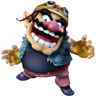
He's the greedy go-getter, the purse-snatching pile-driving pulverizer, the scoundrel with a fart of gold who got too lazy to go on actual treasure hunts and just makes video games with people who really should know better than to associate with him: #30 Wario

Brawl: :wario:

Image Link
HQ Image Link (Early Version)

Getting into it with Wario's render, I love how this render portrays him. There's just something about this pose, his arms out with his hands gesturing an unclear motive, his jaw agape as his eyes focus on you. It isn't clear if he's going to rob you, eat you, beat the crap out of you; his intentions are left very ambiguous. It's surprisingly menacing for a character whose motives are typically clearer than a bright, sunny day in the middle of Death Valley, California during the Summer. He isn't doing a well-known, familiar or any sort of "recognizably Wario" type of pose, which I remember being initially disappointed by when I first saw it all those years ago. That being said, hindsight is 20-20, and I now recognize this as a pretty decent pose.
8/10

Brawl: :warioc:

Image Link (GOOD GRIEF, finding a Smashboards compatible image of this alternate outfit was a pain)
Larger Image Link (Not HQ)

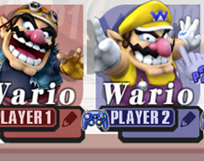
And then we have our first instance of an alternate costume with a unique pose attached to it. This is a direct reference to a Wario pose that I love in particular. it's so Wario Land 4. The arms out, the three fingers as a 'W'. It's a direct callout. As an alternate costume, this works really well.
9/10

Wii U/3DS: :4wario:

Image Link

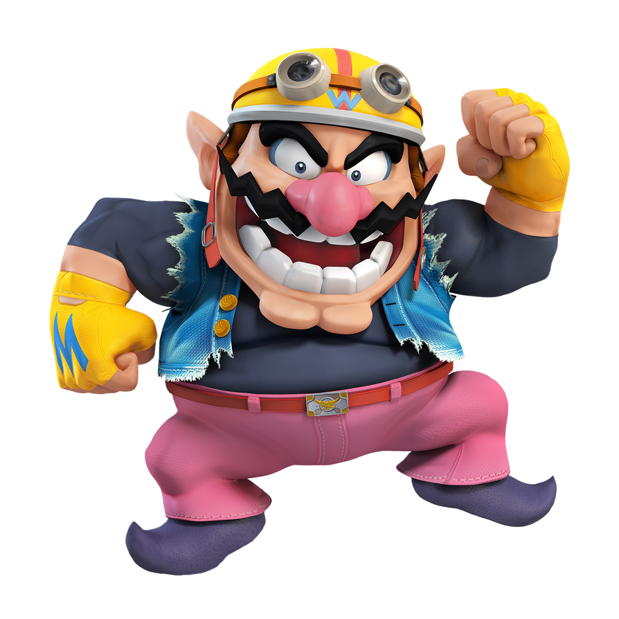
I'm just going to come out and say it: I actively dislike this pose. I think it's terrible and doesn't fit Wario whatsoever. Heck, it wouldn't fit Mario IMO. It's really weird and out of place. It's like he's copying a Mario jump but butchering it with poor positioning while trying to hold the pose for the camera. It just doesn't work. Even worse, the alternate outfit doesn't change the pose. Greatly missed opportunity.
3/10

Ultimate: :ultwario:

Image Link

"Hey, the render for Wario in Wii U and 3DS wasn't so great."
"Well, what do you propose we do for Ultimate?"
"... How about we just mix together both his renders from Brawl, give it a tweak or two, and call it a day?"
"You're a genius!"

And what an incredible mixture it is! It's practically both his Brawl renders in one! Heck, they even threw the Sm4sh render a bone by keeping the leg lift. He's flashing the W-fingers, he's got a WIDE open mouth again, with a really nice silhouette to boot. Unlike both his Brawl renders, though, his arms are very easily distinguished from the rest of his body. His alternate costume doesn't need a different pose as this one works well enough for both outfits. They really nailed the best of both worlds with this one!
9.5/10

Greatest to least: :ultwario: > :warioc: > :wario: > :4wario:

What do you all think of Wario's various poses?
 
Last edited:

TheTrueBrawler

Smash Demon
Joined
Jul 16, 2018
Messages
816
Location
Mystery
Zero Suit Samus's renders in order from best to worst:

Smash Ultimate
Smash Brawl
Smash 4
 
Last edited:

Sari

Editing Staff
Writing Team
Joined
Aug 3, 2014
Messages
4,439
Location
New Jersey
NNID
Villager49
Switch FC
SW-2215-0173-2152
:wario:: 8/10 A decent pose that kind of works with his biker outfit, not much else to say.
:warioc:: 9/10 A nice homage to one of Wario's artworks from Wario Land 4.
:4wario:: 5/10 I think they were trying to go for a Warioware-styled type of pose but it just looks really weird and doesn't really encompass Wario that good. This pose looks even worse on the overalls Wario.
:ultwario:: 9.5/10 So far Wario's poses seemed to work for either his biker or overalls alt but not both. Wario's Ultimate render works great for both outfits as it helps to show that this character is loud and greedy regardless of what he's wearing.
 

CallMeKnux

Smash Ace
Joined
Oct 24, 2018
Messages
933
Location
20,000 feet under the sea
Switch FC
SW-0424-3957-0991
Brawl: 8/10, very fitting for the more villainous role Wario takes in the Subspace Emissary. The pose legit gives me Darth Vader vibes.
Brawl (Alt): 8/10, I don’t like it as much because IMO Wario in his plumber outfit always looks kinda weird in renders to me, but it’s a good reference.
Sm4sh: 4/10 it’s boring
Ultimate: 10/10 its wario
 

channel_KYX

Smash Apprentice
Joined
Jan 29, 2019
Messages
195
I like all his renders to the same degree. Even the S4 one portraits him well. All of them are great in their own right. 9,5/10 for all
 

TreeChopperVillager

The Rubber Man Himself...
Joined
Mar 1, 2019
Messages
55
Location
Tokyo Japan
Switch FC
SW 1611 0712 3143
:wario:: 6.5/10. Could of done better.
:warioc:: 7/10. Slightly better then the last although I personally never played Wario games so maybe i'm missing a reference or something.
:4wario:: 5/10 Ew.
:ultwario:: 8.5/10. Probably the best one.
 

NintendoKnight

Smash Lord
Joined
Oct 26, 2013
Messages
1,735
Location
Climbing the mountain I made from a molehill
NNID
Nin-Knight
He's the infiltrator extraordinaire, the sneaking specialist, the legendary mercenary: #31 Snake

Brawl: (Early)

Image Link

Hey, do you all recognize THIS render? This is Snake's early announcement render! All the characters that debuted in Brawl's very first trailer all had early renders that were somewhat different from their final in-game renders. Out of all of them, Snake was the only one whose render actually changed drastically through development, aka, had different posing as opposed to model or lighting differences.

Getting right to it, if you've seen the character illustrations form the Metal Gear series you'd recognize that merely standing there, looking cool, is a Metal Gear tradition. However, this render is geared towards the heroic stand-off theme. There's clearly a foe in front of him, but the battle hasn't engaged yet. This is like a pre-fight render. It works well if you see it in that regard. It is rather static though.
7.2/10

Brawl: :snake:

Image Link

Now, on to the official and final Brawl render for Snake. This is him in battle-stance. There's a much different vibe to this one. He's engaged in combat, but hasn't acted yet. Most likely to anticipate his opponents moves. It's static like the previous one, but has a more dynamic feel in regards to combat. However, he's glaring DEAD AT THE CAMERA. Are WE the ones he's fighting?! This normally isn't an issue with an other renders, but even his entire posture is focused towards the viewer. I'm sure there's some sort of filmmaking or compositional rule he's breaking here. I do like the silhouette much more in this pose, though.
7.8/10

Ultimate: :ultsnake:

Image Link

And now we have our Ultimate render which puts Snake in a much more dynamic and distinct pose that he definitely is known for going into. He's in his stalking stance, with an arm rested on his leg with the other hand accessing his Codec. The overall shape of this render is fantastic. I love how even the ripples and folds of his suit are visible from the silhouette. I also like how it's been clarified that his knee caps are covered by protruding pads. In Brawl you could sorta tell they were knee pads, but here it's super clear what they are. Also love the visible muscle on his left arm; the shape is excellent. Points are lost, however, for his right hand doesn't have his fingers directly on his ear for the codec.
8.9/10

Greatest to least: :ultsnake: > :snake: > (Early)

What do you guys think of Snake's renders? Are they Solid enough for you? Or do they grind your metal gears?
 

TreeChopperVillager

The Rubber Man Himself...
Joined
Mar 1, 2019
Messages
55
Location
Tokyo Japan
Switch FC
SW 1611 0712 3143
That's what he looked like in the earlier jump n run games.
Oh.

And for snake:

:snake: ( Early ) 6/10. Never played a metal gear game but it doesn't look as awesome as the other poses. It looks like he's looking at some hot girl lol.
:snake:: 8.5/10. Pretty good. Not much to say about it though other then that.
:ultsnake:: 9.5/10. Now, is it just me or is that a more metal gear pose. Yes, I know I said I never played a metal gear game but that's what a pose in those games looks like. Or at least i can assume.
 

Idon

Smash Legend
Joined
May 24, 2018
Messages
17,715
Location
Waxing Moon Ritual
NNID
Miyamoto Iori
Switch FC
SW-4826-9581-3305
that a more metal gear pose. Yes, I know I said I never played a metal gear game but that's what a pose in those games looks like. Or at least i can assume.
It absolutely is. The pose where he's crouched over, arm on knee, with his other arm touched to his earbud is the pose he takes when he's making a codec call.
 

CallMeKnux

Smash Ace
Joined
Oct 24, 2018
Messages
933
Location
20,000 feet under the sea
Switch FC
SW-0424-3957-0991
Early: 7.5/10, kinda boring but looks right out of Metal Gear.
Brawl: 3/10, dog ****. Doesn’t look like a Snake battle pose at all, it doesn’t fit him, and is boring. Looks a lot more like he’s about to get into a street fight than, you know, espionage or a stealth mission. Also all the wrinkles on his suit make him look bulimic
Ultimate: 8.5/10, not much to say but it fits Snake very well.
 
Last edited:

slamallama

Smash Journeyman
Joined
Oct 3, 2018
Messages
268
Location
the cold void of space
Early: 7/10, all-around just a solid render and not much more (pun not intended)
Brawl: 5/10, not too different from the early render, and not incredibly interesting, and the way he's staring right at the viewer with that glazed look in his eyes is super uncomfy
Ultimate: 7.9/10, very dynamic, more interesting, looks like he's actively engaged in an infiltration. But... what's he doing with his hand? He's clearly not wearing any earpiece. Not sure why the render is calling attention to something that isn't even there.
 
Last edited:

MarioMeteor

Smash Hero
Joined
Nov 27, 2014
Messages
8,340
Location
New Orleans
NNID
BGenius23
3DS FC
0662-2900-1492
Ultimate: 7.9/10, very dynamic, more interesting, looks like he's actively engaged in an infiltration. But... what's he doing with his hand? He's clearly not wearing any earpiece. Not sure why the render is calling attention to something that isn't even there.
He’s using the codec, which isn’t visible. It’s nanomachines that are activated by touching the ear area, and on this note...
Points are lost, however, for his right hand doesn't have his fingers directly on his ear for the codec.
The placement of the fingers are accurate. Snake has never put his fingers directly on his ear for the codec. I would subtract points for the weird halfway-crouch he’s doing, though, because Snake has never done that. In the games, he takes a knee whenever he’s talking to someone on the codec.
 

NintenRob

Rising YouTuber
Writing Team
Joined
Feb 8, 2014
Messages
5,505
Location
Australia
NNID
trpdm.wilton
I'm gonna give praise to Snake's flowing Bandana. It's probably the least changed part of each render though
 

NintendoKnight

Smash Lord
Joined
Oct 26, 2013
Messages
1,735
Location
Climbing the mountain I made from a molehill
NNID
Nin-Knight
He's the Radiant Hero of Legend, the one who walks the path of the Blue Flame, and leads the Greil Mercenaries: #32 Ike

Brawl: :ike:

Image Link

Starting off with Ike, who very quickly rose through the ranks as of my favorite all-time game characters, we have his Brawl render. He's kinda got this Cloud Strife vibe in his battle stance. I really like the emphasis on the sword here, it looks like a pretty chunky weapon. It's a bit static of a render: there's almost no flow to the cape, yet the bandana tails disagree and flow in the opposite direction of the cape's lean...weird. Either way, I like the focus of this render.
7/10

Wii U/3DS: :4myfriends:

Image Link

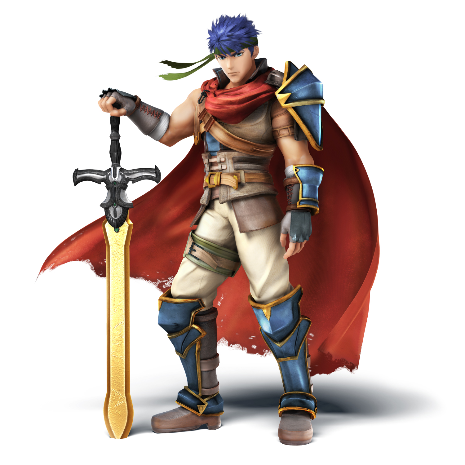
Pure gold thy name is Ragnell! This is hands-down one of my personal favorite renders in the entire Smash series. Loving the confidence in his stance. Seeing the sheer difference between Ike's two designs really sells this render for me" he started out lean, with that anime-bishounen style of appearance, but then suddenly builds the muscle and shapes up into this beefcake of a man who stands triumphantly with his hand rested on the blade stuck in the ground. He may be posing for the camera, but it's so Ike it works. Ironically, the sword is less focused on and less "huge-looking" in this render, but in contrast Ike himself looks bigger.
10/10

Ultimate: :ultike:

Image Link

Image Link

Honestly, the only difference between the two renders is the direction Ike's eyes looking, which I don't think is enough to warrant a separate rating. I still prefer this design, however, and thus prefer this render overall.

This render shows Ike in the middle of combat. In fact, you can find this exact pose in-game too. So it's not an unused pose here as it has a basis during gameplay. It's almost a more battle-ready version of Ike's idle stance over the years. It's a pretty solid pose, and the flow works real well. It also offers a nice comparison picture for both of Ike's designs and how he changed between his games. The greatest thing they offered Ike was being able to choose between the two designs, as there were plenty of people who liked Ike's original design more.
8.6/10

Greatest to Least: :4myfriends: > :ultike: > :ike:

Ike's had pretty solid renders over the years. I do not see the Ultimate render as his absolute best render, but it's still good.

What do you guys think of Ike's renders over the years?
 
Last edited:

CallMeKnux

Smash Ace
Joined
Oct 24, 2018
Messages
933
Location
20,000 feet under the sea
Switch FC
SW-0424-3957-0991
:ike:: 8/10. I really like the coloring on Ike here. The colors really pop ad that causes it to look a lot like a real Fire Emblem render. The actual pose is aight tho.
:4myfriends:: 9/10. He’s swole af now and he’s showing it. Look at this big man boy
:ultike:: 9/10. I love the details on him, it makes the pose look damn sexy and all around compliments the render a lot. I’d say I personally like this one a whole lot better than Sm4sh but objectively I have to put them on the same tier. The alt for Radiant Dawn honestly looks a bit odd tho. Idk why but i’d honestly drop that one down to an 8.5.
 

WiserThanYou

Smash Apprentice
Joined
Oct 28, 2015
Messages
78
Location
Australia
:ike:: 8/10. Brawl's overall aesthetic fits Ike really well, and the pose really expresses his more brutish fighting style compared to other sword fighters.
:4myfriends:: 9/10. RD Ike is a whole lotta man, and when I first saw this render I fell in love with him. Calm but fierce.
:ultike:: 7.5/10. Not bad at all, but the pose fits PoR Ike more imo. Regardless it captures Ike's character pretty well.
 
D

Deleted member

Guest
#1:4feroy: Pretty much the exact same as Melee, the new design puts it up.
#2:roymelee: Basic, but it works.
#3:ultroy: Would be above the other two if not for the way he's holding the sword, which makes him look like a complete idiot.

#1:4mewtwo: Perfectly fits him. Like he's releasing mind power at you. Perfect.
#2 :ultmewtwo: Not bad, would just look so much better on a different Pokemon.
#3:mewtwomelee:Why isn't he looking at the camera? And why is he so anorexic and "twisty"?

#1:4myfriends:: I feel it just fits him as it displays he's a heavy hitter. Also his best taunt
#2:ike:: Showing off his sword. Shows his brutish personality. Also one of his taunts.
#3:ultike:: Nothing about this pose says Ike IUAM. Would look good on Roy, tho.

#1:ultsnake: Not the coolest, but he looks like he's actually in the middle of a battle which is great.
#2:snake:He just.....stands there.

#1:sonic:Fits him the best and forever will fit him the best.
#2:4sonic:Pretty boring, but displays his speediness.
#3:ultsonic:I can't even put in words how stupid he looks.

#1 :wario: Perfectly displays his evilness.
#2:4wario2: He's flexing his muscles and you can see the disgustingness in him.
#3:ultwario: Wario ditches all his evil and becomes a bland happy go lucky rival. Yuck.
#4:warioc: Nothing about this pose says Wario at all. It would look much better if he wasn't holding out a Peace sign, or whatever that is.

#1:4zss:Just. Perfect. the knee bent, her gun aside, awesome.
#2:zerosuitsamus:Not too cool, but at least she displays her athleticism.
#3 :ultzss:"wAtCh OuT, I hAvE a Gun" Ugh.
 
Last edited by a moderator:

DelugeFGC

Smash Stick Space Cowboy
Joined
Jan 30, 2019
Messages
737
Location
Tennessee (US)
Switch FC
SW-2582-1162-1537
I wasn't a huge fan of Ike's look in Brawl and 4, it looked a little too generic and like the designers just designed him and his renders to look like a single picture they found from Radiant Dawn.

In Ult, however.. especially with both RD / PoR skins being available.. and that render? Ike is fantastic looking, easily my favorite FE character both in Smash and out, so it's good to see him done right.

Brawl Ike: 6/10

4 Ike: 7/10

Ult Ike: 9.5/10
 

TreeChopperVillager

The Rubber Man Himself...
Joined
Mar 1, 2019
Messages
55
Location
Tokyo Japan
Switch FC
SW 1611 0712 3143
:ike: 7/10: Nostalgia reasons some of you might not understand.
:4myfriends: 8/10: I think this pose is a bit overrated but its good.
:ultike: 5/10: Not a fan of this pose. Looks badass, i guess but it doesn't look that good.
 

The DanMan051

Banned via Warnings
Joined
Aug 18, 2018
Messages
681
Ah, so Ike is only the 312th character-- so does this mean Ultimate has 741 characters?

Anyways:

:ike:: 7.5/10, simple and clean is the way to go (though his face does kinda look dead). The way his cape looks here is really nice.
:4myfriends:: I'll admit, I'm not a big fan of his bulkier look from RD, so I think this render gets a 6/10.
:ultike:: Looking at this now I realized why Ike looks off in Ultimate; in Brawl and his PoR art, his tunic is dark blue veering towards purple almost (as is his hair). His Ultimate render, however, kinda screws that up-- his tunic is a dark teal with his hair also changing colors to a different shade of blue from either of his two designs. On top of all this, his boots got simplified-- with the reddish-brown parts from his Brawl render and PoR design just becoming brown leather like everything else. Couple that with the distracting cape, I want to give this render a 4.5/10.
 
Last edited:

slamallama

Smash Journeyman
Joined
Oct 3, 2018
Messages
268
Location
the cold void of space
:ike:6/10: Not bad, not great. Looks battle-ready but calm, as Ike should, but other than that, not much to say about it.

:4myfriends:9.5/10: Great design coupled with a very characteristic pose make this my personal favorite render for Ike. High color contrast helps beautifully, showing off all the little scratches on his armor and drawing out Ragnell's gold sheen. +0.5 for making such a great silhouette too, it shows off all the necessary details- buff, huge sword, vambrace, hairstyle, bandana- even as just a shadow.

:ultike: 4.5/10: Something about this pose rubs me the wrong way, which makes very little sense since it's almost exactly his idle stance from the last two games, but slightly more active and flowy. Maybe it just looks odd as a freeze-frame. I know I said Ike is a pretty calm guy, but his face here doesn't really look calm... more just blank. His beefcake render fixes that a bit with his eyes looking off to the side, but it still looks kinda strange to me.
 
Last edited:
Top Bottom