• Welcome to Smashboards, the world's largest Super Smash Brothers community! Over 250,000 Smash Bros. fans from around the world have come to discuss these great games in over 19 million posts!

    You are currently viewing our boards as a visitor. Click here to sign up right now and start on your path in the Smash community!

Rate That Render! (Now Rating: #49 Little Mac)

Luigifan18

Smash Master
Joined
Feb 19, 2015
Messages
3,134
Switch FC
SW-5577-0969-0868
how come I wasn't getting notified I'm sure I had watch thread on
You can only get a notification if you've opened the latest page of the thread since the last notification you've received.
 

NintendoKnight

Smash Lord
Joined
Oct 26, 2013
Messages
1,735
Location
Climbing the mountain I made from a molehill
NNID
Nin-Knight
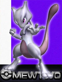
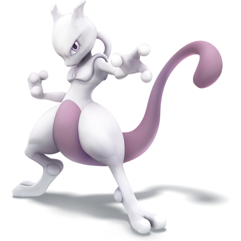
He's the genetic clone of Mew, the most savage-hearted of all Pokemon, and one of the most powerful beings in the Pokemon Universe: #24 Mewtwo

Melee: :mewtwomelee:

Image Link

Here we have Mewtwo's first render. Pretty decent for the undisputed coolest character in the game. Ironically, this style of posing is going to be consistent with Mewtwo no matter what media he appears in. Be it Pokemon or Smash this'll be his pose, or at least close to it. Though points are deducted for a couple reasons: one, he's not looking at the camera which denies us the strength of a menacing glare. Two, we can't see his left arm so clearly as his hand is blocking a good portion of it. Three, it generally just hasn't aged well; perhaps the model has something to do with it?
5/10

Character Select Screen Portrait: CSSP

Image Link

Woah, what the heck is going on with his hand?! And his tail is blending in with his arm to make it look like the arm of a Dragon Ball Namekian! What is going on here?! Though a good portion of the render is cutoff, what we do see of this pose is bland and really awkward.
3/10
Wii U/3DS: :4mewtwo:

Image Link

Mewtwo strikes back after being gone in Brawl, but makes his return from Melee as the first ever Smash DLC character. He jumps in by... reusing his Melee pose. However, it brings new life into the pose and makes it great again. Being refreshed with Mewtwo's modern design, you can see every part of him that the designers wanted to make visible. Two immediately noticeable improvements are the curvature of the tail, and where his eyes are looking. Other than that, this render of Mewtwo actually looks like he's comfortable with the position he holds, as opposed to looking like he's suffering as he stretches into a difficult position.
8.8/10

Ultimate: :ultmewtwo:

Image Link

My goodness, this render looks so CLEAN. Look how shiny his skin is! Hilariously, this resembles the Wii U/3DS render, except if Mewtwo was told to turn and show us his "good side." His hands are even in similar poses despite his full-body rotation: the right hand is more clenched, while the left hand is open. His tail even curves the same. Though I do appreciate the fact that he's no longer tilting his head downward, which means we can see both shoulders clearly. But more interesting than that is the coloring of this render matches closer to that of the Melee renders; neat. Personally I like the Wii U/3DS render slightly more, but I do feel that this one is the better of the two.
8.9/10

Greatest to Least: :ultmewtwo: > :4mewtwo: > :mewtwomelee: > CSSP

And that's it for Mewtwo! I can't believe we're almost done with the Melee vets! Just one left before we hit the Brawl veterans!

Now, what do you guys think of the (REALLY SIMILAR) posing of our favorite genetic-experiment gone awry?
 

Mogisthelioma

Smash Master
Joined
Aug 24, 2018
Messages
3,596
Location
Ravnica
:mewtwomelee:: 4/10: Yeah neither of his Melee renders were done well.
:4mewtwo:: 9/10: This one is excellent and really captures Mewtwo's form.
:ultmewtwo:: 10/10: Although almost just a reverse of Smash 4 Mewtwo, it's done a bit better and looks more cold-hearted than Smash 4.
 

Porygon2

Smash Journeyman
Joined
Sep 2, 2014
Messages
225
:mewtwomelee:: 4/10: Proportions are off. Big-headed Mewtwo looked great in the games / TGC, not so much in most 3D renders. Looks like they didn't quite know how to handle the paws/hands.
:4mewtwo:: 7/10: Nice. I like that it's basically an update of the first with a tail that looks more like an extension of his body. Can't really picture this incarnation doing that "shaking with rage" victory screen animation, though. Would generally prefer unfeeling malice over the standard anti-hero scowl, and the lighting is quite flat. As with a lot of Pokemon the artist probably couldn't decide what his skin texture is supposed to be.
:ultmewtwo:: 9/10: Cool mage-like flow in the arms/wrists and relatively dynamic stance. The posing could again give more of an impression of his character, but this is likely a result of Mewtwo no longer being marketed/seen as as "evil". Still, I feel like floating would really make him pop and give off that "superior" vibe. Committed to "dolphin skin" texture and it looks great.
 

VexTheHex

Smash Ace
Joined
Mar 30, 2018
Messages
567
Looks like I got a differing opinion on this lot.

:mewtwomelee: - 2/10 - Well he does look like an abomination here. Proportions are off, looks pretty bad.
:4mewtwo: - 5/10 - Proportions are better, but it's boring.
:ultmewtwo: - 5.5/10 - Eyes look better and nice smooth skin, but it's just the other one flipped. Boring.

Mewtwo's renders suck. No floating, psychic powers, or anything showcased in them. They are boring and one note.
 
Last edited:

Penroze

The Surreal Deal
Joined
Oct 6, 2018
Messages
370
Location
Flat Zone X
Switch FC
SW-7239-4479-0495
:mewtwomelee: - 4/10 It looks pretty gross, but it's an okay pose. He's ready for Melee, I guess. Even though he's F tier.
CSSP - 2/10 This ***** just looks like he's wavin. Happy little ****.
:4mewtwo: - 5/10 Pretty much the same as the Melee render, but shinier.
:ultmewtwo: - 6/10 Pretty much the same as the Smash 4 render, but shinier.

:ultmewtwo:>:4mewtwo:>:mewtwomelee:>>CSSP

Overall, a pretty boring set.

(By the way, I don't believe we have one more to go before the Brawl vets. Don't we still have Roy and G&W?)
 
Last edited:

Sari

Editing Staff
Writing Team
Joined
Aug 3, 2014
Messages
4,439
Location
New Jersey
NNID
Villager49
Switch FC
SW-2215-0173-2152
:mewtwomelee:: 5/10 Alright pose but it looks like he's staring at the ground. Also the tail looks really awkward; I think it'd be better if it was more curled like in the later pics.
:mewtwomelee: (CSSP): 4/10 I can't tell if he's waving or trying to close his hand. Everything about this portrait feels off.
:4mewtwo:: 9/10 I love the more expressive pose and his angry expression helps capture the animosity Mewtwo feels towards humans. It's far from an evil look but it's the type of face that says "don't mess with me or I'll destroy you" which fits Mewtwo very well.
:ultmewtwo:: 8/10 Basically the same as the SSB4 one but he seems much calmer and as a result less expressive.

Overall: :4mewtwo:>:ultmewtwo:>:mewtwomelee:>:mewtwomelee:(CSSP)
 

Alternis

Ignore the user in front of you
Joined
May 28, 2018
Messages
1,304
Location
Tartarus
NNID
GeneralO
Switch FC
SW-1137-6792-9994
:mewtwomelee:: 8/10 - I really like this pose. It's feels threatening, as it should. It's only brought down by Melee's unfortunate design for Mewtwo.
:4mewtwo:: 10/10 - And now that we have the great new model and design, this pose comes to life!
:ultmewtwo:: 7/10 - This is a nice render, but somehow I very much dislike this pose relative to the others.
 

Quetzal77

Smash Journeyman
Joined
Sep 6, 2014
Messages
300
NNID
yomugo
3DS FC
1349-4940-0147
:ultmewtwo:: slightly better than Smash 4, he just looks a bit more natural.
:4mewtwo:: looks menacing and the proportions have been improved from Melee, but he looks a bit uncomfortable still.
:mewtwomelee:: looks a little frail and the model hasn't aged well.
 

NintendoKnight

Smash Lord
Joined
Oct 26, 2013
Messages
1,735
Location
Climbing the mountain I made from a molehill
NNID
Nin-Knight
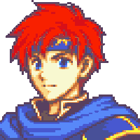
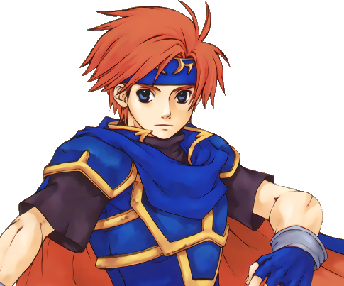
He's the wielder of the Binding Blade, son of Eliwood (and part dragon if his mother is Ninian), the Young Lion : #25 Roy

Melee: :roymelee:

Image Link

Similar to Marth, Roy makes the jump into Smash with a simple pose. However, it is really well constructed despite its simplicity. I like the right hand resting on the hilt of the sword. I also like how the sheath jets out from Roy's left. It's a nice pose, I tell you what.
7/10

Character Select Screen Portrait: CSSP

Image Link

Yes, Roy is in a different pose in the CSSP, although only slightly different from his normal pose. He's leaned back a bit, his left hand is out moe, and his right leg is raised a touch. I wish we could see more of what's hidden here, I'm sure it would be interesting to see.
7.2/10

Wii U/3DS: :4feroy:

image link

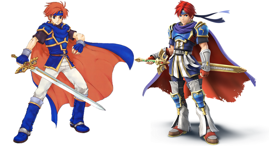
For those of who are are terminally unaware or have lived under a rock, I'm here to inform you that Roy's Sm4sh render is posed exactly the same as his Melee render. Now, it was pretty clear why they did it, because they revealed why as they announced that Roy would be DLC. They did a comparison picture of his old render and his new render to show off the differences in his character design. It was strictly kept consistent for comparison purposes! Looks Like Sakurai was doing my job before me. Though, the cape flow is nicer in this one.
7.2/10

Ultimate: :ultroy:

Image Link

Overall, this render is fantastic! It has motion and movement to it with a feel of forward progression. Personally, I like being able to see the fully-exposed Binding Blade, not just the sword as hidden within its sheath. I think it looks really good.
8.7/10

Greatest to Least: :ultroy: > :4feroy: = CSSP > :roymelee:

And that's Roy... our boy.

What do you think of his renders? Not much difference, I know. But it's interesting to see the differences.
 

TheTrueBrawler

Smash Demon
Joined
Jul 16, 2018
Messages
816
Location
Mystery
Roy's renders in order from best to worst:

Smash Ultimate
Smash Melee and 4

I grouped Smash Melee and Smash 4 together because they're just too similar.
If a fighter's design factors into which is better, then Melee would be more favorable.
 
Last edited:

Mogisthelioma

Smash Master
Joined
Aug 24, 2018
Messages
3,596
Location
Ravnica
:roymelee:: 3/10: Uhhh........ he looks like he just got a bug bite but he's too embarrassed to itch it so he just glares at everyone who notices.
:4feroy:: 5/10: This is literally just his Melee render. At least it's in HD.
:ultroy:: 8/10: Normally tis would be a 6 or 7 out of ten at best but I had to give bonus point because of the way he holds his sword. he's holding it in the correct position to hit where the hilt is, specifically where the sweetspot is in-game. But other than that this render didn't interest me too much.
 

CardiganBoy

Smash Lord
Joined
Aug 11, 2013
Messages
1,758
Location
Naked in Magicant
:roymelee:: 7/10: Pretty good, this pose is the same as his sprite in FE Binding Blade, but that game came after Melee, that's interesting. It's simple but i gives him a more stoic look yet relaxed.
:4feroy:: 7/10: Again pretty much the same but with his new design.
:ultroy:: 8/10: I like the sense of movement and the reverse sword grip let's you know his play style is more agressive.
 

Vic Viper [FR]

Smash Rookie
Joined
Jan 13, 2019
Messages
13
:roymelee: 8/10: Great render only pulled back by the visual limitations of the time.

:ultroy: and:4feroy: 6.5/10: Both renders look great, and I like both poses for different reasons... but - 2 points for one simple thing. (otherwise it'd be at 8.5)

Roy looks older than he should be. He's 15 in his game. It always irks me when I see his face in Ultimate.
The problem might be because in 3D every character looks older than they should, but Melee actually got that right (somewhat), so I really don't know. Maybe it's the eyes? Eyebrows? His expression?


Last edited:

Oddball

Smash Lord
Joined
Oct 1, 2016
Messages
1,808
Melee: :roymelee:
Simple, but very effective at showing personality. The casual lean with a sword almost but not quite at the ready gives a good impression of the youthful brash hero.


Character Select Screen Portrait: CSSP
It looks like somebody just took his melee pose and started to tip him over. He's almost doing something but not quite.


Wii U/3DS: :4feroy:
Roy's bulked up and added a lot of accessories to his look, but it really did him no favors. With all the detail, the pose itself is downplayed and the added bulk really takes away from the youthful attitude the melee pose had. This is a nice example of over detailing an outfit.

Also the leg things he wears look really stupid.


Ultimate::ultroy:

Still the same overly designed outfit, which is bad, expecially the leg things. The bulk is toned down some but he still doesn't have the thinness of his melee self. The pose itself feels good but rather generic.
 

Opossum

Thread Title Changer
BRoomer
Joined
Aug 10, 2011
Messages
33,987
Location
This Thread
NNID
OpossumGuy
3DS FC
4742-4911-3431
Switch FC
SW 2859 6322 5208
Melee: :roymelee:
Simple, but very effective at showing personality. The casual lean with a sword almost but not quite at the ready gives a good impression of the youthful brash hero.


Character Select Screen Portrait: CSSP
It looks like somebody just took his melee pose and started to tip him over. He's almost doing something but not quite.


Wii U/3DS: :4feroy:
Roy's bulked up and added a lot of accessories to his look, but it really did him no favors. With all the detail, the pose itself is downplayed and the added bulk really takes away from the youthful attitude the melee pose had. This is a nice example of over detailing an outfit.

Also the leg things he wears look really stupid.


Ultimate::ultroy:

Still the same overly designed outfit, which is bad, expecially the leg things. The bulk is toned down some but he still doesn't have the thinness of his melee self. The pose itself feels good but rather generic.
I don't think he's over-designed, really. Only thing slightly weird is the choice to go with bell-bottoms over traditional greaves, but other than that there's not a lot to complain about.
 

Vic Viper [FR]

Smash Rookie
Joined
Jan 13, 2019
Messages
13
I don't think he's over-designed, really. Only thing slightly weird is the choice to go with bell-bottoms over traditional greaves, but other than that there's not a lot to complain about.
And it's weird, cause I have no idea where that new design comes from.
Cause if you try to compare the two, there's a TON added on the Smash 4 & Ultimate version.


Granted, I haven't played much of Binding Blade (only one playthrough till, Chapter 21) but I know Roy's promotion doesn't change his clothes and overall sprite (except for the sword).


My best guess is that they attempted to "modernize" the design, and it all came with extra pointless **** to look cool.
I actually much prefer the original clothing design, it looks way less busy.
 
Last edited:

Opossum

Thread Title Changer
BRoomer
Joined
Aug 10, 2011
Messages
33,987
Location
This Thread
NNID
OpossumGuy
3DS FC
4742-4911-3431
Switch FC
SW 2859 6322 5208
And it's weird, cause I have no idea where that new design comes from.
Cause if you try to compare the two, there's a TON added on the Smash 4 & Ultimate version.


Granted, I haven't played much of Binding Blade (only one playthrough till, Chapter 21) but I know Roy's promotion doesn't change his clothes and overall sprite (except for the sword).


My best guess is that they attempted to "modernize" the design, and it all came with extra pointless **** to look cool.
I actually much prefer the original clothing design, it looks way less busy.
The white belts and gauntlets, at least, come from the Awakening DLC redesign.
 

Vic Viper [FR]

Smash Rookie
Joined
Jan 13, 2019
Messages
13
The white belts and gauntlets, at least, come from the Awakening DLC redesign.
The belt, that I can see.

The greaves look completely different though.

As well as his armor, his upper clothes/armor, him having long sleeves, one single big shoulder pad, black pants...

...in fact, change just the hair, and it might as well be a different character.
 
Last edited:

Opossum

Thread Title Changer
BRoomer
Joined
Aug 10, 2011
Messages
33,987
Location
This Thread
NNID
OpossumGuy
3DS FC
4742-4911-3431
Switch FC
SW 2859 6322 5208
The belt, that I can see.

The greaves look completely different though.

As well as his armor, his upper clothes/armor, him having long sleeves, one single big shoulder pad, black pants...

...in fact, change just the hair, and it might as well be a different character.
Oh, no, the greaves are completely different lol. I was talking about the vambrace, but misspoke and said gauntlets, haha.
 

Mogisthelioma

Smash Master
Joined
Aug 24, 2018
Messages
3,596
Location
Ravnica
:roymelee: 8/10: Great render only pulled back by the visual limitations of the time.

:ultroy: and:4feroy: 6.5/10: Both renders look great, and I like both poses for different reasons... but - 2 points for one simple thing. (otherwise it'd be at 8.5)

Roy looks older than he should be. He's 15 in his game. It always irks me when I see his face in Ultimate.
The problem might be because in 3D every character looks older than they should, but Melee actually got that right (somewhat), so I really don't know. Maybe it's the eyes? Eyebrows? His expression?


It's the eyes. Notice how OG Roy has much bigger pupils than Smash 4 Roy. I guess it's the emphasis on cute eyes that children have in artwork that make him look.....younger. Other than that Smash 4 Roy has clearly more defined facial features, a more profound jawline (and a longer face), and a more built body. It's almost as if they Smash 4 designers wanted him to look older (probably so people could ship him with the others and not feel guilty).
 

MarioMeteor

Smash Hero
Joined
Nov 27, 2014
Messages
8,340
Location
New Orleans
NNID
BGenius23
3DS FC
0662-2900-1492
:roymelee: 6/10 - It’s serviceable, but nothing special.
:4feroy: 7/10 - I give this one more points because the reason for it being identical to the last is to show off the superior design, which it definitely does.
:ultroy: 9/10 - This is pretty much a perfect render. The way he’s shouting and leaning forward gives the impression that Roy is more aggressive compared to the other Fire Emblem characters, which he certainly is. Best of all is the fact that he’s reverse-gripping the Binding Blade. He’s the only character in Smash to fight like this, so it makes perfect sense to showcase this in his render.
The white belts and gauntlets, at least, come from the Awakening DLC redesign.
Which, by the way, is the best Roy design and the one they should used in this game.
 

Quetzal77

Smash Journeyman
Joined
Sep 6, 2014
Messages
300
NNID
yomugo
3DS FC
1349-4940-0147
:roymelee:: yeah, I actually think Melee is his best one. Not only does he look near his canon age, but his pose is the most fitting. In FE Roy is canonically a kind, gentle bookworm, pretty much, who only fights because it's his duty. The calm/regal pose fits him.
:4feroy:: same pose as above, but it's less fitting because here he looks much older than he is. The clothes also make him appear to be much more of a warrior than he is.
:ultroy:: and finally, in Ultimate he looks even older than before and is outright aggressive. I don't dislike how he's portrayed in Smash, but while Marth has gotten closer to his canon self over time, Roy has gone the opposite direction. So while his Smash self probably fits what an older Roy would be like, it's pretty much made up.
 

Alternis

Ignore the user in front of you
Joined
May 28, 2018
Messages
1,304
Location
Tartarus
NNID
GeneralO
Switch FC
SW-1137-6792-9994
:roymelee:: 6/10 - A nice render. It looks good, but doesn't stand out particularly.
:4feroy:: 7/10 - This is the same pose, but I'll rate it higher for the better aesthetics here.
:ultroy:: 9/10 - And now his Ultimate render is quite impressive! There's a great motion in this render, and I love how he's mid-attack.
 

MarioMeteor

Smash Hero
Joined
Nov 27, 2014
Messages
8,340
Location
New Orleans
NNID
BGenius23
3DS FC
0662-2900-1492
Can we all agree that if Roy makes it to Smash 6 he should have a more younger looking render?
I mean, he can’t be 15 forever, and it really wouldn’t make sense if he’s suddenly young again after two games of being older.
 
Last edited:

Idon

Smash Legend
Joined
May 24, 2018
Messages
17,715
Location
Waxing Moon Ritual
NNID
Miyamoto Iori
Switch FC
SW-4826-9581-3305
I mean, he can’t be 15 forever, and it really wouldn’t make sense if he’s suddenly young again after two games of being older.
Except he can.
Because characters don't age between games, because they're not real.
Plus, he's not older in 4/U. He's still 15, he just has a ridiculous design that makes him look like an 18 year old as old as Ike.
 

ccllr

Smash Cadet
Joined
Jan 23, 2019
Messages
56
Location
Mx
:roymelee: 7/10 - The face has no expression at all, but the pose is good
:4feroy: 9/10 - Such a good tribute and a good way to compare how much the game evolved. One of my favorite poses of Tr4sh
:ultroy: 8/10 - Too much unnecessary action IMO. The quality is good, but it feels forced just like the Lucina one.
 

Sammybam88

Smash Cadet
Joined
Jul 25, 2018
Messages
33
NNID
eliasranchds2
3DS FC
2681-3569-0921
can't he do two or three days before the next character
 

Idon

Smash Legend
Joined
May 24, 2018
Messages
17,715
Location
Waxing Moon Ritual
NNID
Miyamoto Iori
Switch FC
SW-4826-9581-3305
:roymelee:: 5/10
Extraoridinarily boring and personality-less. You neither get a feel for him, nor his playstyle, nor his personality, or anything. He's just kinda there.
:4feroy:: 6/10
The exact same, albeit with better flowing on the cape. The added bandana trails also help give him a more flowy and wild feel, though ultimately, the same issues persist between.
:ultroy:: 8/10
A great pose with a clear line of action that carries the force of his attack and expresses a ton of personality and shows his playstyle as well. It's fantastic as a render. Every element is finely crafted to really sell you on both the speed and force of his backhanded slash.

My only gripes with Roy is that he's so bereft of any and all references to his original game sans his neutral B and final Smash, that I can't give any of the Smash renders points for being true to Roy's actual character. This made up "Smash Roy" feels like something more along the lines of Alm if I'm being honest.
Either way, they're good renders, but they don't fit Roy, especially when such a large part of his character is being a young nonviolent child and the costume goes out of its way to look like he's far older, experienced, battle-frenzied, and... fashion-focused.
 
Last edited:

Kairyu24

Smash Cadet
Joined
Feb 7, 2016
Messages
46
It's crazy that I checked out blinding blade specifically because I liked Roy(and Fire Emblem) and having his GBA self growing on me. It indeed is a bit different from his Smash self. But then again, his gba version in gameplay hits exactly as hard as his muscles would suggest. Now the DLC hype is 4 years ago, I'm starting to like his original melee design more and more. His smash redesign might be to be in line with his gameplay style and power though. For a legacy character his design isn't too bad. He still is more faithful then Brawl pit was, technically. :p

I guess Melee is a 8.
Smash 4 a 7.
And Ultimate a 8 because the pose is well made.

Finally getting around to posting in this topic because of this haha. Can't wait for the exiting G&W content.
 
Top Bottom