• Welcome to Smashboards, the world's largest Super Smash Brothers community! Over 250,000 Smash Bros. fans from around the world have come to discuss these great games in over 19 million posts!

    You are currently viewing our boards as a visitor. Click here to sign up right now and start on your path in the Smash community!

Rate That Render! (Now Rating: #49 Little Mac)

Necro'lic

Smash Ace
Joined
Aug 9, 2015
Messages
654
We didn't, but apparently just because it has only one render.

Still, an exception could be made to at least do the echos in their proper game of release which is one of the number system's biggest issues.
I personally have never had a problem with the numbering in this system. I just expect echoes to be right next to their original fighter. Sorta an exception to the rule. Otherwise, Lucina would have her own number, and echoes are still not enough for their own fighter numbers. The only echo that is close enough to that is Ken, but not Lucina.
 

Sari

Editing Staff
Writing Team
Joined
Aug 3, 2014
Messages
4,439
Location
New Jersey
NNID
Villager49
Switch FC
SW-2215-0173-2152
:4lucina:: 7.5/10 I like the pose though something about her hair and face feels off.
:ultlucina:: 7/10 Her hair is better though the pose itself is really bland.
 
D

Deleted member

Guest
:ultlucina: 9/10 Looks really cool actually
:4lucina:6/10 Ok but bland
 
Last edited by a moderator:

Augi

Smash Cadet
Joined
Dec 12, 2018
Messages
67
It breaks the pattern as before we've been going by game, but because we apparently must adhere to the arbitrary number system, sure, let's do a Smash 4 fighter with Melee.
How 'bout you cold chill and stop bringing a bad attitude to an otherwise pleasant thread?

As for the Lucina works:

:4lucina:: Why are her hands so tiny on the sword?

:ultlucina:: Did the sword just shrink!? Her hand is huge on it!
 

Arthur97

Smash Master
Joined
Jun 7, 2016
Messages
3,463
I personally have never had a problem with the numbering in this system. I just expect echoes to be right next to their original fighter. Sorta an exception to the rule. Otherwise, Lucina would have her own number, and echoes are still not enough for their own fighter numbers. The only echo that is close enough to that is Ken, but not Lucina.
The number system is arbitrary as Doc shows. It also fails at its task of putting them in order of Smash debut as none of them except Richter are placed right. It also, as you kind of pointed out, makes them seem inferior which they are typically treated as lesser which is part of the problem.
 

Penroze

The Surreal Deal
Joined
Oct 6, 2018
Messages
370
Location
Flat Zone X
Switch FC
SW-7239-4479-0495
Woah, this thread is a thing?? I love it...

:4lucina: - 6/10. She looks kinda pale. Are we sure she's not dead? It's pretty okay overall.
:ultlucina: - 7/10 This one's much more lively than the one in Smash 4, which isn't surprising since it's a later game, but the pose is also a bit better.

wish i'd found this thread earlier
 

Mogisthelioma

Smash Master
Joined
Aug 24, 2018
Messages
3,596
Location
Ravnica
:4lucina:: 5/10: Boring, expressionless features, doing the Down b counter pose.
:ultlucina:: 4/10: Can we just agree that none of the Fire Emblem fighters have decent renders?

Like I'm just bored of these emotionless features Marth and Lucina have. I get it that they're supposed to look noble or something but I don't find that interesting at all.
 
Last edited:

MarioMeteor

Smash Hero
Joined
Nov 27, 2014
Messages
8,340
Location
New Orleans
NNID
BGenius23
3DS FC
0662-2900-1492
:4lucina: - 8/10 - I would like this one less if it wasn’t a direct reference to Awakening and also the way Chrom holds his Falchion.
:ultlucina: - 7/10 - Visually less interesting than the last render but acceptable nonetheless. Also, Falchion has shrunken for some reason.
:ultlucina:: 4/10: Can we just agree that none of the Fire Emblem fighters have decent renders?
That’s just not true at all.
 
Last edited:

Good Guy Giygas

Smash Master
Joined
Jul 7, 2013
Messages
3,154
Location
Official Doomguy Hype-Man®
Switch FC
SW-6635-8915-7294
:4lucina:: 7/10 - The way she's holding her sword just looks really awkward to me. It's like she's peaking out from behind it. I do think her facial expression in this one's a bit better though.
:ultlucina:: 7.5/10 - I think the pose in this one's more natural, but overall it's still kinda meh. Her face in this one just looks so lifeless, like it was painted on or something.
 
Last edited:

Quetzal77

Smash Journeyman
Joined
Sep 6, 2014
Messages
300
NNID
yomugo
3DS FC
1349-4940-0147
Jumping in late...

Marth:
:ultmarth:: his new hairstyle makes a big difference, he looks more like himself than in the other renders. His outfit also looks the best here imo.
:4marth:: the outfit change is much better and I like the pose, but he's a bit too aggressive.
:marth:: it's bland, but it's better than Melee.
:marthmelee:: it's like a totally different character than canon Marth.

Lucina:
:4lucina:: the pose is a nice reference even if it's weird. I don't really like her face in Smash Bros but it doesn't look as bad here as the other render.
:ultlucina:: her face looks weird and her expression isn't really fitting. I don't think the way her hair is shown works well either

Previous characters:
:4mario::mario64::ultmario::mario2::mariomelee:
:4dk::ultdk::dk2::dkmelee::dk64:
:4link::ultlink::linkmelee::link2::link64:
:ultsamus::samus2::4samus::samus64::samusmelee:
:4yoshi::ultyoshi::yoshi2::yoshi64::yoshimelee:
:ultkirby::kirby2::kirby64::kirbymelee::4kirby:
:ultfox::4fox::fox::foxmelee::fox64:
:4pikachu::ultpikachu::pikachu64::pikachumelee::pikachu2:
:ultluigi::luigi2::luigi64::luigimelee::4luigi:
:4ness::ultness::ness2::ness64::nessmelee:
:ultfalcon::falcon64::4falcon::falconmelee::falcon:
:4jigglypuff::ultjigglypuff::jigglypuff64::jigglypuff::jigglypuffmelee:
:ultpeach::4peach::peach::peachmelee:
:4bowser::ultbowser::bowser2::bowsermelee:
:ulticeclimbers::popo::icsmelee:
:ultsheik::sheikmelee::4sheik::sheik:
:ultzelda::4zelda::zeldamelee::zelda:
:4drmario::ultdoc::drmario:
:ultpichu::pichumelee:
:ultfalco::4falco::falco::falcomelee:
 

NintenRob

Rising YouTuber
Writing Team
Joined
Feb 8, 2014
Messages
5,505
Location
Australia
NNID
trpdm.wilton
Just had a thought, when the time comes, can we take Ridley? Since he actually does have renders in pass games to compare to (brawl, regular and Meta)
 

VexTheHex

Smash Ace
Joined
Mar 30, 2018
Messages
567
:4lucina: - 4.5/10 - Arlright, why is she holding her sword like she has never picked one up in her life and never seen one used? Looks like someone's sheltered wife or daughter who tries picking up a weapon and looking all super serious while having no idea how to hold it. Her cape is also flowing wildly in the wind while her hair is very static which is conflicting.

:ultlucina: - 6.5/10 - Well at least her hair is actually moving alongside her cape here. She also learned how to hold a sword at least better than her poking the ground angle she was going for last time. Her facial features however took a downward turn and she looks even more doll like and generic than she did in 4's. She also has the original Marth issues with her color scheme being pretty uninteresting before he got updated. She is a blob of blue.

Not that impressed with her showings. 4's doesn't really make sense to in pose and flow while Ultimate's got a bit more generic in her facial features. And her rather lacking color scheme leaves much to be desired in either version, though I do find 4's feels a little more interesting in the coloring.


*don't have much emotion*
*Robin and Roy literally shout in their renders*
That's something at least, but they're both still pretty doll faced except these open their mouths slightly to look more annoyed than the others. Doesn't help Roy and Robin while being given some facial expression... are the same direction for both of them. Been nice if they gave Robin a smug smile or something and gave Roy the shout. So it's not like hey look... two of them are making a face... the same face!

Radiant Dawn Ike in Ultimate has more anger to his expression making him at least look more alive.

Which are we going to do alternate versions? At least Ike's in Ultimate has some different approaches to his face based on which one.
 
Last edited:

Alternis

Ignore the user in front of you
Joined
May 28, 2018
Messages
1,304
Location
Tartarus
NNID
GeneralO
Switch FC
SW-1137-6792-9994
:4lucina:: 7/10 - While it's a reused pose, I still like that's it's a reference to her original pose.
:ultlucina:: 8/10 - This pose is better, though. Far more is going on, and it looks better and more interesting as a result. The wind blowing is also a good parallel to Marth.
 
Last edited:

Vic Viper [FR]

Smash Rookie
Joined
Jan 13, 2019
Messages
13
For Lucina, while I never really liked Awakening's 2D art style (or the game period) compared to the older ones (mainly the GBA & GC/Wii games) or Shadows Of Valentia, I think these two 3D renders goes to show how Fire Emblem characters work better in 2D illustrations and within the constraints of their own art direction (or occasionally in their own 3D CG cutscenes, Awakening had great ones).

I dunno why, but without some serious retooling or redesign, most of the time FE characters look off in Smash. Chrom's face to me is the worst offender in Ultimate, Marth's face in Brawl was weird, I also have major issues with Roy's render in Ultimate cause... well... HE'S 15 IN HIS GAME AND LOOKS LIKE AN ORDINARY EARLY/MID-TEENAGER, HOW DID WE GET THERE!?!? nerd rage

As for ranking her renders...

:ultlucina: > :4lucina:

Purely based on the pose.
 
Last edited:

NintendoKnight

Smash Lord
Joined
Oct 26, 2013
Messages
1,735
Location
Climbing the mountain I made from a molehill
NNID
Nin-Knight
Just had a thought, when the time comes, can we take Ridley? Since he actually does have renders in pass games to compare to (brawl, regular and Meta)
Did someone discover the secret in my original post?

Which are we going to do alternate versions? At least Ike's in Ultimate has some different approaches to his face based on which one.
Once we hit characters with alternate costumes that change their posing, I was going to. So yes, alternate costumes (with different poses) will be tackled. Not sure about Ike though since only his facial expression changed.

Now, on to business!

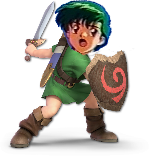
He's the Hero of Time, the splitter of timelines (Timesplitters?!), and the wearer of transformation masks: #22 Young Link

Melee: :younglinkmelee:

Image Link

Here we have my favorite Link of the crew! With that total bias being confirmed I must say that while I loved this render years ago, it has not aged well in my eyes. The sword is mostly lost in the silhouette, and his eyes are dead and dull. The posing itself isn't so bad, and it does hold a nice contrast to Melee Link's render and CSSP. I've seen people replicate this render pose using modern HD models of Young Link to see how it would look today... not so great, honestly. Also, the misalignment with his torso and lower body looks strange too. Chest is pointed one way, legs are pointed another.
5/10

Ultimate: :ultyounglink:

Image Link

And THIS is where ultimate comes through for me! After being absent for two games, Ultimate does NOT reintroduce Young Link by bringing back the pose of his original render! Instead they gave him this beautiful, well crafted placement of EVERYTHING! His silhouette is well defined, his body alignment is accurate as his back is bent and the clothes warp a bit to show that his upper body has shifted, and it has the right amount of flow to all the loose parts of his outfit! That perfect anime hair curve of his bangs is amazing, and I love the use of negative space between his face and his shield. I also enjoy that emphasis on his round cheeks and lower lip; which are features children are known for having. But he does posses that stern look in his eye, a very experienced gaze for one so young. Don't mess with this kid.
9.8/10

One over the other: :ultyounglink: > :younglinkmelee:

How do you guys stack the renders of this time-hopping boy? Young Link is the last character whom only has 2 renders to compare for a little while. There are multiple renders to the next many characters we go over.
 
Last edited:

Sari

Editing Staff
Writing Team
Joined
Aug 3, 2014
Messages
4,439
Location
New Jersey
NNID
Villager49
Switch FC
SW-2215-0173-2152
:younglinkmelee:: 6/10 I don't mind the pose itself though I'm not a fan of how his lower half is looking. The leg placement is odd and it looks like his tunic is clipping through his buckle.

:ultyounglink:: 9.5/10 Cool pose and the determined/serious look feels very Link-ish.
 
D

Deleted member

Guest
:4lucina:: 5/10: Boring, expressionless features, doing the Down b counter pose.
:ultlucina:: 4/10: Can we just agree that none of the Fire Emblem fighters have decent renders?

Like I'm just bored of these emotionless features Marth and Lucina have. I get it that they're supposed to look noble or something but I don't find that interesting at all.
roy.exe
 

Alternis

Ignore the user in front of you
Joined
May 28, 2018
Messages
1,304
Location
Tartarus
NNID
GeneralO
Switch FC
SW-1137-6792-9994
:younglinkmelee:: 4/10 - Looks stilted and awkward. Additionally, what is this pose supposed to represent? What is he doing here?
:ultyounglink:: 9/10 - I love this pose! I gives him a determined expression common to all Links, but also adds a more obvious silhouette to him. And now he looks poised to strike some unseen foe. It just looks pretty cool.
 

Vic Viper [FR]

Smash Rookie
Joined
Jan 13, 2019
Messages
13
:younglinkmelee: 4.5/10: Just... meh. Average. Don't really have many thoughts about it, though I could say his knees look rather thin compared to the rest of his legs.
:ultyounglink: 8/10: Much better posing and facial expression...
...
but...
I hate his damn face, I won't count it in the rating, but holy ****.
Everytime I see his mug, I get PTSD and his loud and obnoxious screams get inside my mind, whether he does smash attacks or gets his butt whooped my ears suffer. Might be just because I hate that little twerp so much that it bled into his design to me.

First thing I'll do if I can mod the game (without repercussion) will be to change all his voice lines to (non-exhaustive list): "YOU BIG JERK", "FIVE POINTS!", "NUTS!" and most importantly, his star-KO to a "BUT MAaAaaAaAARS!"


Widely accessible modding can't come soon enough, I'd finally get my most requested Fire Emblem character.
 

Quetzal77

Smash Journeyman
Joined
Sep 6, 2014
Messages
300
NNID
yomugo
3DS FC
1349-4940-0147
:ultyounglink:: the pose is good, everything is good except the face. It looks off somehow.
:younglinkmelee:: however, in this render he looks emotionless and the pose isn't interesting or exciting.
 

VexTheHex

Smash Ace
Joined
Mar 30, 2018
Messages
567
:younglinkmelee: - 2.5/10 - This is pretty boring and meh. The aspect that he is holding his sword perfectly horizontal (or really close to) annoys me.

:ultyounglink: - 9/10 - Much more exciting pose and coloring. However his eyes feel more painted which hurts his score.

One of the characters I saw no point in ever bringing back. With how annoying online he can be, I may rather he not of. Render wise though he massively improved and looks pretty cute in Ultimate so there is that plus. Though didn't take much to improve from Melee's.
 

NintendoKnight

Smash Lord
Joined
Oct 26, 2013
Messages
1,735
Location
Climbing the mountain I made from a molehill
NNID
Nin-Knight
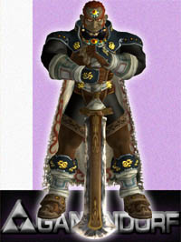
He's the Great King of Evil, the Demon Thief, and the Centennial Male of the Gerudo Race: #23 Ganondorf

Melee: :ganondorfmelee:

Image Link

While Ganon's Melee render was cool, it was one of those things that teased us about him having a sword that he never got to use. This is the beginning of 17 years of chain-yankery that drove most of us up the wall. Personally, I think if the character doesn't use the object that was shown in their artwork, it shouldn't appear in their render. Despite this, the render was pretty neat. It's strangely symmetrical, but the attitude it presents exudes an air of authority and menace. Though much of the render is swooped up in the silhouette of the torso, and the legs are completely lost in the cape.
7.2/10

Character Select Screen Portrait: CSSP

Image Link

The CSS render was... different. I don't know why, but they elected to go for a profile shot that looks like he's got one foot on a stump and is about to tell a story of the good ol' days. It's okay, I guess. Not very interesting to look at, though. The sharp emphasis on his nose is funny though.
6.8/10

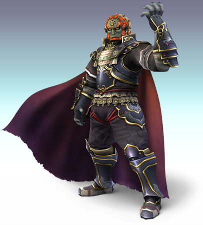
Brawl: :ganondorf:

Image Link

This time, in Brawl's render, they decided not to tease us with the sword in the artwork, which is a better designation of how he actually fights in the game. This one actually fits Ganon's personality a little bit more as it calls upon his signature, "Raised hand as if holding the world" pose, which is a staple of the his art in the Zelda series. The cape has flow to it as opposed to Melee's static feel, and though the art is now lacking a bit of the symmetry the Melee render had, it's more dynamic with a more interesting and varied silhouette. Though it fits him the pose itself could be stronger.
7.4/10

Wii U/3DS: :4ganondorf:


Image Link

To hide the fact that he has an ugly mug in Wii U/3DS, Ganondorf decides to give us a profile shot; which works because Ganondorf has ALWAYS possessed a very strong profile (see the Melee CSSP). However, we've lost some of the wind in his cape, presumably due to the shredded bits toward the bottom, which are a very nice touch. The best part of this render is the bright, glowing weakspot at the center of his torso. Said glowing weakpoint which was a major part of Ganondorf's Twilight Princess design, and a feature that Brawl strangely lacked for some reason. The energy itself, looking quite godlike, is permeating the cracks in his armor, which is actually visible on the in-game model. His posing, however, does look less... interested. Almost as if he's present in the game more so out of obligation than actual desire. He's more relaxed and less menacing than his previous render. The silhouette is pretty well-defined, so that's a plus.
7.4/10


Ultimate: :ultganondorf:


Image Link

Now this is my JAM! Just take a look at this! You got that asymmetry! You got yourself a beautiful silhouette with clearly defined hands, boots, torso, shoulders, and a fully outstretched arm! It still has that signature Ganondorf hand pose, but he's finally got the other hand doing something else that isn't boring! The flow and folds of the cape look so good, especially with the hilarious fringe on the end of it. I especially love the curves of the cape on the left and upper right sides. It demonstrates a stance of strength; he's clearly amidst combat with this pose. And take note: this man is SMILING. And not just any smile either, he's wearing that sort of dirtbag smile where he truly believes that he's won the battle and is toying with you as though you were a lost, little child. His hair also spikes up in that unruly sort of way which only a bandit king could accomplish without looking like a poser.
9.4/10

Greatest to Least: :ultganondorf: > :ganondorf: & :4ganondorf: > :ganondorfmelee: > CSSP

What do you all think of the King of Evil's renders?

As I mentioned in the OP, this was the render comparison that inspired the thread. And we finally reached it, though it's only in the early twenties, lol. I did copy-paste my original comparison, but have tweaked and refined it to be more in line with the rest of my comparisons in this thread.
 
Last edited:

Sari

Editing Staff
Writing Team
Joined
Aug 3, 2014
Messages
4,439
Location
New Jersey
NNID
Villager49
Switch FC
SW-2215-0173-2152
:ganondorfmelee:: 7.5/10 Cool pose with his sword, not much else to say.
:ganondorfmelee: (CSSP art): 5/10 Looks like he's sitting at a bar listening to someone tell an interesting story. I always thought that sideways shot of his face looked weird.
:ganondorf:: 8.5/10 I love the pose and the flowing cape. Only issue I have is that his legs look sort of stiff.
:4ganondorf:: 6.5/10 I like how his cape is torn near the bottom and that he has the cracks in his chest, but I'm really not a fan of that pose. Looks like he's thinking "hmmph I'll show them!" in a sassy manner.
:ultganondorf:: 9/10 Everything about this render just screams King of Evil. I think the positions of his hands are what makes it so great.

:ultganondorf:>:ganondorf:>:ganondorfmelee:>:4ganondorf:> (CSSP)
 

NintenRob

Rising YouTuber
Writing Team
Joined
Feb 8, 2014
Messages
5,505
Location
Australia
NNID
trpdm.wilton
:ultganondorf:>:ganondorf:>:ganondorfmelee:>>>>>>:4ganondorf:

I love Ganondorf renders in the 3 higher options, even with my overall disdain for TP design. The brawl render just emits raw POWER!!! but doesn't capture the Smugness of Ganondorf.


Now excuse me, I just noticed the site finally updated with alt icons for ultimate. And I'm going to admire them
 

Vic Viper [FR]

Smash Rookie
Joined
Jan 13, 2019
Messages
13
:ganondorfmelee: : 7/10 The pose is great, but his face feel a bit... ehhh, his design is by now dated (which is true for a lot of Melee characters, Melee DK I find hideous), but everything that's not the face I like... and I should point out something that's on his CSSP (I count both as the same) though I'm gonna use another picture cause it's too dark to properly see.


That bulge hits all my buttons, +5 points. 12/10.

:ganondorf:6/10: I should like this more than I do. I really like TP's design, but I think something was lost in translation. Maybe it's the lighting? Maybe it's the detail? I'm not sure, but I much prefer how Ganondorf looks ingame in TP, there's something raw and flat about that render. The pose itself is fine, but overall I'm "meh, it's okay" on the render.

:4ganondorf:6/10: I like this pose better than Brawl's in terms of how it presents his face, and I prefer that lighting, but after reading Sari's comment... yeah I'm starting to see it too: "Looks like he's thinking "hmmph I'll show them!" in a sassy manner." This rating doesn't count how actually hideous he looks in front though, otherwise I'd drop that rating to a 3/10.

:ultganondorf: 9.5/10: Hurt me daddy. Everything is near perfect, the only thing that prevents him from getting a 10 for me is that cape which looks like a carpet and no bulge.
 
Last edited:

Mogisthelioma

Smash Master
Joined
Aug 24, 2018
Messages
3,596
Location
Ravnica
:ganondorfmelee:: 3/10: it's :GCB:ularia from :GCB:reath of the Wild.
:ganondorf:: 5/10: He looks like he's at a party and tried to swat a fly and missed and executed this pose to not look awkward in front of everyone.
:4ganondorf:: 6/10: This design is OK but I feel like TP D O R F overstayed in Smash.
:ultganondorf:: 9/10: I cannot tell you how much I missed the Chad D O R F. It would be a 10/10 if he had some dark magic coming out of his fist or something.
 

VexTheHex

Smash Ace
Joined
Mar 30, 2018
Messages
567
:ganondorfmelee: - 5.5/10 - I kind of like the pose as it fits as some tanky bad guy you to take down. It's not the prettiest though.
:ganondorf: - 5/10 - I got to be honest going into the next two, I'm not big on Grandpadorf. He's squeezing some produce at the grocery store here in dramatic fashion.
:4ganondorf: - 2.5/10 - Sassy Grandpa squeezes a avocado in local grocery store. It's laughable looking.
:ultganondorf: - 10/10 - His nose (oddly enough he looks better with that nose than Grandpa Nose) points down towards his crotch pointing up guiding you to his hand. Interesting posture going on there. Besides that, I like what he is doing with his hands and feet positioning, looks solid. I also like the look in his eyes like he is evaluating how he is going to suck the next person into his crotch to let down a powerful foot slam on their head as they try to flee.

Seriously though in that one spirit battle against the giant Ganondorf with a Zelda you have to protect, I kept getting caught in the suction thing where he jacks his foot up in the air and you got sucked towards him. I know people still holler for him to be reworked, but I feel he is has a pretty intense and powerful kit currently that feels pretty fitting and can be intimidating. Anyways, I didn't like Grandpadorf's design, the hair is ugly as is the face by quite a bit. Something with the coloring of his skin and hair while the same also felt worse during that era. I welcome back our pointy nose evil king.
 

MarioMeteor

Smash Hero
Joined
Nov 27, 2014
Messages
8,340
Location
New Orleans
NNID
BGenius23
3DS FC
0662-2900-1492
:ganondorfmelee: - 8/10 I’m not especially fond of this design, but I love this render. The way he’s calming resting his hands on his sword while looking as though he’s saying “I could kill you with this blade, but I don’t want to stain it” is very fitting for Ganondorf.
:ganondorf: - 8/10 This one exudes power and menace. I definitely get more of a King of Evil vibe from this one. It would be perfect if the Triforce of Power were visible on his outstretched hand.
:4ganondorf: - 6.5/10 This one loses a lot of the authority that the previous renders had, but the addition of the stab wound on his chest is welcome. It needs something like dark energy emanating from his fist to make me feel like this is a world-destroying demon and not just a pretty bad guy.
:ultganondorf: - 8/10 They went back to the pointy nose design, but this render returns the aura of menace that was missing last game. I especially like the sinister smile on his face. It looks as though he’s about to cast a devastating spell. He is a warlock, after all.
 

Penroze

The Surreal Deal
Joined
Oct 6, 2018
Messages
370
Location
Flat Zone X
Switch FC
SW-7239-4479-0495
:ganondorfmelee: - 5/10 I must admit, I am a fan of this render by itself. Ganondorf just looks so cocky in this pose. However, the reason I am rating it at 5/10 is because he doesn't even use the sword he's behind. One of the things that can really put me off of a render is the presence of something that you cannot see in regular gameplay, although this doesn't happen often. It just feels like I'm looking at a different version of the character from another game.
CSSP - What ew 3/10
:ganondorf: - 7/10 Now this is an evil man with passion! Look at his confidence. His raw power. This is a great man. He is good.
:4ganondorf: - 6/10 This is just the Brawl render but wimpier. However, I do like the fist.
:ultganondorf: - 10/10 CHAD CHAD CHAD CHAD CHAD
:ultganondorf:>>>>:ganondorf:>:4ganondorf:>:ganondorfmelee:>>CSSP
 

Alternis

Ignore the user in front of you
Joined
May 28, 2018
Messages
1,304
Location
Tartarus
NNID
GeneralO
Switch FC
SW-1137-6792-9994
:ganondorfmelee:: 7/10 - Failure to have the sword in his moveset aside, this is honestly a nice render. Ganondorf may lack a strong silhouette, but his pose here just emanates power. It's a great fit in terms of his personality, so it gets points for that.
:ganondorf:: 5/10 - I think that this renders is decent. It has more dynamic cape movement, for one. But otherwise it looks like he's posing for a photo; he's got no expression, so he looks bored.
:4ganondorf:: 7/10 - Indeed, Smash 4 fixes the expression issue somewhat, as Ganondorf now looks more determined, and his new pose is similar to the previous, but with more interesting elements. He keeps his more menacing aura this time.
:ultganondorf:: 8/10 - I'm personally not fully sold on this new render. Nonetheless, his silhouette is quite defined here, and he's gotten his cocky grin back, so it ends up higher than the rest.
 

Quetzal77

Smash Journeyman
Joined
Sep 6, 2014
Messages
300
NNID
yomugo
3DS FC
1349-4940-0147
:ultganondorf:: the better design returns, and it's made so much better by the fact that he actually seems intimidating again after two games of being Smash grandpa.
:ganondorfmelee:: solely because his OoT design is better. The sword is strange and unnecessary, but he has a powerful aura that the last two renders lack.
:4ganondorf:: not a fan of this design, and the pose isn't the best, but the stab would and profile shot are better than the last render.
:ganondorf:: it's dull... I get what they were going for with the pose as it isn't bad, but he's missing that "power" vibe and doesn't have personality here.
 

Sammybam88

Smash Cadet
Joined
Jul 25, 2018
Messages
33
NNID
eliasranchds2
3DS FC
2681-3569-0921
how come I wasn't getting notified I'm sure I had watch thread on
 
Top Bottom