-
Welcome to Smashboards, the world's largest Super Smash Brothers community! Over 250,000 Smash Bros. fans from around the world have come to discuss these great games in over 19 million posts!
You are currently viewing our boards as a visitor. Click here to sign up right now and start on your path in the Smash community!
It appears that you are using ad block :'(
Hey, we get it. However this website is run by and for the community... and it needs ads in order to keep running.
Please disable your adblock on Smashboards, or go premium to hide all advertisements and this notice.
Alternatively, this ad may have just failed to load. Woops!
Please disable your adblock on Smashboards, or go premium to hide all advertisements and this notice.
Alternatively, this ad may have just failed to load. Woops!
Rate That Render! (Now Rating: #49 Little Mac)
- Thread starter NintendoKnight
- Start date
Alternis
Ignore the user in front of you
(Since OP mentioned the frost on their mallets, I'd just like to take a moment to appreciate all such details on Ultimate's renders; the attention to what materials and textures are present is absolutely phenomenal, and I love it.)
VexTheHex
Smash Ace
- Joined
- Mar 30, 2018
- Messages
- 567
Ice Climbers had a pretty solid showing overall, I don't got really anything else to add on them besides some appreciation for them being our only ice users!
RealPokeFan11
Smash Lord
Don't forget LucasIce Climbers had a pretty solid showing overall, I don't got really anything else to add on them besides some appreciation for them being our only ice users!
NintendoKnight
Smash Lord
- Joined
- Oct 26, 2013
- Messages
- 1,735
- NNID
- Nin-Knight
Sorry I haven't updated in a while, everyone! Smash Ultimate sucks up more time than I expected.
She's the lone survivor of the Sheikah, the enigmatic alter ego, the warrior who flows across the battlefield: #16 Sheik
Melee:

Image Link (Thus far, Sheik was the hardest render to get. This is as high as the quality goes)
Welcoming the first new Zelda character to the cast, Sheik drops in with an already hyper-dynamic pose, needles drawn, and ready for action. This is as unconventional as poses get. It's not often you find a character render where the character's feet are over their head. She even has two sets of needles ready, one set in each hand. It may be interesting, but I'm still not sure how I feel about it. It's not bad, that's for sure.
6.5/10
Brawl:

Image Link
For whatever reason, I like this one so much more than her Melee render. It's very ninja-esque, but not like the assassin-looking render she had in Melee. It's much more based on Sheik's established personality and falls in line with what she'd do. I enjoy the nice curve that her body line follows, and the crossing of her arms is quite nice as well!
8/10
Wii U/3DS:

Image Link
Gonna be honest, I actually don't like how this one is posed. It just looks awkward. It resembles when a child says "I know karate!" as they try their best impression of what they think a karate master would pose like. It's just weird. It's like there's no sense of balance because of her back leg. How the heck is she standing? As strange as it is, I do like it slightly more than Melee's.
7/10
Ultimate:

Image Link
I love this one! Now that's a ninja! I like how her ponytail and scarf are flowing together in the motion. Also, I love the scarf. But she's also doing that two-fingered ninja thing that she does, and it's amazing. Her body curve also looks really nice, and her overall silhouette is really clear. It's pretty great.
9.4/10
From greatest to least: >
>  >
>  >
> 
Overall, Sheik's had two weird renders, but two really good renders. How do you guys feel about her renders?
She's the lone survivor of the Sheikah, the enigmatic alter ego, the warrior who flows across the battlefield: #16 Sheik
Melee:

Image Link (Thus far, Sheik was the hardest render to get. This is as high as the quality goes)
Welcoming the first new Zelda character to the cast, Sheik drops in with an already hyper-dynamic pose, needles drawn, and ready for action. This is as unconventional as poses get. It's not often you find a character render where the character's feet are over their head. She even has two sets of needles ready, one set in each hand. It may be interesting, but I'm still not sure how I feel about it. It's not bad, that's for sure.
6.5/10
Brawl:

Image Link
For whatever reason, I like this one so much more than her Melee render. It's very ninja-esque, but not like the assassin-looking render she had in Melee. It's much more based on Sheik's established personality and falls in line with what she'd do. I enjoy the nice curve that her body line follows, and the crossing of her arms is quite nice as well!
8/10
Wii U/3DS:

Image Link
Gonna be honest, I actually don't like how this one is posed. It just looks awkward. It resembles when a child says "I know karate!" as they try their best impression of what they think a karate master would pose like. It's just weird. It's like there's no sense of balance because of her back leg. How the heck is she standing? As strange as it is, I do like it slightly more than Melee's.
7/10
Ultimate:

Image Link
I love this one! Now that's a ninja! I like how her ponytail and scarf are flowing together in the motion. Also, I love the scarf. But she's also doing that two-fingered ninja thing that she does, and it's amazing. Her body curve also looks really nice, and her overall silhouette is really clear. It's pretty great.
9.4/10
From greatest to least:
Overall, Sheik's had two weird renders, but two really good renders. How do you guys feel about her renders?
TheTrueBrawler
Smash Demon
Sheik's renders in order from best to worst:
Smash Ultimate
Smash Brawl
Smash 4
Smash Melee
Smash Ultimate
Smash Brawl
Smash 4
Smash Melee
Mogisthelioma
Smash Master
Wait, I forgot, did we ever do Daisy?
 : 4/10: Eh, looks weird.
 : 5/10: Still looks weird.
 : 8/10: Based on OOT reveal render, nice!
 : 10/10: Like an actual ninja.
TheTrueBrawler
Smash Demon
Come to think of it, I don't think we ever did Dank Samus either.Wait, I forgot, did we ever do Daisy?
Last edited:
Alternis
Ignore the user in front of you
Eh, save them for Ultimate.Come to think of it, I don't think we ever did Dank Samus either.
- Joined
- Oct 14, 2016
- Messages
- 2,746
catch up time
 : 8/10
 10/10
10/10
 10/10
10/10
 : 8/10
 : 7/10
 : 9/10
 : 10/10
VexTheHex
Smash Ace
- Joined
- Mar 30, 2018
- Messages
- 567
Sheik never was one of those characters I care that much for as she'd be long forgotten and not cared about in her massive franchise if she didn't score lucky with Smash. That being said, her renders were pretty lack luster and didn't really capture the ninja spot she took that well.
NintendoKnight
Smash Lord
- Joined
- Oct 26, 2013
- Messages
- 1,735
- NNID
- Nin-Knight
Wait, I forgot, did we ever do Daisy?
Come to think of it, I don't think we ever did Dank Samus either.
Daisy and Dark don't really have prior renders to compare. As I mentioned in the OP, characters introduced in Ultimate won't really be compared as they have no previous renders to compare to.Eh, save them for Ultimate.
But it's time to move on to the next comparison!
She's the wielder of Wisdom, descendant of the incarnate Goddess Hylia, and the princess of destiny: #17 Zelda
Melee:
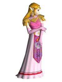
Image Link
It's kind of funny how, even though Sheik was added before Zelda, you must use Zelda to access Sheik. Here we have the solemn Zelda, her arm grabbing her other arm as she gives us a profile shot. Fun fact, she actually briefly performed this pose in Ocarina while speaking to Link. The interesting about her silhouette is that it's still visually distinct from Peach's silhouette with the both of them being the only characters with dresses. Visually, it's a neat callback, and describes a lot about Zelda's personality. Other than that it isn't super interesting.
7/10
Brawl:
.png)
Image Link
I like this pose much more than her Melee one. It's just more interesting from a visual standpoint. It doesn't say much on a characteristic standpoint, but it's nicer to look at. It's like they took the opposite approach to this render than her Melee render. Looking at the camera also doesn't hurt the pose. We wanna see them big, pretty eyes.
8/10
Wii U/3DS:

Image Link
HOLY CRAP SHE'S GORGEOUS—I mean, uhh, wow, she's so beautiful. Quality of the model aside, I actually really like the simplicity of the pose itself with Zelda holding only a single arm out. It has that "I'm magical" sort of touch to it, all the while she wears a rather serious expression. She's not here to mess around. This is actually among my favorites of the Wii U/3DS renders. Very regal, very elegant.
9.7/10
Ultimate:
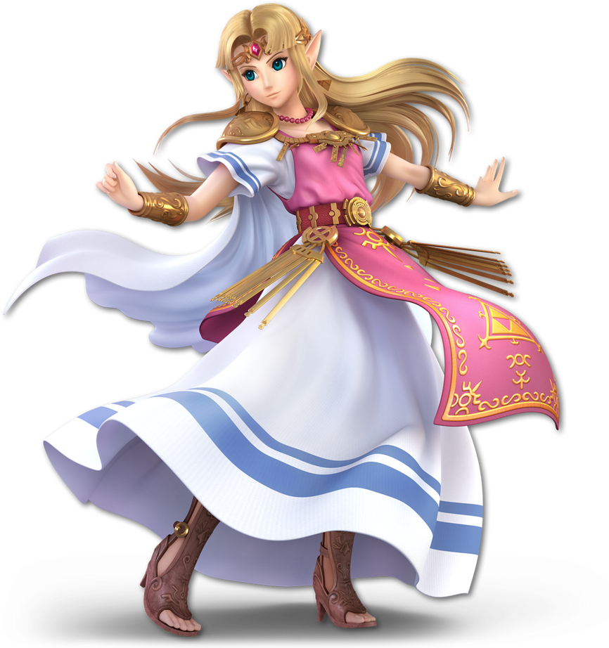
Image Link
All of us were looking forward to a Breath of the Wild-styled Zelda; how glad I am that we were wrong and got this cutie-pie instead. Regardless, we are to judge the pose and not the design or quality of the model. There's so much happening in this render: capes, tassels, sleeves, hair, dress, that weird pink thing that drapes over her dress, there's a lot of wind flowing in this image. Gotta say, with all the additional fluff added by way of flowing garments, it's actually just a tad difficult judging where her body is. In fact, the flowing garments and hair are actually doing almost all of the work in this render. She's not doing any complicated posing at all. It is visually interesting, though it's because of the flair from the clothes and hair, not that it subtracts from the overall render.
9.7/10
From Greatest to least:
And that was Hyrule's Wise Princess!
Which render was your favorite? Going to be honest, I find Zelda in Ultimate to have a better in-game model than her actual render. Her face in game is MUCH CUTER than her render depicts:

Ermahgerd...
Necro'lic
Smash Ace
- Joined
- Aug 9, 2015
- Messages
- 654
My girl Zelda is fabulous, adorable, and adorably fabulous in Ultimate!!! I rate Ultimate Zelda 100/10! No contest, best character! 
Wait... we are supposed to vote on renders only?
Well, crapbaskets. In that case, her Smash 4 render wins no contest to me. It's very understated, kinda like Dr. Mario's Ultimate render , but it says a lot about her personality without needing to be over the top. She's regal, she's elegant, but she's also a bit passive and controlled. I also love her stepping forward, as it gives an air of intent and action, if only slightly, unlike her Brawl and Melee renders that are much more passive than I think they should be. All in all, Smash 4 render wins.
(Still, Ultimate Zelda is best girl and no one can change my mind )
)
Wait... we are supposed to vote on renders only?
Well, crapbaskets. In that case, her Smash 4 render wins no contest to me. It's very understated, kinda like Dr. Mario's Ultimate render
(Still, Ultimate Zelda is best girl and no one can change my mind
 )
)
Last edited:
TheTrueBrawler
Smash Demon
Zelda’s renders in order from best to worst:
Smash Ultimate
Smash 4
Smash Brawl
Smash Melee
Smash Ultimate
Smash 4
Smash Brawl
Smash Melee
Last edited:
Mogisthelioma
Smash Master
- Joined
- Oct 14, 2016
- Messages
- 2,746
Alternis
Ignore the user in front of you
Last edited:
VexTheHex
Smash Ace
- Joined
- Mar 30, 2018
- Messages
- 567
Zelda's poses can look dignified or cute, but I don't really think any of them capture mage in anyway which could of been a nice little flair for her. While I do think Ultimate Zelda is cute, I kind of preferred her with the darker colors cause now she looks more like Peach who already has the Rosalina clone here as well.
Augi
Smash Cadet
- Joined
- Dec 12, 2018
- Messages
- 67
All from that perspective, seeing this as a Zelda in the midsts of this transition period, this is a perfect representation of her. Her attitude is confident, but somewhat playful. The way everything is loose and flowing in the wind implies this is not a Zelda currently tied down by her royal responsibilities (notice how tied down her hair and dresses are in the previous models in comparison). Her pose fills the frame and it says a lot about her character. I see a Zelda that's still coming to grips with her powers and using them in various, experimental ways.
Last edited:
NintendoKnight
Smash Lord
- Joined
- Oct 26, 2013
- Messages
- 1,735
- NNID
- Nin-Knight
He's the curer of Fevers and Chills, the prescriber of Megavitamins, and became a plumber in an alternate reality: #18 Dr. Mario
Melee:

Image Link
Dr. Mario has appeared and brings complementary Megavitamin lollipops. Wait, I shouldn't eat those unless I have a fever or the chills? Dang. Anyway, The Doc's pose here is pretty good. It's like he's saying, "HERE! TAKE THE PILL!" in an overly-heroic fashion. Though, even as a Doctor, I must assume that Mario's heroic nature still took major precedent in his personality despite being a Doctor. Still saving lives, albeit in a very different fashion than his parallel universe self.
7.6/10
Character Select Screen Portrait: CSSP

Image Link
Gotta say, I really love what we can see of this CSSP. He's pulled out a stethoscope to see whether or not he can hear a heartbeat. If he can still hear a heartbeat, then he hasn't successfully beaten his enemy to death. I think it's pretty fantastic despite not seeing all of it.
8/10
Brawl: Wait, what? Is this the first Melee vet to MISS Brawl?! But he was in the code at least, yeah? Yeah.
Wii U/3DS:

Image Link
As Dr. Mario finally returned to Smash after many years, he took it upon himself to make up for lost time and hop into that "serious mode" that he missed in Brawl. He looks a bit too tough for a Doctor, if you get my meaning. It's like you can tell he intends to break your bones and then charge you the medical fee for his follow-up. Dr. Mario: the only doctor who puts you in his own clinic.
7/10
Ultimate:

Image Link
Now THAT'S a doctorly pose if I've ever seen one! It may not be very actionable or dynamic, but I love the simplicity of him holding his hand up to his chin as he contemplates your treatment plan. A detail I love is that you can see his shirt underneath his coat, especially in his right sleeve. He looks very professional here.
8.6/10
Greatest to least: > CSSP >
  >
> 
How do you all feel about the doctor's renders?
Melee:


Image Link
Dr. Mario has appeared and brings complementary Megavitamin lollipops. Wait, I shouldn't eat those unless I have a fever or the chills? Dang. Anyway, The Doc's pose here is pretty good. It's like he's saying, "HERE! TAKE THE PILL!" in an overly-heroic fashion. Though, even as a Doctor, I must assume that Mario's heroic nature still took major precedent in his personality despite being a Doctor. Still saving lives, albeit in a very different fashion than his parallel universe self.
7.6/10
Character Select Screen Portrait: CSSP

Image Link
Gotta say, I really love what we can see of this CSSP. He's pulled out a stethoscope to see whether or not he can hear a heartbeat. If he can still hear a heartbeat, then he hasn't successfully beaten his enemy to death. I think it's pretty fantastic despite not seeing all of it.
8/10
Brawl: Wait, what? Is this the first Melee vet to MISS Brawl?! But he was in the code at least, yeah? Yeah.
Wii U/3DS:

Image Link
As Dr. Mario finally returned to Smash after many years, he took it upon himself to make up for lost time and hop into that "serious mode" that he missed in Brawl. He looks a bit too tough for a Doctor, if you get my meaning. It's like you can tell he intends to break your bones and then charge you the medical fee for his follow-up. Dr. Mario: the only doctor who puts you in his own clinic.
7/10
Ultimate:

Image Link
Now THAT'S a doctorly pose if I've ever seen one! It may not be very actionable or dynamic, but I love the simplicity of him holding his hand up to his chin as he contemplates your treatment plan. A detail I love is that you can see his shirt underneath his coat, especially in his right sleeve. He looks very professional here.
8.6/10
Greatest to least:
 >
> How do you all feel about the doctor's renders?
Necro'lic
Smash Ace
- Joined
- Aug 9, 2015
- Messages
- 654
With all the dynamism of the Ultimate renders, even through all of the cool character design changes and the ADORABLE new Zelda, Dr. Mario still is my favorite Ultimate render, and it's probably the least eventful.  In fact, I've seen people say this is the worst one, but I couldn't disagree more.
Why? He's a heavy contrast to Mario. Mario's Ultimate render is dynamic, doing a kick, smiling, ready to fight. Doc here is static, cold, calculated, inquisitive, a stark contrast to Mario's render. It works with the occupation he has, and makes him seem much more ruthless and cool as a result.
Everytime Dr. Mario is seen in the match startup in Ultimate and you hear that low drone before the match starts up, I feel like he's about to fight someone for cold, hard science rather than joy, and the fact that it's Mario both terrifies me and makes me kinda laugh inside.
IDK, maybe I put too much stock into this sorta stuff.
solitonmedic
Potassium, potassium
 8/10
8/10TheTrueBrawler
Smash Demon
Doctor Mario’s renders in order from best to worst:
Smash Ultimate
Smash Melee
Smash 4
Smash Ultimate
Smash Melee
Smash 4
Last edited:
Mogisthelioma
Smash Master
 : 4/10: Doc....doc, is everythin--DOC!!!
- Joined
- Oct 14, 2016
- Messages
- 2,746
 : 8/10
 css: 10/10
Alternis
Ignore the user in front of you
 : 8/10 - This pose is pretty great. I like how Dr. Mario looks so excited to be delivering this megavitamin. It's full of energy.
VexTheHex
Smash Ace
- Joined
- Mar 30, 2018
- Messages
- 567
 - 8/10 - I like how happy he is about his job here. He's going to give you that pill with a smile.
Dr. Mario is an odd one since none of them are home runs for me and Melee's oddly stands as a front runner alongside Ultimate. I feel the missing pill hurts Ultimate's while Melee's is just a bit too heroic for the doctor approach.
Last edited:
Sammybam88
Smash Cadet
- Joined
- Jul 25, 2018
- Messages
- 33
- NNID
- eliasranchds2
- 3DS FC
- 2681-3569-0921
lol smash 4 was like why didn't I get in brawl I'm mad now
UltimateXsniper
Smash Ace
 8/10 because while it's a little dated today, he looks like he's pumped to join the fight.
NintendoKnight
Smash Lord
- Joined
- Oct 26, 2013
- Messages
- 1,735
- NNID
- Nin-Knight
He's a threat to himself and others, and when he grows up he'll become an icon, it's the 2nd Generation electric rodent: #19 Pichu
Melee:
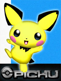
Image Link
As far as it's designed, this render falls pretty much in line with Pikachu's poses. Nice consistency for those who appreciate that sort of contextual detail. I like how he's up on the tip-toe of his little foot. Other than that, it isn't super dynamic or interesting. I think it's trying to play on cuteness but I don't think it's working very well in that regard. This pose isn't very flattering on the cuteness factor. It's not even showing the tail very clearly either.
6.2/10
Character Select Screen Portrait: CSSP
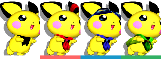
Image Link
Now, THAT'S cute! It's like he's doing a sort of doggie-paddle swim in midair. It's a much better angled image for Pichu's overall shape. It's not perfect though, as his tail isn't visible for whatever reason and the cheeks are a little too purple instead of the pink they're supposed to be.
7/10
Ultimate:

Image Link
Oh my gosh, he's adorable. This render comes with an impeccably, and strangely satisfying, round silhouette that really shows off what makes Pichu Pichu. Also, a very strong presence from his tail! It looks like the top part of a musical note! Honestly, it takes many notes from the Melee render, but it simply does it a lot better.
8.2/10
Greatest to Least: > CSSP >
What are your opinions on Pichu's renders?
Melee:

Image Link
As far as it's designed, this render falls pretty much in line with Pikachu's poses. Nice consistency for those who appreciate that sort of contextual detail. I like how he's up on the tip-toe of his little foot. Other than that, it isn't super dynamic or interesting. I think it's trying to play on cuteness but I don't think it's working very well in that regard. This pose isn't very flattering on the cuteness factor. It's not even showing the tail very clearly either.
6.2/10
Character Select Screen Portrait: CSSP

Image Link
Now, THAT'S cute! It's like he's doing a sort of doggie-paddle swim in midair. It's a much better angled image for Pichu's overall shape. It's not perfect though, as his tail isn't visible for whatever reason and the cheeks are a little too purple instead of the pink they're supposed to be.
7/10
Ultimate:

Image Link
Oh my gosh, he's adorable. This render comes with an impeccably, and strangely satisfying, round silhouette that really shows off what makes Pichu Pichu. Also, a very strong presence from his tail! It looks like the top part of a musical note! Honestly, it takes many notes from the Melee render, but it simply does it a lot better.
8.2/10
Greatest to Least:
What are your opinions on Pichu's renders?
Mogisthelioma
Smash Master
TheTrueBrawler
Smash Demon
Really, I don't have any preference this time. The renders look too similar this time around.
Idon
Smash Legend
- Joined
- May 24, 2018
- Messages
- 17,715
- Location
- Waxing Moon Ritual
- NNID
- Miyamoto Iori
- Switch FC
- SW-4826-9581-3305
They're almost identical except one's super HD this time around.
- Joined
- Oct 14, 2016
- Messages
- 2,746
