• Welcome to Smashboards, the world's largest Super Smash Brothers community! Over 250,000 Smash Bros. fans from around the world have come to discuss these great games in over 19 million posts!

    You are currently viewing our boards as a visitor. Click here to sign up right now and start on your path in the Smash community!

Rate That Render! (Now Rating: #49 Little Mac)

NintendoKnight

Smash Lord
Joined
Oct 26, 2013
Messages
1,735
Location
Climbing the mountain I made from a molehill
NNID
Nin-Knight
He shows the monkeys whose boss, he's on your side, Einstein, and he's the surly, space ace pilot of the Star Fox mercenary team: #20 Falco

Melee: :falcomelee:

Image Link

Starting off the second member of Star Fox, we have Falco here showing high levels of that 90's era attitude. He's holding some sort of martial arts stance, which does look pretty cool with his overall shape. (I love the propped-up collar which leads into the frilled feathers on his head.) I always liked how Falco wore his uniform differently from Fox, so it made his similar model more unique in that regard. (Kind of like in Brawl, where the ends of Luigi's pant legs were rolled up. I miss design quirks like that).
7.6/10

Brawl: :falco:
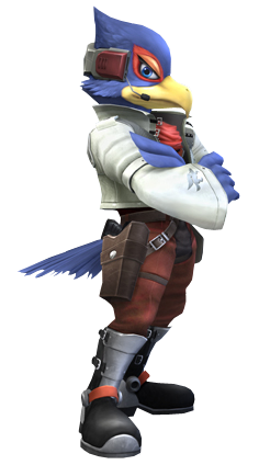
Image Link

Moving onto Brawl, I love this pose for Falco! It may be static, but it's 100% attitude. His wings being crossed is pretty great, and that sideways glance at the camera, pure gold. Well within character for him. I also prefer the silhouette of his profile shot of this design instead of his 64 design's profile silhouette. I don't know, it might be the design, but Falco actually resembles a pilot in this render. It looks really good. Among my favorites from Brawl.
9.1/10

Wii U/3DS: :4falco:

HQ Image Link

Now when I think of Falco, this pose is not the image that comes to mind. I mean what is this? Is that the ending pose to his Falco Phantasm when used on the ground? It looks weird for him. I mean, it's not bad posing wise, but I find it very unfitting for the character doing the pose because of the significant lack of attitude or sass... so in THAT way, it's a bad pose because it does not fit the character.
5.8/10

Ultimate: :ultfalco:

Image Link

I like this posing a lot more for Falco than his Wii U/3DS pose. He looks like he's mid-combat, he's putting a lot of flair into it, kinda sorta showing off, doing his thing. But overall, as interesting as it looks, I still prefer the ones that show more attitude. Not enough sass, stranger. Not bad, though.
7.3/10

Greatest to Least: :falco: > :falcomelee: > :ultfalco: > :4falco:

So, how do you all like Falco's poses over the years?
 

Mogisthelioma

Smash Master
Joined
Aug 24, 2018
Messages
3,596
Location
Ravnica
:falcomelee:: 3/10: Sorry, he looks lame.
:falco:: 9/10: Actually resembles his smug personality.
:4falco:: 6/10: Um...what is he doing?
:ultfalco:: 10/10: :GCB:irb.
 

Arthur97

Smash Master
Joined
Jun 7, 2016
Messages
3,463
I think the one from 4 should be considered with Fox's as they do seem designed to mirror one another.
 

Alternis

Ignore the user in front of you
Joined
May 28, 2018
Messages
1,304
Location
Tartarus
NNID
GeneralO
Switch FC
SW-1137-6792-9994
:falcomelee:: 8/10 - I like this pose he's striking; it's a bit bland, but it feels cocky, which is obviously good.
:falco:: 10/10 - Like Melee's but better. This is honestly really good, because it just suits him so well.
:4falco:: 7/10 - Not really bad at all, and I like the reference to one of his moves. Though it feels slightly inferior to his other poses.
:ultfalco:: 7/10 - This one feels akin to the Smash 4 render to me. It seems fine, but it lacks character. This just looks like a unique pose for the sake of it.
 

TheTrueBrawler

Smash Demon
Joined
Jul 16, 2018
Messages
816
Location
Mystery
Falco’s renders in order from best to worst:

Smash Brawl
Smash Melee
Smash Ultimate
Smash 4
 
Last edited:

VexTheHex

Smash Ace
Joined
Mar 30, 2018
Messages
567
:falcomelee: - 7.5/10 - I like how even though it's rather simple, you still get a sense of his personality. It kind of looks like he is back sassing someone here. The hand and foot movement is nice. However it isn't the easiest to read him as a space pilot though as he could easily be the more hot headed detective or just regular joe here since there is no blaster even.

:falco: - 10/10 - I actually quite enjoy his general energy in this one. He has attitude and presence here and showed up with his equipment as well which Melee lacked. It kind of makes me think that while Fox is trying to get some crook to spill some beans with some talk, Falco is waiting in the back eager to smack the crook around. Maybe a quick punch to the gut followed by a kick into the face.

:4falco: - 6/10 - I like the movement going on with his legs and feet, but the arm placement is kind of odd. I know what it's referencing with his Side B, but I'm not very fond of it. You could probably keep the feet and legs the same but made him holding his blaster out or something instead of some weird dabbing motion.

:ultfalco: - 7.5/10 - The arms are still in some weird dabbing formation and his foot play got more static as it looks like he is slowly floating down from low gravity. However, his stance is at least better than 4's and helps go back to him looking like he has some skill and authority.

Falco's Brawl render actually quite well represents my online match ups against him so far. He kicks the tar out of me quite easily and makes me feel inferior. I can say I at least have had fun in these matches, but that render definitely is reminding me of some matches I have had!!! I feel they tried to stick too much movement onto Falco with 4 and Ult and loss some of that cocky authority he is known for. They could maybe mess with his arms, hands(?), legs, and foot placement to make something more energized, but I honestly feel he may be one that is better off with less movement.
 
Last edited:

NintendoKnight

Smash Lord
Joined
Oct 26, 2013
Messages
1,735
Location
Climbing the mountain I made from a molehill
NNID
Nin-Knight
The prince of Archanea, wielder of the dragon-slaying Falchion, and future known Hero-King: #21 Marth

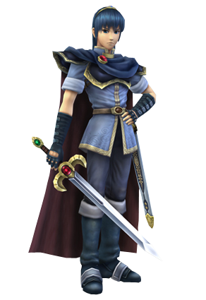
Melee: :marthmelee:

Image Link

While this is a very basic pose, it has some strength to it. Marth carries an intense glare in his eyes, and his posture has a good curve to it. Though I don't like how his silhouette hides most of his body within the shape of his cape. He looks refined, but ready to scrap as necessary.
7/10

Brawl: :marth:

HQ Image Link

As Brawl comes along, we see that Marth's pose really hasn't changed all that much since Melee. Though personally, I feel the hand placed on the hip adds a lot more than it should to the render. Other than that, MArth's render hasn't really done anything super interesting just like the last one.
7.5/10

Wii U/3DS: :4marth:

Image Link

Marth decided for this installment that he'd like a slightly more dynamic pose. The pose is less relaxed than his previous poses, but is still pretty similar to his previous poses. I do like how they moved his open hand from his hip to his sheath. They even upped his manliness by a point or two.
7.8/10

Ultimate: :ultmarth:

Image Link

And with Ultimate, Marth has taken his most visually interesting pose in my opinion. All the cloths flowing in the wind (which includes his hair), his sword is now held upwards as opposed to being pointed to the floor as before, and I like what he's doing with his off-hand for whatever reason. It's interesting, it's more different than what he's done before, and I like how Marth has progressively gotten more interesting with his poses over the years.
8/10

Greatest to least: :ultmarth: > :4marth: > :marth: > :marthmelee:

What do you all think of the poses of our Swordsman Supreme?
 

Idon

Smash Legend
Joined
May 24, 2018
Messages
17,715
Location
Waxing Moon Ritual
NNID
Miyamoto Iori
Switch FC
SW-4826-9581-3305
Finally, someone I'm invested in.
:marthmelee:6/10
Marth here looks a bit on the stilted side, with a rather sharp glare in his eyes. He holds himself well, easily being able to distinguish himself as royalty and one that exudes an air of grace. At the same time though, it's kinda boring and at the same time makes Marth look more pompous than he should.
:marth:6.5/10
Extremely similar to Melee and, but executed better in my opinion. The sword gains more prominence , he faces the camera more to show off more of his design, and the hand on the hip adds even more sass on top of the sideways glance he's shooting. Better still, but still rather plain and a bit too stiff for the hero-king.
:4marth:7/10
Finally, we're getting some motion. Here he looks graceful and flowing and at the same time actually ready to fight. You can tell he's more confident and with that wider stance actually ready to fight on top of having a more determined look on his face rather than a disdainful one.
:ultmarth:8/10
And here I think is an even greater improvement than on the last. The wind itself blows in the opposite direction of where he's facing making for a really great sense of motion in a still image, with almost every loose bit of clothing being lifted. On top of that his off-hand is now raised up to steady himself and his stance with the falchion is more aggressive.
As opposed to Smash 4 Marth, Ult feels more active than passive.

I'd say overall the Marths have shown slow but steady improvement.
 

Mogisthelioma

Smash Master
Joined
Aug 24, 2018
Messages
3,596
Location
Ravnica
:marthmelee:: 4/10: He looks like you just walked into a depressed kid's room while they're on their phone and he's mumbling "what."
:marth:: 4/10: Still pretty boring.
:4marth:: 6/10: Less boring but still not that interesting. The new design to Falchion was pretty sick, though.
:ultmarth:: 8/10: The best he's gotten but I'm not gonna lie all of these poses he's doing aren't too great. If he had a pose like he was striking someone with Falchion and didn't have such an emotionless expression on his face I'd like that.
 

Opossum

Thread Title Changer
BRoomer
Joined
Aug 10, 2011
Messages
33,989
Location
This Thread
NNID
OpossumGuy
3DS FC
4742-4911-3431
Switch FC
SW 2859 6322 5208
Marth, in general, is a character whose renders have gotten progressively better over time.

Melee: 2/10
I dislike Melee's models and renders in general. It doesn't help that his expression led to people mischaracterizing him as a pompous **** bag for nearly two decades.

Brawl: 6/10
A vast improvement. While a fairly basic pose, it shows a lot more character. And hey, I'd take a basic but workable pose over a unique but terrible one. Looking at you, Smash 4 Luigi.

Smash 4: 9/10
Here, Marth received his New Mystery of the Emblem design, which is a wonderful improvement over his Mystery of the Emblem one. He looks great here. Not much else to say.

Ultimate: 10/10
Best he's ever looked. They fixed his hair, too, bringing it more in line with his canonical look. Everything is so swishy too.
 

Rie Sonomura

fly octo fly
Joined
Jul 14, 2014
Messages
19,716
NNID
RieSonomura
Switch FC
SW-4976-7649-4666
Melee Marth: looks flat and plastic-y. 4/10
Brawl Marth: slight step up, but the pose is kinda...eh. 6/10
3DS/WiiU Marth: like that the hair looks wilder and the look in his eyes. 8/10
Ultimate Marth: gonna miss the wild hair, but the color scheme looks better. 7.75/10

Bonus - Lucina:
Ultimate Render > 3DS/WiiU Render
 

Aemuli

Smash Cadet
Joined
Dec 17, 2018
Messages
29
Location
North America
:marthmelee:
Good, it is a simple pose but I like the statement it shows how he is not someone you want to mess with 8/10.
:marth:
Meh, it is just so bland to me no emotion, no signs of self-determination, nothing 6/10.
:4marth:
This one is like melee + brawl combined into one. It is good but it is not great; I just feel like he looks too neat and tidy to have an expression like that 7/10.
:ultmarth:
Easily the best one, this one may not be as intimidating as melee, but it has more character. Furthermore, this one is less neat and tidy than the sm4sh one and it makes him look more real as a person rather than a plastic doll. It is the one who shows who he is, what he has been through, and why he is the one and only Hero-King 9/10.
 

Alternis

Ignore the user in front of you
Joined
May 28, 2018
Messages
1,304
Location
Tartarus
NNID
GeneralO
Switch FC
SW-1137-6792-9994
:marthmelee:: 4/10 - I think this one is bland and it feels out of character. This render is off.
:marth:: 6/10 - Essentially an improvement over Melee's, though it's still pretty plain.
:4marth:: 8/10 - This one best contains Marth's personality, I feel. It has a stately air to it.
:ultmarth:: 7/10 - This pose is also pretty dynamic, but it feels more aggressive, and I don't feel that as much in Marth himself.
 

Good Guy Giygas

Smash Master
Joined
Jul 7, 2013
Messages
3,154
Location
Official Doomguy Hype-Man®
Switch FC
SW-6635-8915-7294
:marthmelee:: 7/10 - I think it works pretty well for the time it came out, though it's kinda weird seeing him so mad.
:marth:: 5/10 - Never really dug this one. The pose is boring, Marth himself looks bored, and I'm bored just talking about it.
:4marth:: 9/10 - I think this one's my favorite. He looks very regal, and his stance looks natural and elegant. You can tell by the way that he holds his sword that he knows how to use it.
:ultmarth:: 7.5/10 - The model's better, but I really don't like his hands. His hand holding the sword is bent upward at a weird angle and in general just looks unnatural. I don't know much about sword fighting, but it doesn't seem like something a proficient swordsman would do.
 

Sari

Editing Staff
Writing Team
Joined
Aug 3, 2014
Messages
4,439
Location
New Jersey
NNID
Villager49
Switch FC
SW-2215-0173-2152
:marthmelee:: 6/10 This one just looks bland.
:marth:: 5/10 The hand on the hip feels off and he looks angry for some reason.
:4marth:: 8/10 Great pose that I think captures Marth really well.
:ultmarth:: 7.5/10 I like the pose though something feels off about his legs. It looks like they're glued to the ground and he isn't allowed to bend them.
 

VexTheHex

Smash Ace
Joined
Mar 30, 2018
Messages
567
:marthmelee: - 6.5/10 - I kind of like his attitude in this one, but it's also kind of boring.
:marth: - 5/10 - He's a bit sassy here with his hand on the hip, I think this render plays more to the stuck up fan reception to him more so than Melee's.
:4marth: - 8.5/10 - Looks like he is making his stand against a threat, good for him. He also got a visual upgrade to be more appealing.
:ultmarth: - 8.5/10 - They continued the improvements on his design and he looks nice head to toe. The messy hair is alright, though I found his other hairstyle also nice. The hands do look a little awkward though.

Marth does pretty solid in his poses, but I do think he suffers from a rather blank stare and facial expression in all of them. If I read them all as super serious Marth faces I guess it can work, but it'd be nice to see a little more from him. Sadly I'm figuring this is the fate of all the FE cast as I'm not exactly recalling any of them having too much emotion in the face.
 

osby

Smash Obsessed
Joined
Apr 25, 2018
Messages
23,983
:marthmelee: - 6.5/10 - I kind of like his attitude in this one, but it's also kind of boring.
:marth: - 5/10 - He's a bit sassy here with his hand on the hip, I think this render plays more to the stuck up fan reception to him more so than Melee's.
:4marth: - 8.5/10 - Looks like he is making his stand against a threat, good for him. He also got a visual upgrade to be more appealing.
:ultmarth: - 8.5/10 - They continued the improvements on his design and he looks nice head to toe. The messy hair is alright, though I found his other hairstyle also nice. The hands do look a little awkward though.

Marth does pretty solid in his poses, but I do think he suffers from a rather blank stare and facial expression in all of them. If I read them all as super serious Marth faces I guess it can work, but it'd be nice to see a little more from him. Sadly I'm figuring this is the fate of all the FE cast as I'm not exactly recalling any of them having too much emotion in the face.
*don't have much emotion*
*Robin and Roy literally shout in their renders*
 

Opossum

Thread Title Changer
BRoomer
Joined
Aug 10, 2011
Messages
33,989
Location
This Thread
NNID
OpossumGuy
3DS FC
4742-4911-3431
Switch FC
SW 2859 6322 5208
The prince of Archanea, wielder of the dragon-slaying Falchion, and future known Hero-King: #21 Marth

Melee: :marthmelee:

Image Link

While this is a very basic pose, it has some strength to it. Marth carries an intense glare in his eyes, and his posture has a good curve to it. Though I don't like how his silhouette hides most of his body within the shape of his cape. He looks refined, but ready to scrap as necessary.
7/10

Brawl: :marth:

HQ Image Link

As Brawl comes along, we see that Marth's pose really hasn't changed all that much since Melee. Though personally, I feel the hand placed on the hip adds a lot more than it should to the render. Other than that, MArth's render hasn't really done anything super interesting just like the last one.
7.5/10

Wii U/3DS: :4marth:

Image Link

Marth decided for this installment that he'd like a slightly more dynamic pose. The pose is less relaxed than his previous poses, but is still pretty similar to his previous poses. I do like how they moved his open hand from his hip to his sheath. They even upped his manliness by a point or two.
7.8/10

Ultimate: :ultmarth:

Image Link

And with Ultimate, Marth has taken his most visually interesting pose in my opinion. All the cloths flowing in the wind (which includes his hair), his sword is now held upwards as opposed to being pointed to the floor as before, and I like what he's doing with his off-hand for whatever reason. It's interesting, it's more different than what he's done before, and I like how Marth has progressively gotten more interesting with his poses over the years.
8/10

Greatest to least: :ultmarth: > :4marth: > :marth: > :marthmelee:

What do you all think of the poses of our Swordsman Supreme?
Also just to nitpick, Marth was technically never the Prince of Archanea. He was the Prince of Altea, but once he lorded over the entire continent of Archanea, he was the Hero-King. :p
 

NintendoKnight

Smash Lord
Joined
Oct 26, 2013
Messages
1,735
Location
Climbing the mountain I made from a molehill
NNID
Nin-Knight
Also just to nitpick, Marth was technically never the Prince of Archanea. He was the Prince of Altea, but once he lorded over the entire continent of Archanea, he was the Hero-King. :p
Nit-pick, nit-pick!


PREPARE YOURSELVES FOR THE ECHO FIGHTER BONUS ROUND!

She's the last Princess of Ylisse, she came from the future to save the world, and is totally NOT Princess Trunks: 21ε Lucina

Wii U/3DS: :4lucina:

Image Link

Here we have our first echo fighter (and the first of only 2 echo fighters) that will actually be rated! Here we have Lucina doing her official artwork pose from Fire Emblem: Awakening. Re-using a pose here is fine since this IS her Smash debut. It's not too spectacular, the pose itself looks nicer in 2D, but it's not bad either. I wish the cape had a bit *more* flow to it.
7/10

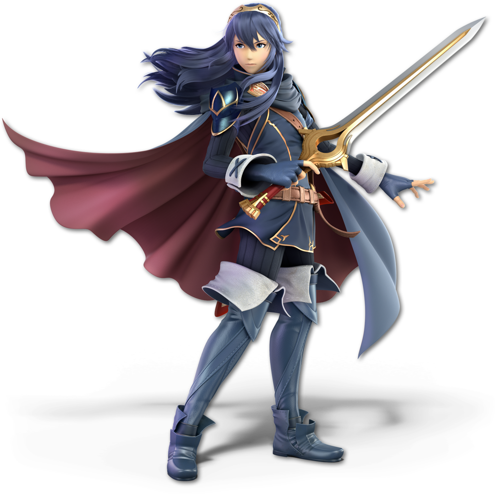
Ultimate: :ultlucina:


Image Link

I love the flow in this render! The pose itself is less interesting than the last one, but the breezy feel of this render makes up for it in my opinion. Although I do like how this pose allows more of her face to be seen, which I think is pretty important. Overall, I think the composition is better suited for a 3D model. It also shows a much greater focus on her long hair, further differentiating her from Marth.
7.5/10

Fun fact: during the process of getting Lumina's Ultimate render, I learned that the official Smash Bros website now allows you to change the costume of the characters on their pages by clicking their renders. How long has that been there?

IMO: :ultlucina: > :4lucina:

I know one of you already stated your opinion on this comparison, but what do the rest of you think of Lumina's renders?
 

Idon

Smash Legend
Joined
May 24, 2018
Messages
17,715
Location
Waxing Moon Ritual
NNID
Miyamoto Iori
Switch FC
SW-4826-9581-3305
They're both on the mediocre side so I'd say even.

Though I do find it hilarious how the length of the Falchion is definitely not remotely reprrsentative of its actual length in game.
 

osby

Smash Obsessed
Joined
Apr 25, 2018
Messages
23,983
Lucina is one of the few fighters whom I actually liked their Smash 4 render better. I don't think flowing hair and cape looks good with her facial expression.
 

fleshdude.gov

Smash Journeyman
Joined
Dec 5, 2018
Messages
276
Personally I far prefer the Ultimate render since it shows Lucina actually knowing how to hold a sword.

Like, what is even going on with her hands in the Smash 4 render? That pose looks both extremely uncomfortable and as though she's about to drop the sword on her foot.
 
Last edited:

osby

Smash Obsessed
Joined
Apr 25, 2018
Messages
23,983
Personally I far prefer the Ultimate render since it shows Lucina actually knowing how to hold a sword.

Like, what is even going on with her hands in the Smash 4 render?
At least it's a direct reference to Awakening.

Personally, I think she grips her sword too lightly in the Ultimate one.
 

fleshdude.gov

Smash Journeyman
Joined
Dec 5, 2018
Messages
276
At least it's a direct reference to Awakening.

Personally, I think she grips her sword too lightly in the Ultimate one.
I will agree that she is holding it a little too lightly in the Ultimate render, yeah, but at least she's holding it in a way that makes sense.
 

Arthur97

Smash Master
Joined
Jun 7, 2016
Messages
3,463
Smash 4's is just a lazy copy of the official pose. I don't like those.

Also, do we really have to go in the stupid echo number order?
 

Necro'lic

Smash Ace
Joined
Aug 9, 2015
Messages
654
But the system still doesn't work as she wasn't in Melee.

Also, I hate it when people just add a lol.
First point: It's how the game orders them, and that's how this thread's order goes, by fighter number.

Second point: It was to lighten the mood. It's hard to signify playfulness/sarcasm/general emotions through simply writing something down.
 

Arthur97

Smash Master
Joined
Jun 7, 2016
Messages
3,463
First point: It's how the game orders them, and that's how this thread's order goes, by fighter number.

Second point: It was to lighten the mood. It's hard to signify playfulness/sarcasm/general emotions through simply writing something down.
It breaks the pattern as before we've been going by game, but because we apparently must adhere to the arbitrary number system, sure, let's do a Smash 4 fighter with Melee.
 

Necro'lic

Smash Ace
Joined
Aug 9, 2015
Messages
654
It breaks the pattern as before we've been going by game, but because we apparently must adhere to the arbitrary number system, sure, let's do a Smash 4 fighter with Melee.
We've always been going by fighter number. That's how it's been. I don't know what else to tell you. Unless... did we not do Dark Samus? If we didn't you would have a point.
 

osby

Smash Obsessed
Joined
Apr 25, 2018
Messages
23,983
We've always been going by fighter number. That's how it's been. I don't know what else to tell you. Unless... did we not do Dark Samus? If we didn't you would have a point.
Dark Samus don't have a previous render, though.
 

Arthur97

Smash Master
Joined
Jun 7, 2016
Messages
3,463
We've always been going by fighter number. That's how it's been. I don't know what else to tell you. Unless... did we not do Dark Samus? If we didn't you would have a point.
We didn't, but apparently just because it has only one render.

Still, an exception could be made to at least do the echos in their proper game of release which is one of the number system's biggest issues.
 
Top Bottom